a windfall of boxes.

I once wrote a blog post explaining that the collective noun for grouping of chairs should be ‘jumble’.
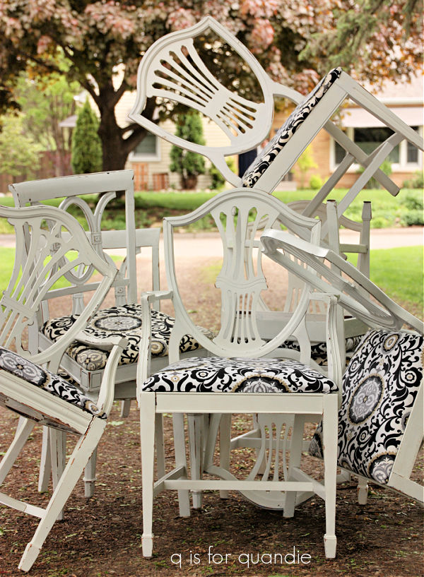
A jumble of chairs.

You know, sort of like a murder of crows, a school of fish, or a flamboyance of flamingos (yep, that’s a real one).

And FYI, re-doing all of those chairs was a lot of work, you can read about that here.

Well, today I have a new collective noun for you.  A ‘windfall of boxes’.

Yep, that’s a large grouping of metal boxes.

All of them were gifted to me by my friend Kathy.  She is also a reader of my blog, and she had been stockpiling metal boxes for a few years now thinking that one day she’d paint them up like I do.  But ultimately, as she explained, ‘just buying a metal box doesn’t make you quandie’.

Well, I don’t know about that.  I think she could have created some masterpieces herself.  But she needed the storage space in the garage and decided she’d just accept that she was probably never going to get around to painting these.

So the other day when we met for lunch she said she had a surprise for me.  Her car was completely loaded up with these boxes.

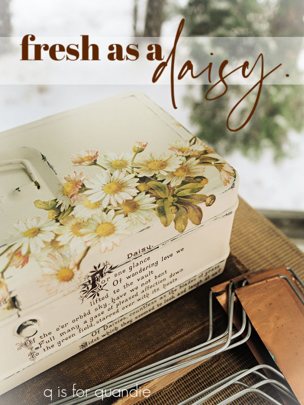
She didn’t want any money for them, but there was a small price I had to pay.  She asked me to makeover a particular box for her.

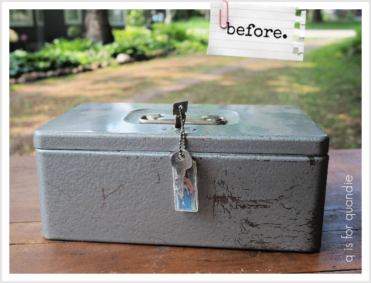
She chose a small, and very simple, little lockbox for herself.  I think she may simply have chosen it because it still had its key, I’m not sure.  Hmmm, I wonder what she’s planning to lock up in there!

She certainly had some other really cool options to choose from, like these two fab boxes.

These are the two largest boxes and I rather love the original patina on both of them.  Especially the one on the left.  I may not paint either one of these, but instead just clean them up and give them a protective coat of sealer to help make them functional for storage.

There were several metal recipe boxes in the stash.

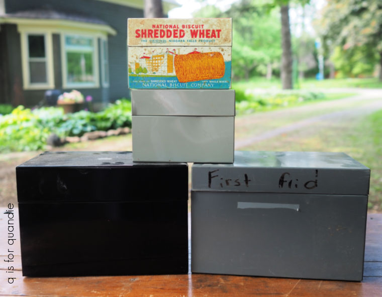
I’ll tuck those away to paint later, except for the shredded wheat box.

I won’t paint over that.  Instead I just used a magic eraser to clean it up.

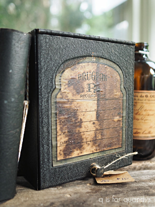
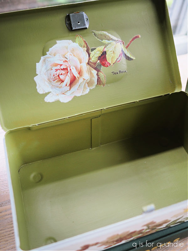
A few of the boxes fall under the heading of ‘office supplies’.

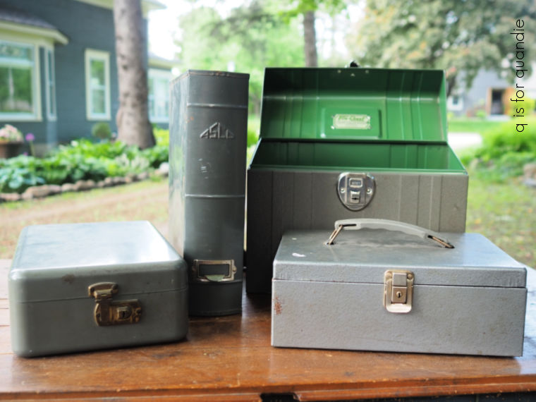
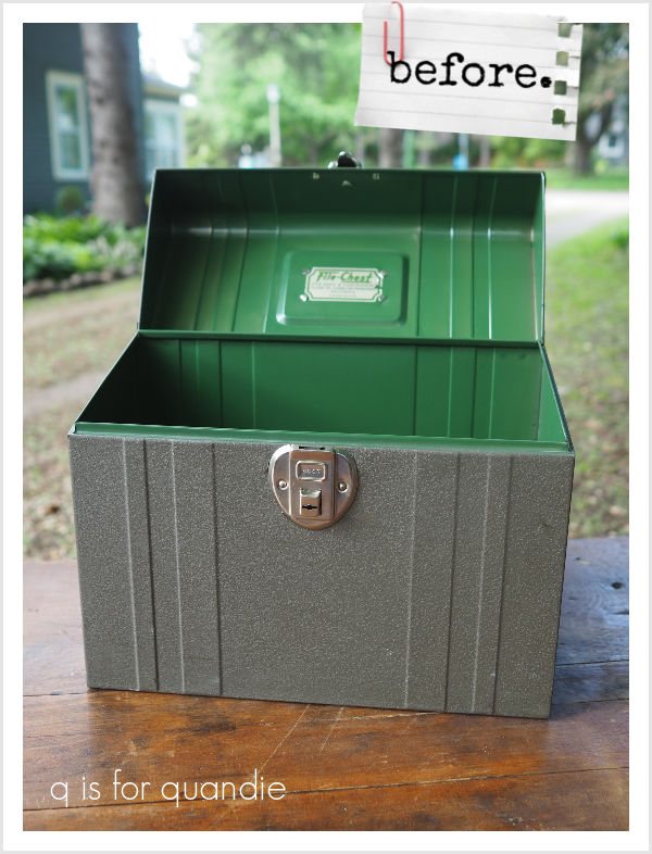
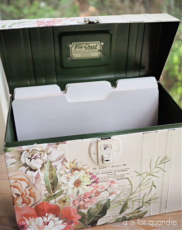
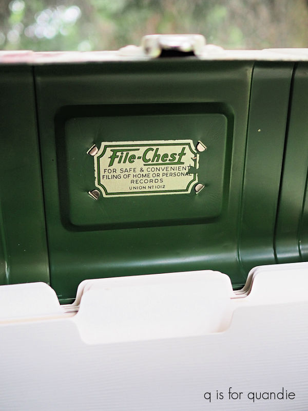
Two are typical lockboxes (that have lost their keys), and the one with the green interior is a file box.

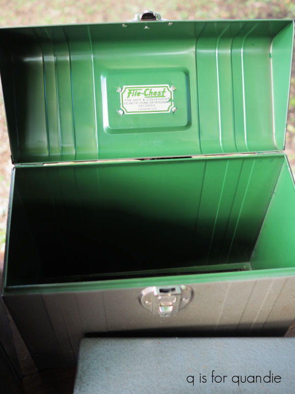
I fell in love with that pop of green as soon as I opened that one up.  I definitely won’t be painting over that green.

I also thought this bookshelf style box was pretty cool.

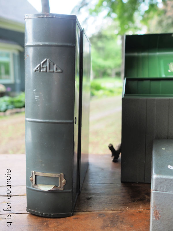
That’s going to be a fun makeover.

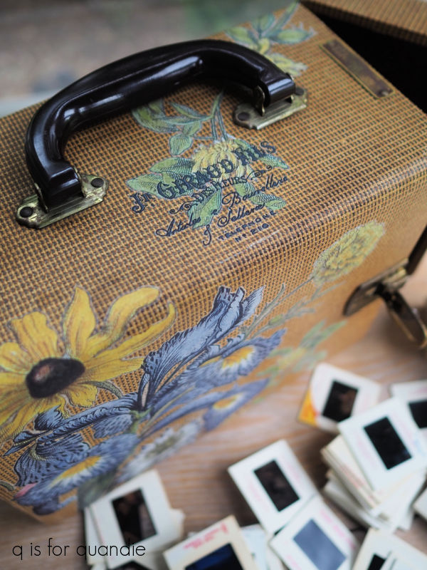
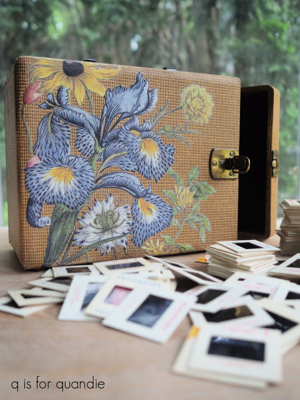
There is one box in the mix that isn’t metal.

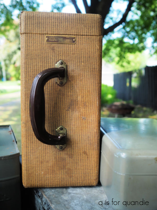
I wasn’t initially sure I wanted to tackle this one, but then I remembered the record box that I painted up a couple of years ago and thought I could do something similar with this one.  I love that Bakelite handle.

Finally, out of this entire pile, there are only two actual toolboxes.  Well, wait, I take that back.  One is an actual toolbox, the other is really a tacklebox.

And can I just say, I wish people wouldn’t write on these things with permanent marker.

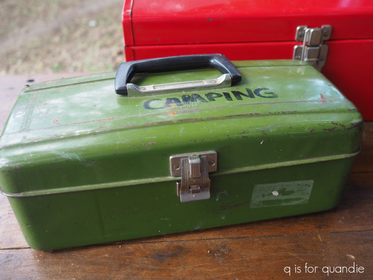
If it weren’t for that, I’d be tempted to just clean this one up and add some transfers because I kind of love that shade of avocado green.  But ‘camping’ has to go, so I’ll have to figure something out for that.

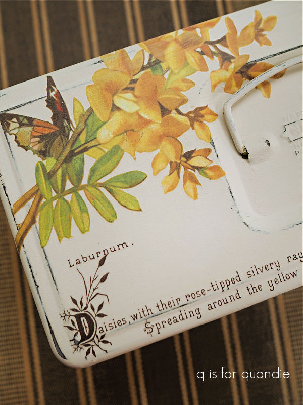
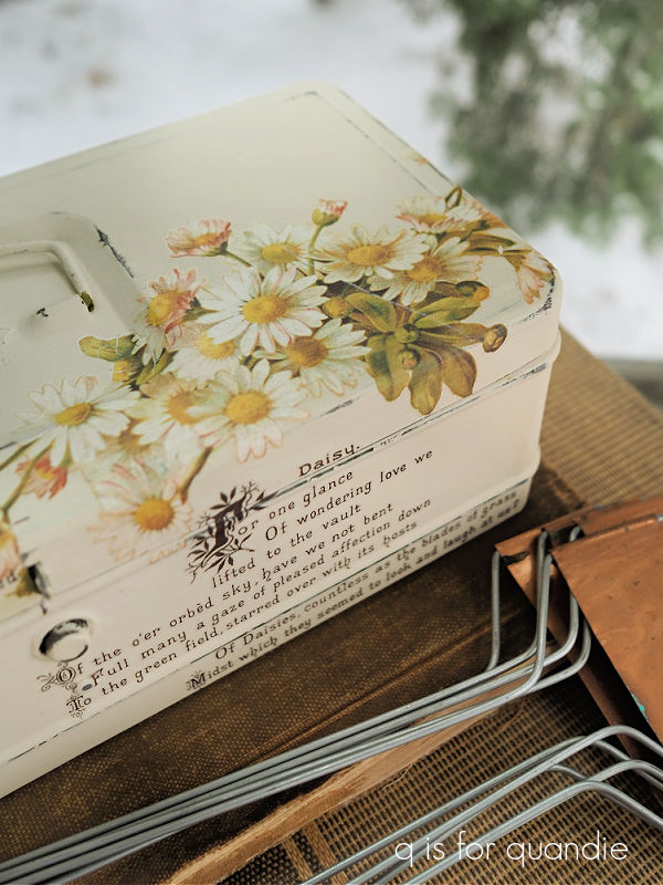
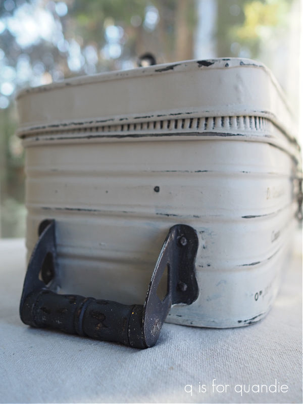
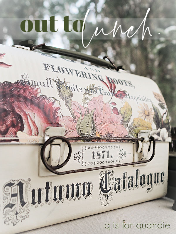
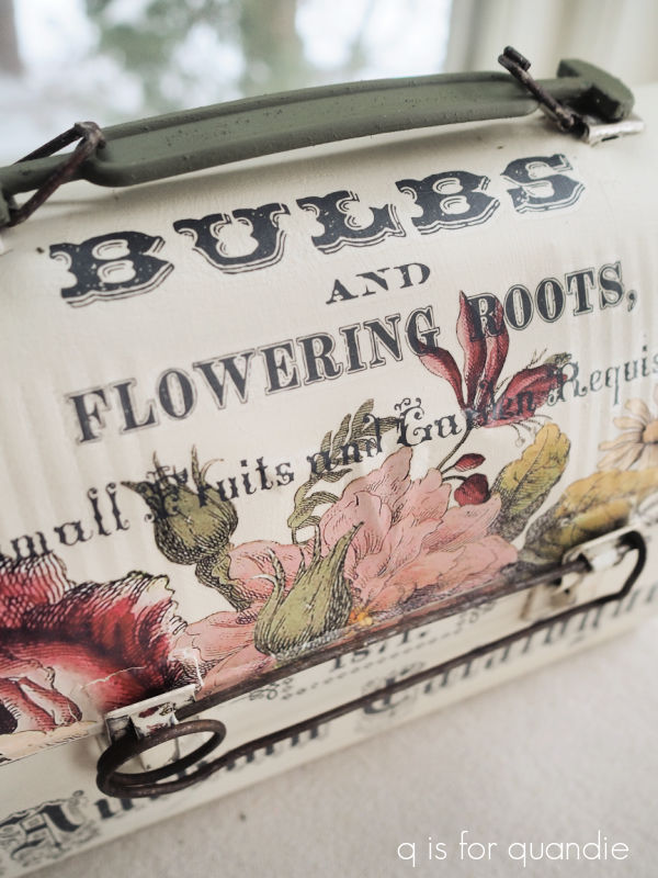
But speaking of avocado green, that brings me back to Kathy’s lockbox.  It had a rather slick, shiny finish so after cleaning it, I gave it a coat of Dixie Belle’s Bonding Boss to improve the adhesion of my paint.

Kathy gave me carte blanche to do whatever I wanted with it, so I started with Dixie Belle’s Guacamole on the inside.

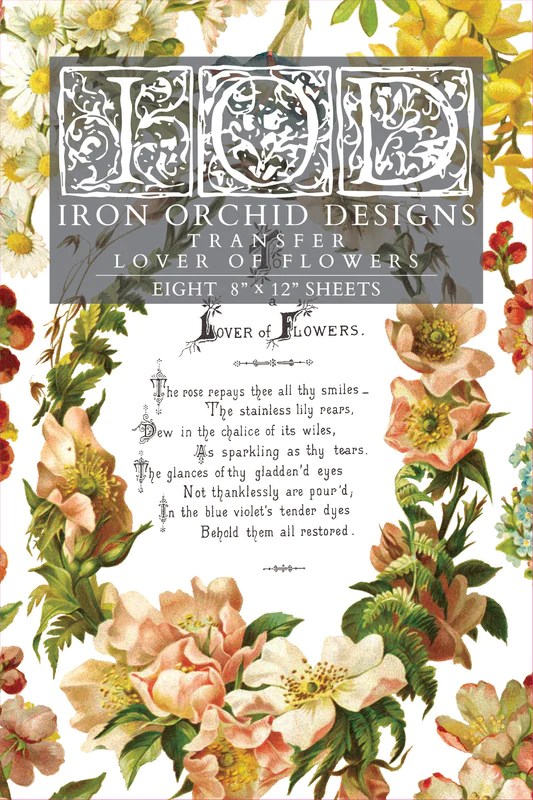
I added the tea rose transfer from I.O.D.’s Lover of Flowers.

After giving the outside two coats of DB’s Drop Cloth, and then sanding the edges to distress it a bit, I dressed it up with more of the Lover of Flowers transfers.

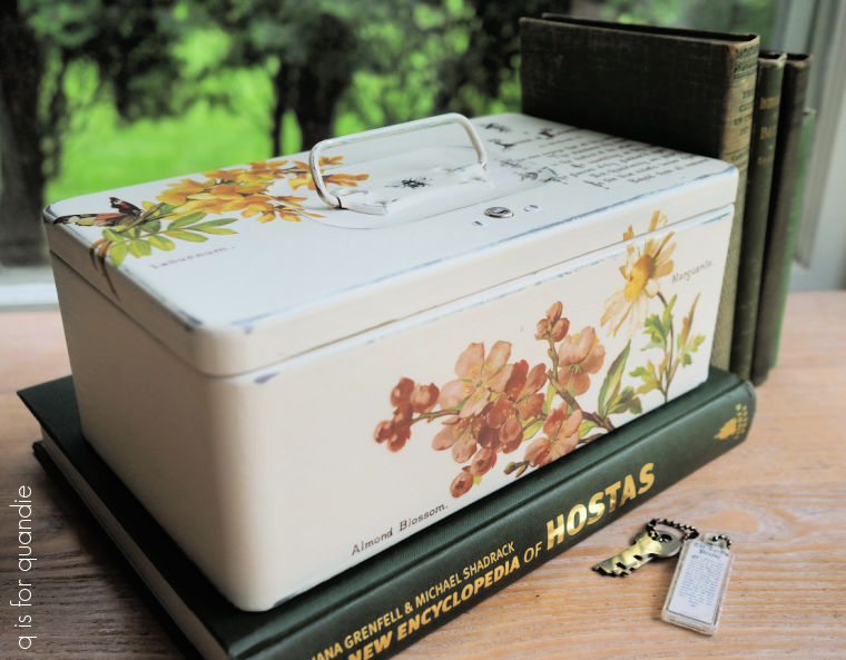
I also added a little bee that came from the re.design with prima knob transfers to the handle.

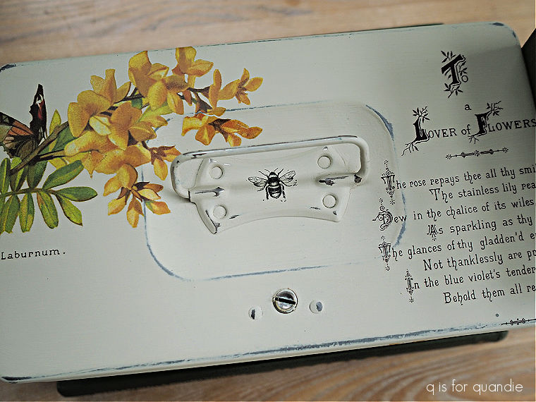
I finished everything off with a coat of Dixie Belle’s clear wax.

I’m pretty sure that Kathy is a lover of flowers, so I hope she’ll love how this box turned out.  How about you?  And which of the boxes from my windfall would be your favorite?  Leave a comment and let me know.

fresh as a daisy.

When I first saw the new I.O.D. Lover of Flowers transfers I just knew I had to have it (along with a couple of other new ones).

I love that it has a combination of both florals and typography to go with them.

There are 8 pages of designs, and I will get at least 10 or more small projects out of one pack.  So at $22 for the set, I think that’s a bargain.

When I was ordering this I was really drawn to the roses, and the pretty blue forget-me-nots.  But after meeting the mailman at my door for my package and ripping it open, I just knew I had to find a use for the daisies.

So I went to my stash and pulled out this simple lockbox.

It was the perfect candidate for a ‘fresh as a daisy’ makeover.

After giving it a light scuff sanding, and then a good wash with some Dawn dish soap and hot water, I gave it a coat of Dixie Belle’s clear B.O.S.S.  Once that was dry, I painted the inside in DB’s Guacamole and the outside in my favorite Drop Cloth.

Then came the fun part of adding the transfers.  I cut up the different elements on this page of the transfer …

and then started laying them out on my box.

I wasn’t initially planning to use the Laburnum floral, but in the end I felt like I needed a little bit more than just the daisies.

I messed up the poem slightly by putting the lower half of it on the top of the box, and then the upper half on the front, but I don’t think anyone is going to notice that.

I absolutely love the muted colors of these florals in combination with the Drop Cloth.  So sweet.

I didn’t forget about the inside.  There was another page of the transfer with just a single Marguerite Daisy image, so I added that to the inside lid.

By the way, if you’re wondering what all of that white stuff is outside the window in the background of that photo … yes, that is snow.  I took these photos during our recent snowstorm.  Mother Nature seems to be playing a cruel trick on us.  After a brown Christmas, and a mostly brown winter, and even gardening weather in early March, she decided to bombard us with nearly a foot of snow at the end of March.  Just when I thought spring was here!

Anyway, back to the box.  I finished it off with a couple of coats of Dixie Belle’s flat clear coat both inside and out to seal it up nicely.

What do you think of it?

Of course this box is for sale locally, so if any of my local readers are interested be sure to check out my ‘available for local sale‘ page.  Otherwise, I’ll likely eventually bring it into the shop.

Thank you to Dixie Belle Paint Co for providing the B.O.S.S., paint and sealer used on this project.

st. patty’s toolbox.

With St. Patty’s Day coming up, I just had to do something green!

And this toolbox was green both ‘before’ and, as you’re about to see, ‘after’.

To be honest, I don’t really remember where this came from.  I think I may have grabbed it at a late fall garage sale, but I’m not sure.

No matter.  It was definitely rusty and filthy dirty, and I remember debating whether or not it was worth the effort.  After giving it a good clean with some Dawn dishwashing soap and hot water, I then went over the rusty areas with some 120 grit sandpaper.  I mainly like to smooth down the surface so it doesn’t look quite so chunky, but I don’t attempt to remove every bit of rust.

But that means that I need to do something to keep the rust from bleeding through my paint.  So I thought this was an ideal opportunity to try the new Bonding Boss from Dixie Belle.

By now you are used to seeing me use Dixie Belle’s B.O.S.S. to block odors and stop stains.  This is their newest version of that product.  It combines all of the blocking qualities of B.O.S.S. with the bonding qualities of their Slick Stick.  It comes in clear, gray or white.  I like the clear version because I don’t want to see a layer of white or gray when I distress the edges of an item I’ve painted.

It’s nice to have one product that does a job that formerly required two different products, but that being said I’ve never had any adhesion problems using chalk style paint over the old B.O.S.S..  So I’ll continue to use it until the stuff I have on hand is used up, then make the permanent switch to Bonding Boss after that.

Once the Bonding Boss was dry, I painted the interior of the toolbox in Dixie Belle’s Cottage Door.  I love this warm shade of peachy-pink.

I added a Classic Vintage Label transfer from re.design with prima inside the lid.

This toolbox came with a tray, so I painted that up too.

Then I added a little section of I.O.D.’s Rose Chintz paint inlay to one of the sections.

I knew that I wanted to paint the outside of the box in a shade of green, but which one?

English Ivy or Kudzu?  I love them both.

Since I was planning to use the paint inlay on the outside too, I decided I’d better do a sample board to see which green worked best with it.

I painted half the board in English Ivy and half in Kudzu, and then added some scraps of the paint inlay.  I also pulled out a scrap of black transfer wording to make sure that would look good over my color of choice as well.

In the end, I rather thought either color would work but I decided I liked the English Ivy just a bit better.  The darker color made the florals pop a bit more.

So I painted the outside of the box in English Ivy and then applied the paint inlay to the bottom front and around the sides.

Before moving on, I sprayed the paint inlay with Rust-Oleum’s matte spray sealer to keep it from smearing while I worked on the rest of the box.  While I was at it, I spray sealed the tray and interior of the box as well.

Once that was dry, I sanded the edges of the box to distress them and then worked on adding some typography to the lid.

I kept it pretty simple, with just some segments of wording from the I.O.D. Label Ephemera transfer.  I added a line of text to the front of the lid as well.

I decided to go ahead and spray seal the exterior since I already had the spray handy, and it’s so much quicker than brushing on a top coat.

After the spray was dry, I also added a quick coat of clear wax over it.  There’s just something about the sheen of a wax topcoat that really appeals to me, although it wasn’t necessary for any practical reason.

With that, this toolbox makeover is complete.

I brought this one into the shop where I sell on consignment (Reclaiming Beautiful in Stillwater, MN), so if any of you locals are in need of a fabulously green toolbox, head into Stillwater this weekend.

Thank you to Dixie Belle Paint Co for providing the Bonding Boss and paint used for this makeover.

let the sun shine.

I’m back from sunny Florida!  Although I have to say, it wasn’t as sunny as we’d hoped it would be.  We started out with one beautiful day, and then the weather ranged from rainy to windy to chilly and then finally to warm and sunny again on our last day there.

My sister and I still had a great time though!

I think we’ve decided that February isn’t the best time for a Disney visit though.  Not only was the weather mediocre, I also didn’t love the Festival of the Arts in Epcot which runs from mid-January to mid-February each year.

I much prefer the Food & Wine Festival, or the Flower & Garden Festival, over this one.  You’d think the ‘art’ theme of this one would appeal to me, but the art is very much focused on animated Disney characters which really isn’t my style at all.

But I’m back from Florida, nearly recovered from a cold I caught on the last day, and still doing a bit of recovering from my tooth extraction (my dentist thinks I had a minor dry socket), and today I’m sharing another toolbox makeover!

One of my fellow Reclaiming Beautiful vendors found this one for me.

Isn’t it funky with that handle off the side?  At one point it must have been painted in a metallic silver, which was later covered up with black paint that then mostly chipped off.

After cleaning it up and not finding any rust, I decided I could skip the B.O.S.S. step this time.  For those of you not familiar, Dixie Belle’s B.O.S.S. is a primer that blocks odors and stops stains.  I usually use it on my toolboxes to block rust stains, but this one didn’t need it.  I simply sanded this toolbox to remove any flaking paint.

Now, I have to confess, I painted this toolbox three times!  Good grief, right?!  Well, I started out painting it black.  But then it sat for a week or so because I just wasn’t loving the black.  So, then I painted just the lid in Dixie Belle’s Drop Cloth thinking I’d go for a black and white look.  But I didn’t love that either.

So ultimately I decided to paint it in Dixie Belle’s Sawmill Gravy.  I did leave the handles black though (and that is Dixie Belle’s Midnight Sky).

I added some I.O.D. transfers next.  The one on the top is from their Label Ephemera set.

Part of the wording on the front is also from that one, but part of it is from their Cosette transfer.

And that bee at the bottom is from a re.design with prima transfer.

And you may have noticed that I opted to leave the latch ‘as is’ along with the chain that hangs beside it.  I’m not entirely sure what that chain was for, but I suspect there was some sort of peg hanging from it originally that you could use to secure the latch.  I was initially planning to remove it, but I couldn’t get it off so I decided to just leave it.

As for the inside … well … we’d been having some seriously gloomy weather here in Minnesota before I left on my trip, so I decided that adding a little Florida sunshine couldn’t hurt.

OK, a LOT of Florida sunshine!  Certainly more sunshine than we saw on our trip!

That is Dixie Belle’s Daisy, and I think these photos make it look just a tad brighter than it really is in person.  Well … I don’t know … it is brighter than their Rebel Yellow, which is a good choice if you’re looking for a paler yellow (you can see Rebel Yellow on this piece).  But in a lovely, sunny sort of way … not in a fluorescent traffic sign sort of way.

The yellow interior was also inspired by the bees.

The bee inside the lid is from the Classic Vintage Labels transfer from re.design with prima.

I feel like I took a bit of a risk with that yellow.  Yellow seems to be a love it or hate it sort of color.  But if the toolbox doesn’t sell with the yellow interior, I can re-paint it quite easily.

I sealed the inside of the toolbox with Dixie Belle’s flat clear coat for extra durability, and the outside with their clear wax.

So, what do you think?  Yellow, yes or no?  Leave a comment and let me know.

And if you’re local and need to add a little sunshine to your life, this toolbox is for sale.  Check out my ‘available for local sale‘ page for the details.

Thank you to Dixie Belle Paint Co for providing the paint and top coats used for this project.

a sweet little toolbox.

My friend opK found this sweet little toolbox for me last summer.

She thought it would be the perfect candidate for a makeover, and she was right.

I gave it my usual prep, a good washing with soapy water and then a coat of Dixie Belle’s B.O.S.S.  By the way, while we’re on the subject of B.O.S.S., did you hear that Dixie Belle is coming out with a new product that combines the qualities of B.O.S.S. and Slick Stick?  So it will still block odors and seal stains, but it will also be formulated to use on slick surfaces to improve the adhesion of your paint.  I’m looking forward to trying that out.

But in the meantime, I still like using the clear B.O.S.S. on items like this.  I prefer the clear version over the white or grey because I almost always distress my pieces and I don’t want to see that white or grey color under my final paint color.  Of course, in this particular instance I could have used the grey and it wouldn’t have made much difference since the original color of this toolbox was a silvery grey.

I painted the inside in DB’s Cottage Door.  This is such a lovely warm pinkish coral.  I’ve used it to create a pop of color inside a few toolboxes now.

Next I painted the outside in DB’s Midnight Sky.  Then I taped off a Swiss cross to paint in Drop Cloth.  Unfortunately, after I painted the cross, the tape I used pulled a bunch of the Midnight Sky with it when I took it off.

I usually use the yellow Frog Tape for delicate surfaces, but they didn’t have that one at Home Depot so I had purchased the regular green Frog Tape instead.  I’ve since gone back to Menard’s to stock up on the yellow version so this doesn’t happen again.  I could also probably avoid this problem if I allowed the paint to cure longer before taping over it, but who has the patience for that?

After going back and touching up the Midnight Sky, I added a small transfer from I.O.D.’s Label Ephemera to the top of the toolbox.

Then I decided that a small section from the I.O.D. Mélange paint inlay had the perfect typography for below that transfer.

I love it!

Except what did I do?  You can definitely see it in that close up photo above.  Yep, I forgot to seal my paint inlay with a spray sealer before applying some clear wax.  As soon as I swiped over it with the wax brush it smeared.  Ugh!

A more detailed explanation on the correct way to apply and seal a paint inlay can be found here.

I’m so annoyed with myself, I definitely knew better, I just wasn’t thinking.

I went back in with a q-tip to try and clean it up a bit, but you can definitely still see a bit of smearing, especially in a close up.

But most people aren’t going to be scrutinizing it that closely, right?

Unfortunately, an immediate fix for this would be rather delicate.  Since the paint inlay has to be applied to wet paint, I would have to paint back over that area.  However, I wouldn’t trust the adhesion of paint over the freshly applied wax, although you can paint over it after it’s cured, in about 30 days.  Otherwise, the wax would need to be removed by scrubbing it off with some mineral spirits.

Then I could brush on some more Drop Cloth paint and apply the paint inlay again.  However, as I’ve found in the past, using a paint inlay for the 2nd time gives a much fainter result than the first time around.  So would I be any happier with the look of that?

Another option would be to buy a new Mélange paint inlay just to use that little section of it.  The inlay is currently on sale at The Painted Heirloom for $40.50, plus $6.95 shipping unless I would spend at least $150 to get free shipping.  Yikes!  That’s a lot of money to fork over just for this one little fix.  Don’t get me wrong, I do think that the Mélange paint inlay is worth that price if you have lots of projects to use it on.  But I already have it, and I’ve only used about half of it.

FYI, The Painted Heirloom site has a message saying that all I.O.D. paint inlays are now considered ‘limited release’ and once sold out there won’t be more.  So maybe that’s motivation to buy another.

Do I really want to spend almost $50 for another Mélange inlay though, just for this one little section on this one little toolbox?

And maybe that blurring isn’t really that bad?

From a distance you barely notice it … especially if you squint just a little.

LOL, I don’t know.  We’re always more critical of our own work, aren’t we?  What do you think?

By the way, I also added a simple Tim Holtz number transfer to the side of the toolbox.

and I think the latch is my favorite part of this makeover.

It’s half black and half white, and I added a little crown.

For now I have set this toolbox aside while I consider whether or not I need to re-do that inlay.  But I may just take it into the shop and see what happens.  I can always make a decision about re-doing it if it doesn’t sell.

What would you do?

out to lunch.

I picked up this vintage lunchbox at a garage sale last summer.

After getting it home, I removed the filthy string that was holding the handle in place and then gave the whole thing a good clean with soapy water.  Then I added a coat of B.O.S.S. and put it on the ‘pile of future projects’.

Sometimes I like to hang onto these smaller projects and then bring them out in January when I’m stuck in the house.

Anyway, I did debate whether or not to paint this one.  I know there is a segment of the vintage loving population that would have preferred this in its original patina.  However, that segment doesn’t seem to buy a lot of my pieces.

So I decided to paint this one up.  I started with a couple of coats of Dixie Belle’s Silk paint in Cactus on the inside.  I thought I’d save myself some work and use a Silk paint with its built-in top coat, thus eliminating one step in the process.

Next up I painted the outside in my favorite Dixie Belle Drop Cloth.  Once that was dry I pulled out some sections of the I.O.D. Floral Anthology transfer.  My original plan was to start at the bottom of the lunchbox and then continue the florals about half way up the lid.  But I started by cutting off the section for the lid and applying that first.

Once that was in place I decided I rather liked the look of the florals just on the lid.

Sometimes … oh, who am I kidding? … most of the time … my designs morph as I go along.

That’s sort of the fun of creating, isn’t it?

Once I had the florals in place I went in search of some typography to add.  I found the upper half of the smaller version of the Seeds transfer in my stash and thought it would be perfect.

This is a retired design.  It was originally sold by re.design with prima, and then by I.O.D.

Sadly, neither one of them produces this design anymore.  I was in luck because one of my readers sent this one to me (thanks again Monica!).

The handle on this lunchbox is made out of plastic, and I wasn’t overly fond of that original shade of forest green.  So I decided to go ahead and paint it in the Cactus as well.

To give my paint every opportunity to adhere to the plastic, I first washed the handle thoroughly with hot soapy water to remove any oils.  Once dry I sanded it to rough up the surface, and then I added a coat of Dixie Belle’s Slick Stick.  I followed all of that up with two coats of the Cactus.

I finished up the lunchbox with a coat of clear wax on the exterior.  Since the interior was painted in the Silk paint it didn’t require a further topcoat.

I was halfway through photographing the lunchbox when I remembered that it came with a funky … well … I’m not sure what you would call it.  It’s sort of a large safety pin thingie.

It slides through the latches and prevents the lunchbox from opening.  The latches are slightly loose and one side in particular tends to fall open rather easily.  I’m guessing that the former owner of this lunchbox added this as a clever fix.

I’m not sure if I prefer the lunchbox with or without this addition.

It certainly adds a unique touch.

What do you think?

I don’t know that I would use this as a lunchbox, although you certainly could.  I think I’d be more inclined to use it to store seed packets, or maybe colored pencils or other art supplies.

Regardless of what you want to use it for, this lunchbox is for sale locally.  Check out my ‘available for local sale’ page for more details!

Thank you to Dixie Belle Paint Co for providing the Slick Stick, Drop Cloth and Cactus paint, and clear wax used on this project.

tackling a tackle box.

I can’t exactly remember how I came by the tackle box that I’m sharing today.

But I’m fairly sure that one of my friends must have found it for me.

I say that because I really don’t think I would have purposely chosen to tackle this one (ha, tackle, tackle box, get it?).

I tend to avoid things with old contact paper stuck to them like that yellow floral stuff in the tray.  This box is also pretty dented and misshapen.  Plus there was some kind of gunk that had totally hardened inside the bottom of the box.  Ewww.

But it was in my stash somehow (I don’t know, maybe I did purchase it myself?), so last fall when I was cleaning up a few other metal boxes out in the yard using the garden hose I added this one to the pile.  First I removed the contact paper, and then I scrubbed it with soap and water.  I then tried to scrape that hardened gunk off the bottom, but it wasn’t going anywhere.  I also tried to sand it down, but it was nearly impossible to get my little palm sander inside the box.

Eventually I just gave up on getting that stuff removed.  I moved on to painting the box with some of Dixie Belle’s B.O.S.S. and then shoved it to the back of the project pile again.

I pulled it back out a couple of weeks ago when I was working on some other Christmas themed items and decided to just see what I could do with it.

I started by painting the inside in Dixie Belle’s English Ivy.

This is such a pretty shade of green, and perfect for Christmas.

Since I couldn’t get the bottom nice and smooth, I opted to line it with some gingham scrapbook paper after I painted it.

I painted the exterior in Dixie Belle’s Drop Cloth.  Once that was dry, I sanded it to distress the edges and then I brought out my transfer scraps to see what would work.

I ended up finding some cursive script that fit the top of the box.  I’m not sure what that was from, but it was most likely a re.design with prima transfer.

Once I had that script in place, I filled in some of the corners with bits and pieces from the Evergreen and Holly transfer from Dixie Belle.

This sweet little red breasted bird fit perfectly on the front of the box.

If you’re someone who pays attention, you might be wondering at this point how I seem to always have more of this transfer even though I’ve mentioned that it’s no longer available.  It was a limited release for Christmas 2022.

Well, as it turned out, one of my local readers purchased it online (you can still find it from various vendors online) and asked me to do a custom lockbox for her.  She had the lockbox, and the transfer, I just painted it up for her.

And as a bonus, she let me keep the remainder of the transfer after finishing her lockbox.

So I do have a bit more of the Evergreen and Holly and I’m rationing it out for a handful of projects.

Now, what would one do with a Christmas tackle box?

I suppose you could put your Christmas card supplies in it.  Is that a bit of a stretch?  Do very many people even do Christmas cards anymore?

What would you do with it?

If you are local and can think of a good purpose, this particular Christmas tackle box is for sale locally.  And I’m pricing it low due to that gunky bottom.  So be sure to check my ‘available for local sale‘ page for more details.

the candy cane toolbox.

Remember back when I said I prefer to work with vintage toolboxes rather than newer ones?

Well, there are always exceptions to every rule, right?

Today’s toolbox was not especially old.

Nor was it in the usual rusty and/or crusty condition.  Which is kind of a bonus really.  It didn’t take a whole lot of prep to get this one ready for paint.  I washed it and then gave it a coat of Dixie Belle’s clear B.O.S.S.  No sanding required.

And really, I probably didn’t even need the B.O.S.S. on this one.  But at the time I was prepping a whole bunch of toolboxes, sort of assembly line style, so I B.O.S.S.’ed them all.

I decided to stick with the red on the inside of this one, just giving it a fresh coat of Dixie Belle’s Honky Tonk Red.

Once that was dry, I added a candy cane transfer from I.O.D.’s Candy Cane Cottage inside the lid.

Next up I painted the exterior of the box in Dixie Belle’s Drop Cloth.  Then I started cutting up different elements from Candy Cane Cottage to see what I could come up with for the outside.

Rather than immediately rubbing transfers on as I chose them, I decided to place everything first to see what would fit.  That way if I needed to overlap some elements I could be sure to apply them in the right order.

This time around that only ended up impacting one spot, where the word “Old” overlaps the floral under it a bit.

If I had put down the wording first, I could have rearranged the floral so that it didn’t cover it, but in the end it’s easier just to do a little pre-planning.

Those florals were the sole reason I ordered this particular transfer.

They are such a pretty combination of floral and holiday with those red berries.

As I mentioned in a previous post, I only wish these images were larger.  I used the two larger florals included with the transfer on either side of the toolbox, and then supplemented those with two of the smaller florals on each side.

By the way, I should probably mention at this point that this limited time only transfer is sold out everywhere.  If you didn’t order it immediately upon release, you likely missed out.

I also added some wording from Candy Cane Cottage to the top of the toolbox.

I think it turned out pretty dang cute.

Now, you might be wondering, what in the world would you do with a Christmas themed toolbox?

Well, how about keeping your gift wrapping supplies in it?  Scissors, ribbon, tape, bows, etc.

Or, you could just use it as decor, placing it on a shelf or table top, or even just under the tree.

But I also really like the idea of filling it up and using it as a gift box.  Remember the toolbox I created a few years back as a Secret Santa gift?

This one would be perfect to fill up with the same sort of stuff.  Some peppermint schnapps, peppermint sticks, hot chocolate mixes and some fabulous retro shot glasses; everything you need to make a peppermint patty (the drink, not the candy).

Whatever you’d use it for, it is available for local sale so be sure to check my ‘available for local sale‘ page for more details if you’re interested.  Be sure to act fast if you want to pick it up, I’ll be bringing this one into the shop on Wednesday.

Also, be sure to leave me a comment and let me know if you’ve used the I.O.D. Candy Cane Cottage transfers, and if so, how did you like them?

leaning in to fall.

Today I’m switching it up just a little.  OK, OK, not by much.  Instead of a toolbox, today’s project is a tackle box.  I know I’ve done a lot of toolboxes/tackleboxes/lockboxes lately, but for whatever reason, those seem to be coming my way these days.

Not only is this one a tackle box, but it’s a double decker tackle box.

Or to be precise, it was a tackle box.  There was no way I was going to mess around with painting those trays though.  So I had my handyman Ken drill out the hinges and take them out (they are already out in that photo above, I’ve just placed them on top for the photo).

Once that was done I gave this one a good clean, and then I sanded the rusty spots with some 220 grit sandpaper.  Next I gave it two coats of Dixie Belle’s B.O.S.S.  I really wanted to try and prevent that rust from coming back through my paint.

When I initially began to work on this one, I wanted to do something using autumnal colors.  I’m stepping a little bit outside of my comfort zone here.  I don’t typically like browns, oranges, or yellows.  But I wanted to lean in to fall (fall the noun, not the verb, get it?).  You know, fully embrace the season.

That being said, I didn’t have any fall themed transfers on hand.  Conveniently, at that very moment, re.design with prima came out with a new release that includes a transfer called Harvest Hues.

It looked perfect for my needs, so I ordered it.

While waiting for my transfer to arrive in the mail, I painted the inside of the tackle box in Dixie Belle’s Mojave.

Whenever I see this color I automatically think ‘Harvest Gold‘.  If you were around in the 70’s, you know what I’m talking about.

Next I painted the outside of the box in DB’s Drop Cloth and waited for my transfer to arrive.

I was so excited when it came, but when I pulled it out of the tube I was startled to find that it came in two long strips.  I’ve gotten so used to using both I.O.D. and Dixie Belle transfers that come on smaller sheets.  I was a little flustered about how to manipulate the sheets to fit my tackle box.

Then tragedy struck when one of the sheets rolled up on itself without the backing paper while I was handling it.  Argh!  Has that ever happened to you?  That basically ruined about half of one strip as it stuck to itself.  Thank goodness I wasn’t planning to use the complete design on a bigger piece, that would have been a real bummer.  I really appreciate that the I.O.D. transfers now come in flat packaging, thus eliminating the whole rolling problem.

Anyway, that left me with trying to figure out how to make the remaining long strip work for my tackle box.  It also left me somewhat frustrated, so I set the whole thing aside for a couple of days.

I then realized that autumn was getting away from me, and if I didn’t get this one done soon I was going to miss the entire season.

Once I started working with the transfer, I realized it wasn’t much harder to fit it to the box.  I just had to play around with placement a bit, and do a little creative trimming here and there.

Once I had the Harvest Hues in place, I added some bits of wording from the I.O.D. Label Ephemera transfer in the blank spots on the top (sadly, this transfer is retired and getting difficult to find) …

I also added some Label Ephemera to the front …

The Harvest Hues transfer is wrapped around one side quite a bit.

But on the other side I added the color chart from the end of the transfer.

Those dots were transferrable, so I thought, why not?

In the end, I think it turned out nicely.  And I was able to stage my photos outside and capture some of those beautiful fall colors in the garden before they are gone!

How about you?  Are you a fan of harvest hues?  Or do you tend to lean more towards summer pinks or corals?  Then again, how about jewel tones?  Or maybe deep, dark navy?  Leave a comment and let me know.

In the meanwhile, this harvest hues toolbox is for sale.  Be sure to check my ‘available for local sale‘ page for more details.

Thank you to Dixie Belle Paint Co for supplying their products used for this project.

the norske toolbox.

When we were in Norway last month I was determined to find a set of 5 small Norwegian flags to bring home as a souvenir.  Yeah, I know, maybe not your typical souvenir.  But I have this vintage flag holder and although I have U.S. flags for it, I was thinking it might be fun to fly the Norwegian flag for a while.

Especially since nnK (my neighbor across the street) flies the Swedish flag!

I initially thought I might have to really hunt around for those flags in Norway, but no.  They were everywhere.  Nearly every souvenir shop we visited had them, and they had them in various sizes too.

So now I have them hanging on the carriage house and I love them.

Fast forward to a week or so ago when I found this red toolbox at a garage sale.

I was heading out to my workshop with it, and as I passed those flags I thought … hmmmm … the Norwegian flag would be perfect on the toolbox.

After all, I’ve done a few union jack pieces …

So why not the Norwegian flag?

So I cleaned up the toolbox and then gave it a coat of Dixie Belle’s Honky Tonk Red inside and out.  You’ll note that I skipped the B.O.S.S. step this time around.  This toolbox did not have any rust, and it also didn’t seem to have any greasy residue from anything.  So I thought I’d be O.K. skipping the B.O.S.S.

I let the paint dry overnight, and then I taped off the white stripes and painted those with Drop Cloth.  Once dry, I taped some more and then added the dark blue stripes using In the Navy.

Once I had the flag design in place I decided that it needed just a little something more.

So I decided to add a few roses.

The white roses are from the I.O.D. Brocante transfer, and the red roses are from their Redoute II transfer.

I wrapped them up and over the top …

And also around the side.

You may be wondering what roses have to do with the Norwegian flag.  Well, nothing really.  I just thought they looked nice together.  Plus, judging by the amount of rose hips I saw while visiting Norway, I’d say they grow plenty of roses there.

So it’s not entirely odd to have added roses to their flag.

I staged the toolbox with some old photos of my Norwegian ancestors.

The wedding photo in the front is my great grandfather who emigrated from Norway as a young man.  In the back row is my grandmother’s confirmation photo, then her wedding to my grandfather, and then there is this photo from 1909 …

My grandmother is the 2nd from the left in the front row.  I thought this photo was particularly relevant because several of the kids are holding Norwegian flags.  The back of the photo dates it to May 17, 1909.  May 17th is Norway’s Constitution Day, so they must have been celebrating that.  I have no idea why there are only men and children in the photo.  Where are all the women?  Probably in the kitchen making Kvæfjordkake or something.

By the way, a little sidebar, I did try Norway’s official national cake, Kvæfjordkake, while I was in Kristiansand …

And it was absolutely delicious.  Have you ever had it?

Anyway, I totally love how the Norske toolbox turned out.

I am going to attempt to sell it.  I’m banking on the belief that there are a lot of locals in Minnesota with Norwegian ancestry who just might want a Norwegian flag toolbox.

Maybe?

Well, I guess I’ll find out.  And if it doesn’t sell, well then, maybe it was meant to be mine.

If interested, be sure to check out my ‘available for local sale‘ page for more details.