the least esteemed creatures toolbox.

Yep, I still have more toolboxes that I’m making over, and I have one to share today.

I picked up this toolbox at a late summer garage sale.

Nothing too exciting, right?

After giving it a good cleaning, I removed that Cramer label from the front of the toolbox.  I was able to pry it off quite easily, and I thought it would be better to have a flat surface for adding a transfer to the front.

Next up I sanded off any loose paint and/or chunky rust and gave it a coat of Dixie Belle’s Bonding Boss inside and out.

I followed that up with a lovely shade of grey green from their Silk Paint line called Highlands on the inside.

Once that dried, I added a sweet little bird transfer from I.O.D.’s Santa’s Hollow transfer.

Next up I painted the outside of the toolbox in Ecru, which is rapidly becoming one of my favorite colors.

Then I pulled out this page from the Winter Botanist transfer from the 2025 Holiday Collection from I.O.D.

Isn’t that lovely?

In my attempt to research what the wording said, I came across this …

Apparently the design of this transfer is based on the cover of a book in Dutch called The Wonders of God in the Least Esteemed Creatures that was originally published in 1762.  It contains 50 engraved plates featuring butterflies and you can buy it from Abe Books for a whopping $9,600.

Or you can buy the Winter Botanist transfer for around $22.

I feel like this particular transfer isn’t super Christmas-y, but instead is only just slightly winter-ish.  It does feature holly and pine, but it also has quite a few butterflies (and I guess the Dutch thought they were the least esteemed creatures).  I don’t know about where you live, but here in Minnesota we definitely don’t have butterflies in the winter.

But let’s just go with it.

I customized the transfer to fit my toolbox by cutting out the wording from the middle to allow for the latch.

I then applied that cut out wording to the top of the toolbox.

Then I felt like I needed the transfer to spread out a bit more, so I added in some extra bits of foliage and some extra butterflies from the Winter Botanist here and there.

I also added some bells to the upper corners of the top that came from the I.O.D. Santa’s Hollow transfer.

So, definitely not overtly Christmas, and only slightly winter-ish in feeling, here is the least esteemed creatures toolbox.

For you locals who may be in need of a toolbox dedicated to God’s least esteemed creatures, I took this one in to Reclaiming Beautiful in Stillwater this week.  This is the perfect time to head towards the St. Croix Valley to check out the fall leaves as well.  According to the Minnesota Department of Natural Resources Fall Color Finder, today they should be at 50 – 75% fall color.

As for the rest of you, how’s the fall color where you are?  And what do you think of today’s toolbox makeover?  Leave a comment and let me know.

the queen’s glory toolbox.

I actually completed the project that I’m sharing today more than a month ago.  It was one of the several projects that I cranked out before our trip to Canada, and it’s this toolbox …

I purchased this toolbox way back in January at the Habitat for Humanity ReStore and it has been sitting in my stash ever since.

Since it was already black, I decided to go ahead and keep it that color on the outside.  That being said, I did scuff sand it, clean it and then give it a coat of Dixie Belle’s Bonding Boss to both help my paint stick, and keep any bits of rust from bleeding through.

Once that prep was done, I painted the inside in Dixie Belle’s Cottage Door.

After all, who doesn’t love a gorgeous pop of color on the inside?

Next up I gave the outside just one coat of Dixie Belle’s Caviar.  Since I was painting black over black, just one careful coat was all that was needed.

Next up I applied some of those gorgeous florals from I.O.D.’s Saint Germain transfer.

I wrapped them around each side.

Next up I pulled out the Queen’s Glory transfer from re.design with prima.  This is another gold transfer, but it isn’t like the gilded transfers from I.O.D. that I’ve been using lately.  It goes on like any other transfer, whereas the I.O.D. gilded transfers require a bit of a more delicate touch when applying them.

It isn’t as ‘gilded’ looking though either.  The gold is a bit darker and not quite as shiny.

But I also think the smaller details are much better defined.  For example, compare the re.design with prima transfer above to the I.O.D. transfer below …

Another plus to the re.design with prima version is price point.  I paid around $20 for two 12″ x 12″ sheets of the Queen’s Glory transfer (so two sheets of the same design, I used just one of them on this toolbox).  The I.O.D. Etiquettes gilded transfer is around $50 for four 12″ x 16″ sheets.  So granted, yes, you’re paying about the same price per square inch, but if you just want to do one project, the Queen’s Glory would accomplish that at a much lower price.

So, six of one, half dozen of the other.  Both products have pros and cons.

And both products are fun to use to add a little bling to your project.

I finished off the toolbox with a coat of Dixie Belle’s clear wax.

FYI, the final waxing step really brings out the richness of the Caviar paint, and it also helps add contrast between the transfers and the black paint.  So if you decide to try something similar, don’t panic if it doesn’t look great right away.  Adding the wax really pulls it all together.

Normally this is where I would say that this toolbox is for sale locally.  However, I already sold it at my Carriage House Sale.  But I hope you enjoyed seeing it here anyway.

Have you tried both the re.design with prima and I.O.D. gold transfers?  And if so, which one did you like better?  Leave a comment and let me know.

seeing double.

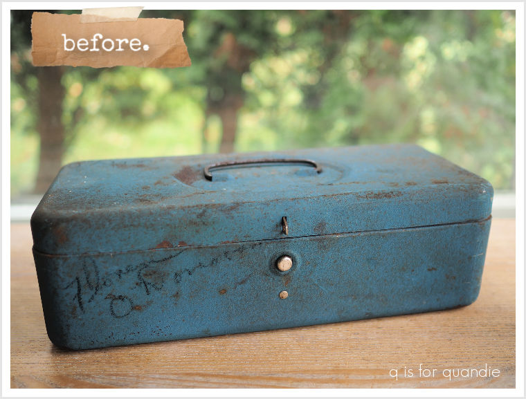
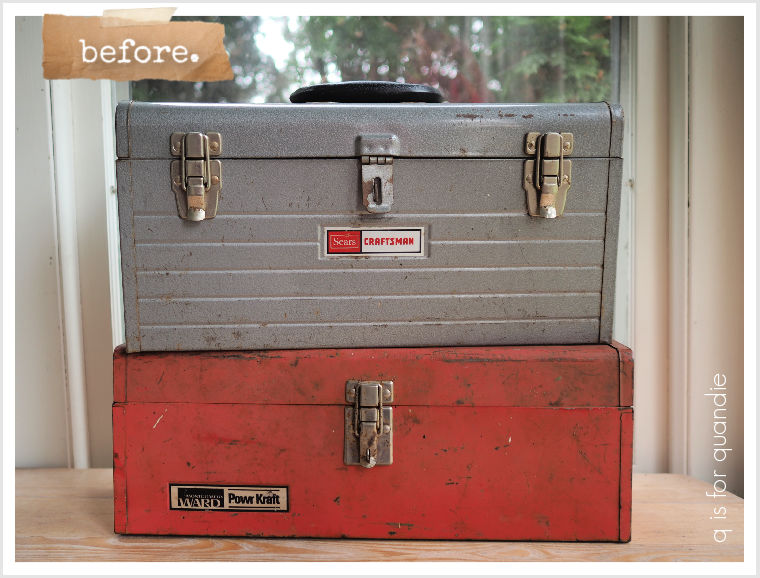
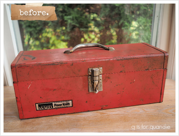
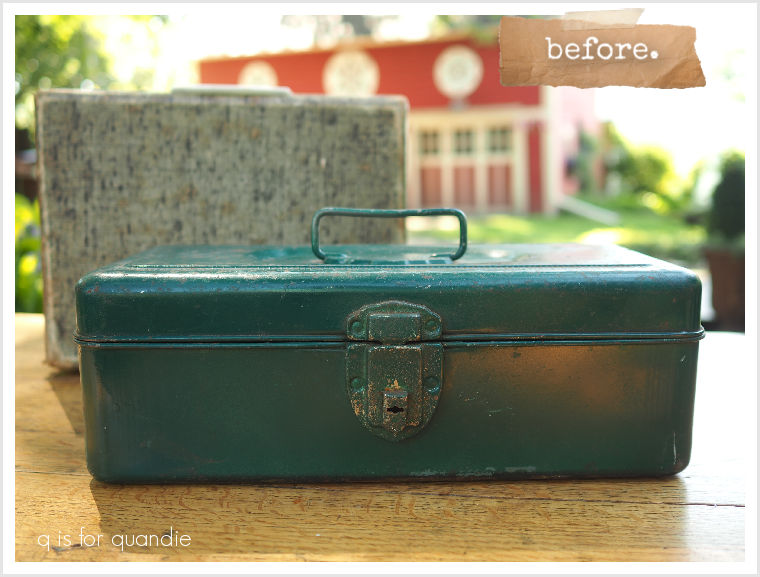
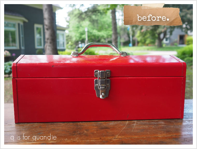
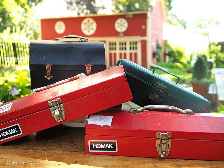
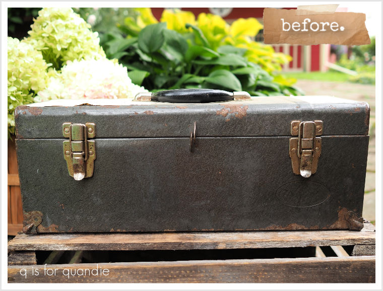
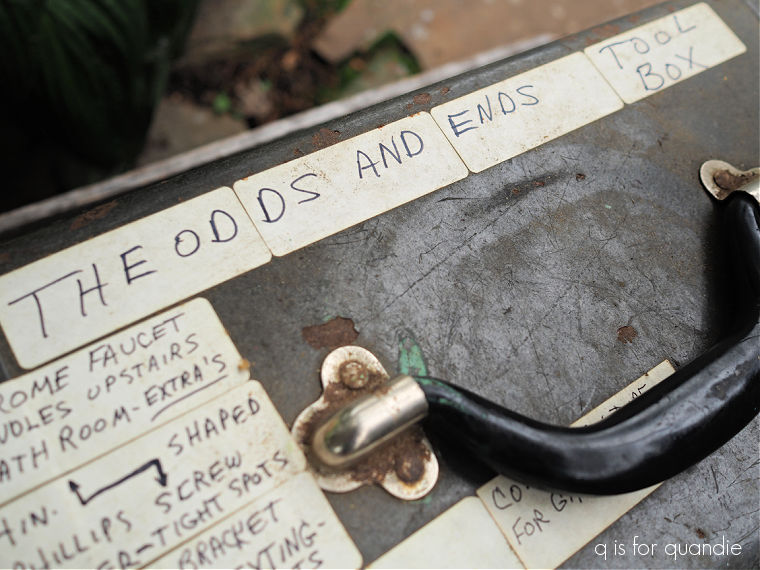
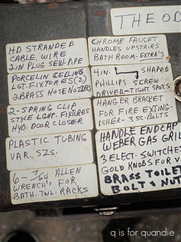
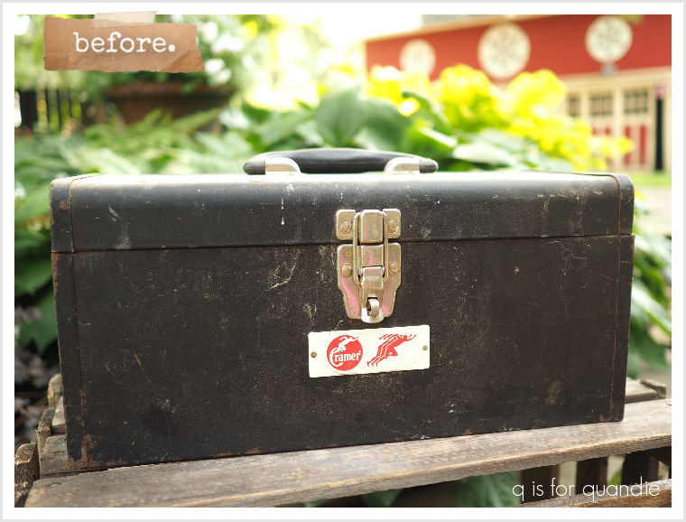
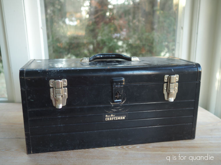
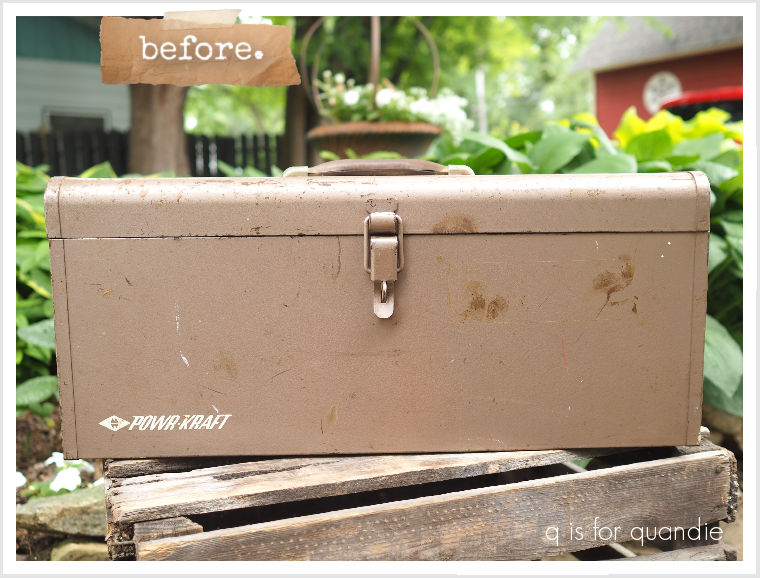
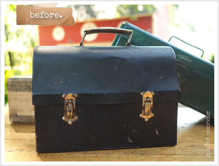
Earlier this summer I picked up this black toolbox at a garage sale.

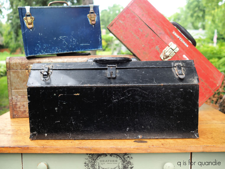
While giving it a good cleaning, I noticed that there was a pretty blue/green/grey color underneath that black paint.

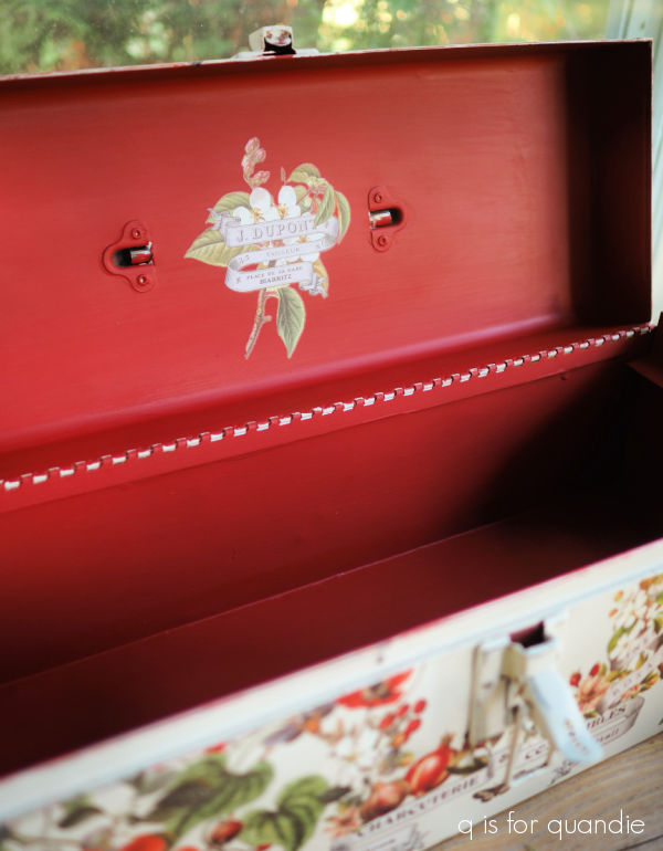
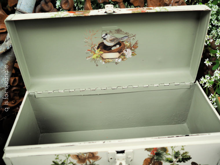
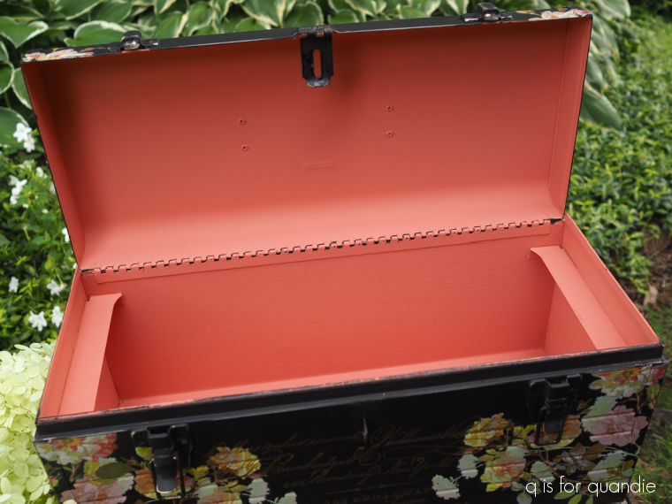
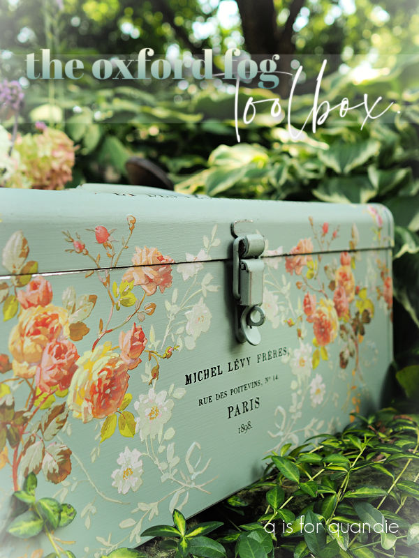
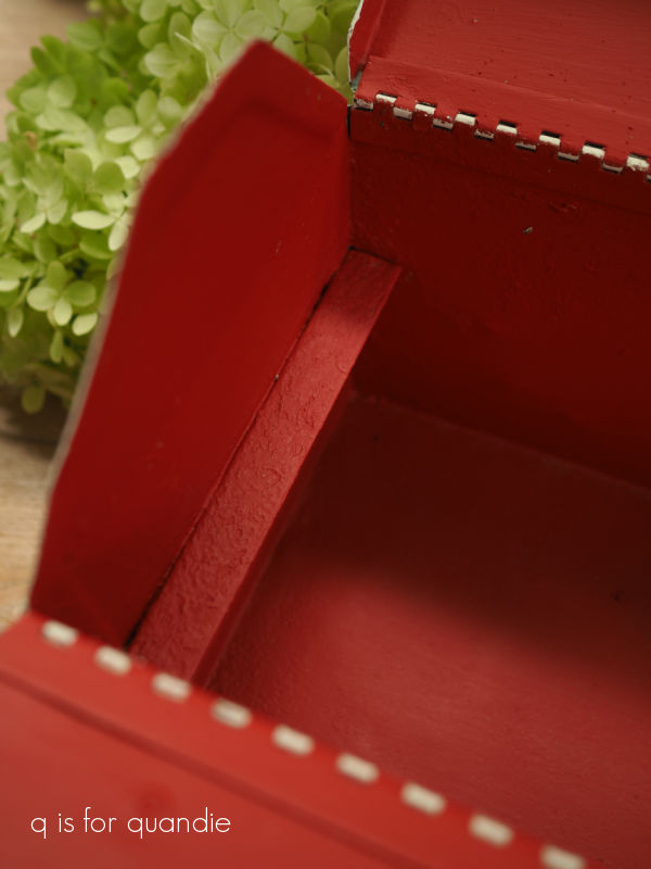
So that inspired me to use one of the new Dixie Belle colors on the inside, Oxford Fog.  Since this color is from their Silk paint line and thus has a built in primer, I thought I could get away with skipping my usual Bonding Boss.

But I was wrong.  If you look closely in the photo above, you can see little pin points of rust bleeding through the paint.  See them?

So that’s just a heads up for you if you like to paint rusty metal, you’ll want to use the Bonding Boss to prevent that rust from bleeding through your paint, even when using the Silk paint with its built-in primer.

All is not lost at this point, I went back and applied a coat of the Bonding Boss over the Oxford Fog.  Keep this in mind if you ever run into a similar problem, you can apply Bonding Boss over a coat of paint, you’ll just have to add another coat of paint over it.

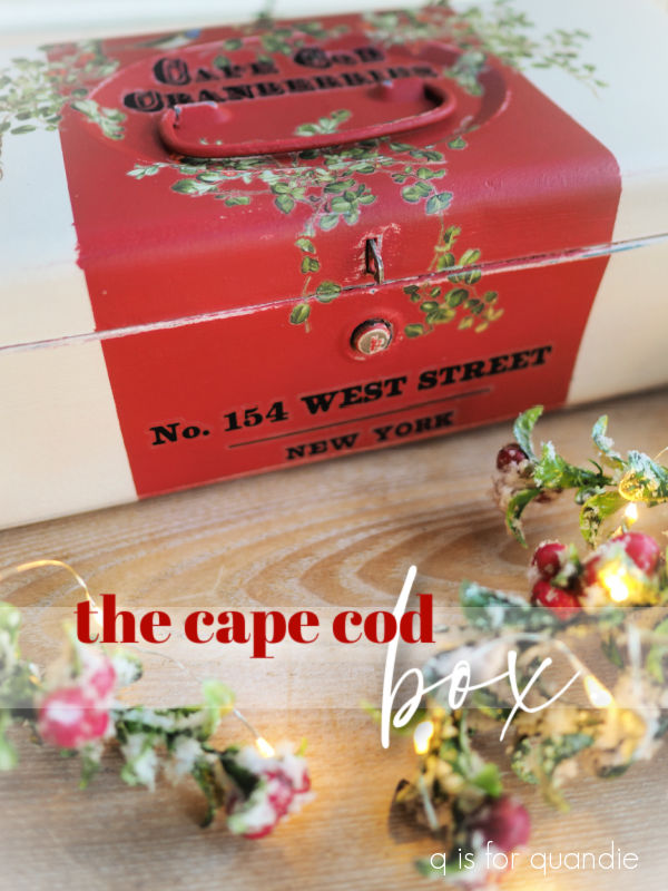
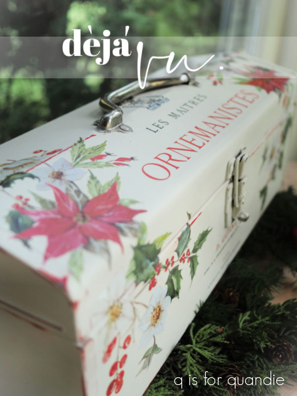
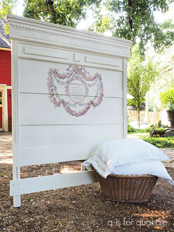
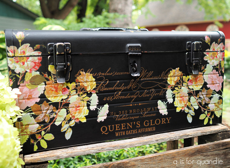
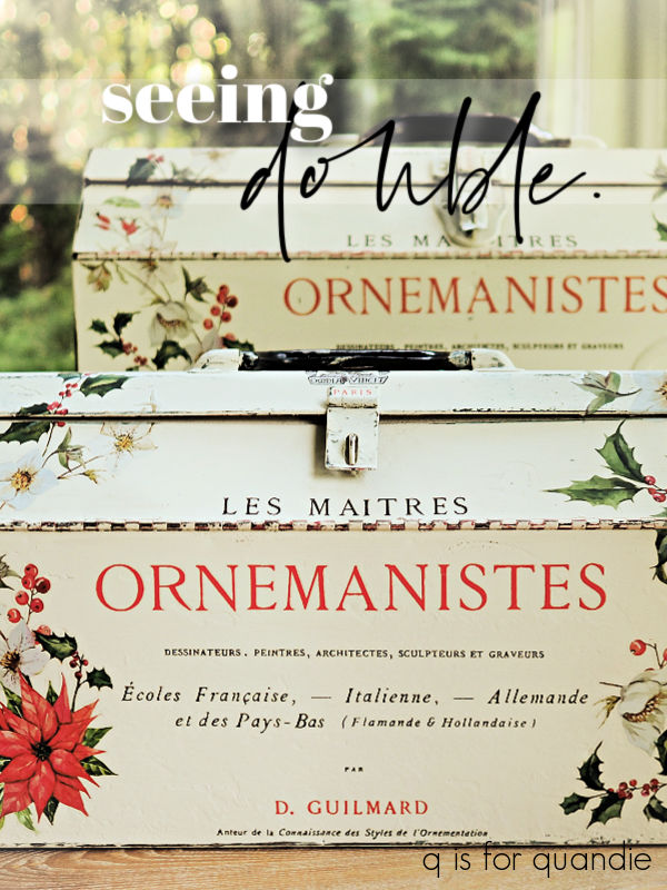
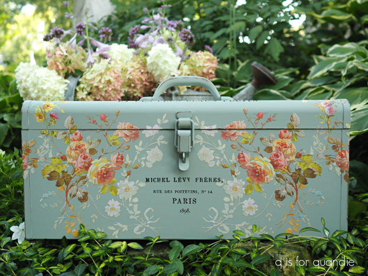
So I could have then added another coat of Oxford Fog over the Bonding Boss, but instead I decided to pivot.  I realized that this particular toolbox wax almost identical to one that I painted back in 2022.
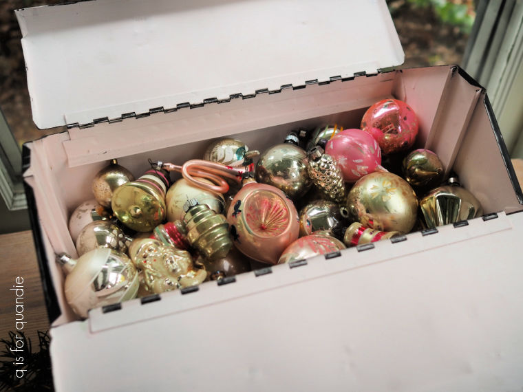
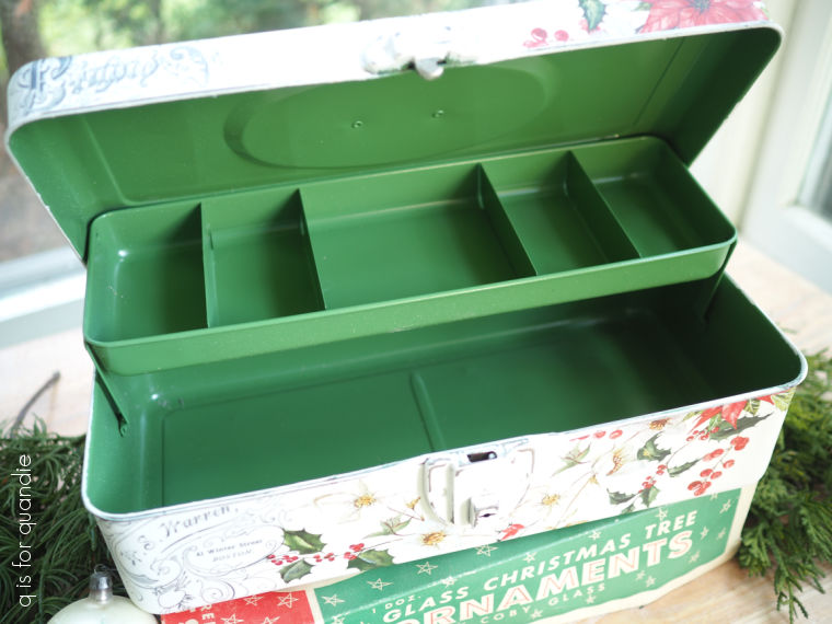
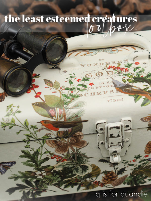
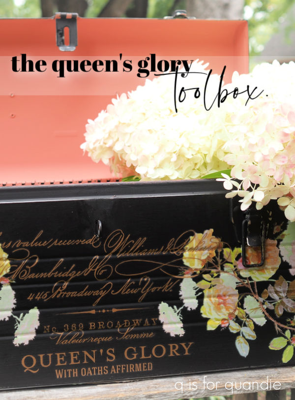
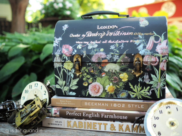
Remember this one?

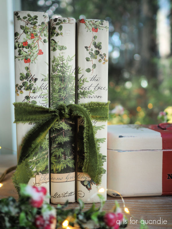
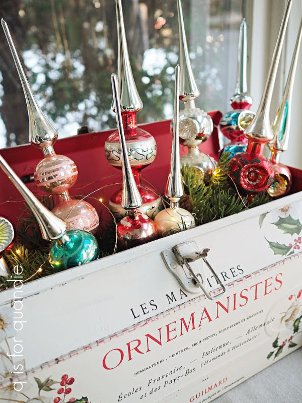
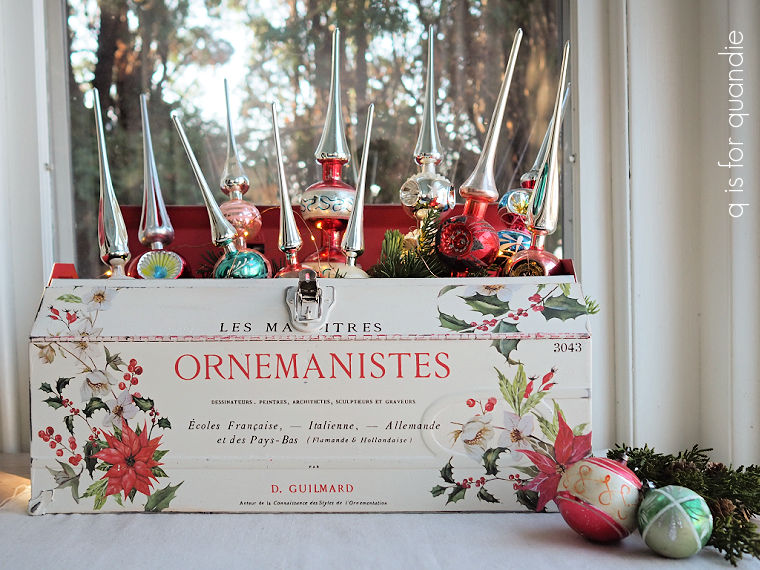
It’s one of my all-time favorites, and in fact I even kept it for myself and have since used it to display my vintage glass Christmas tree toppers.

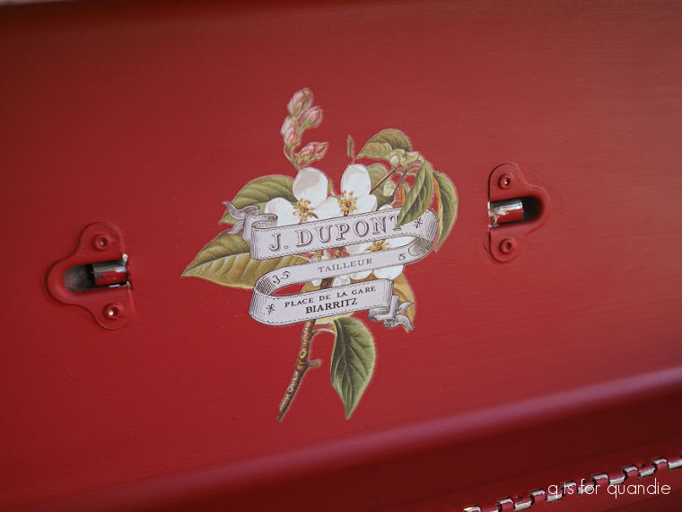
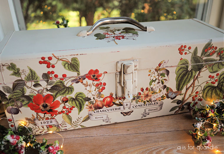
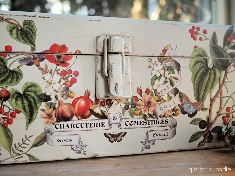
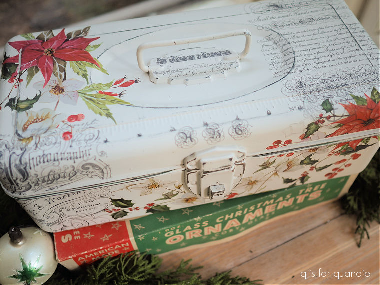
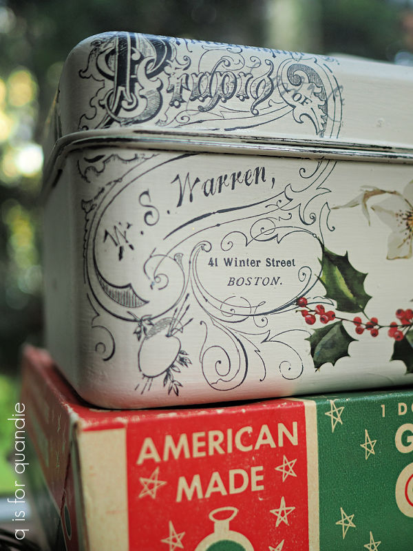
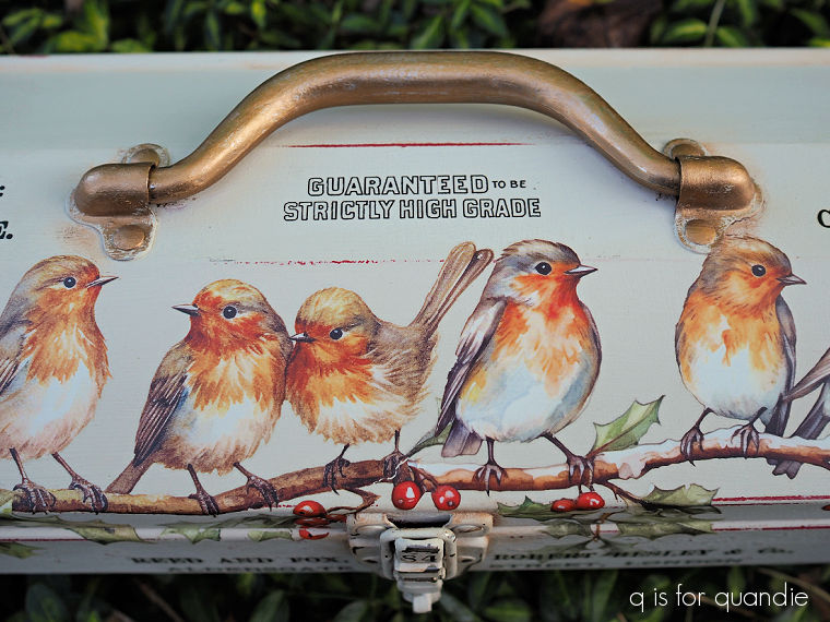
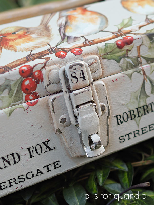
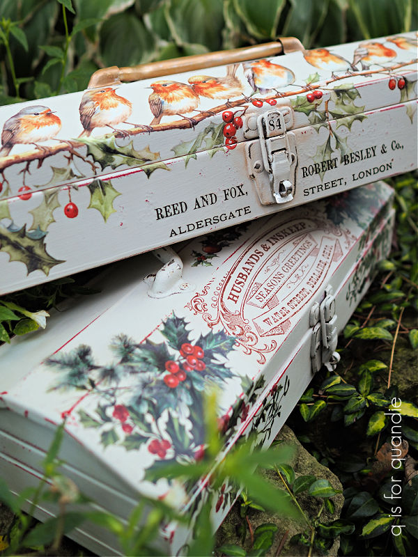
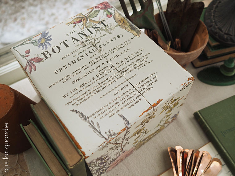
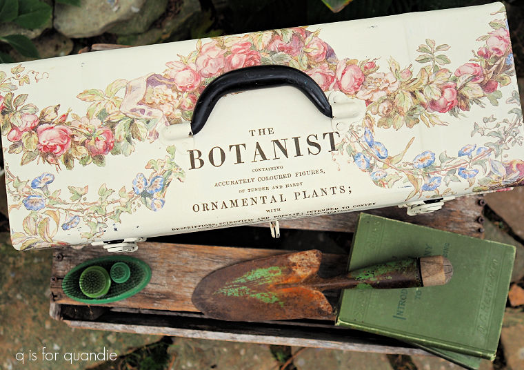
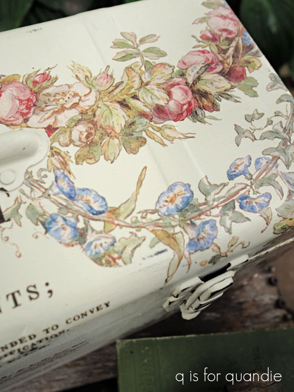
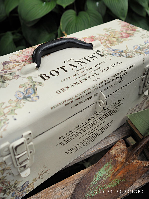
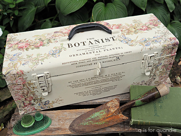
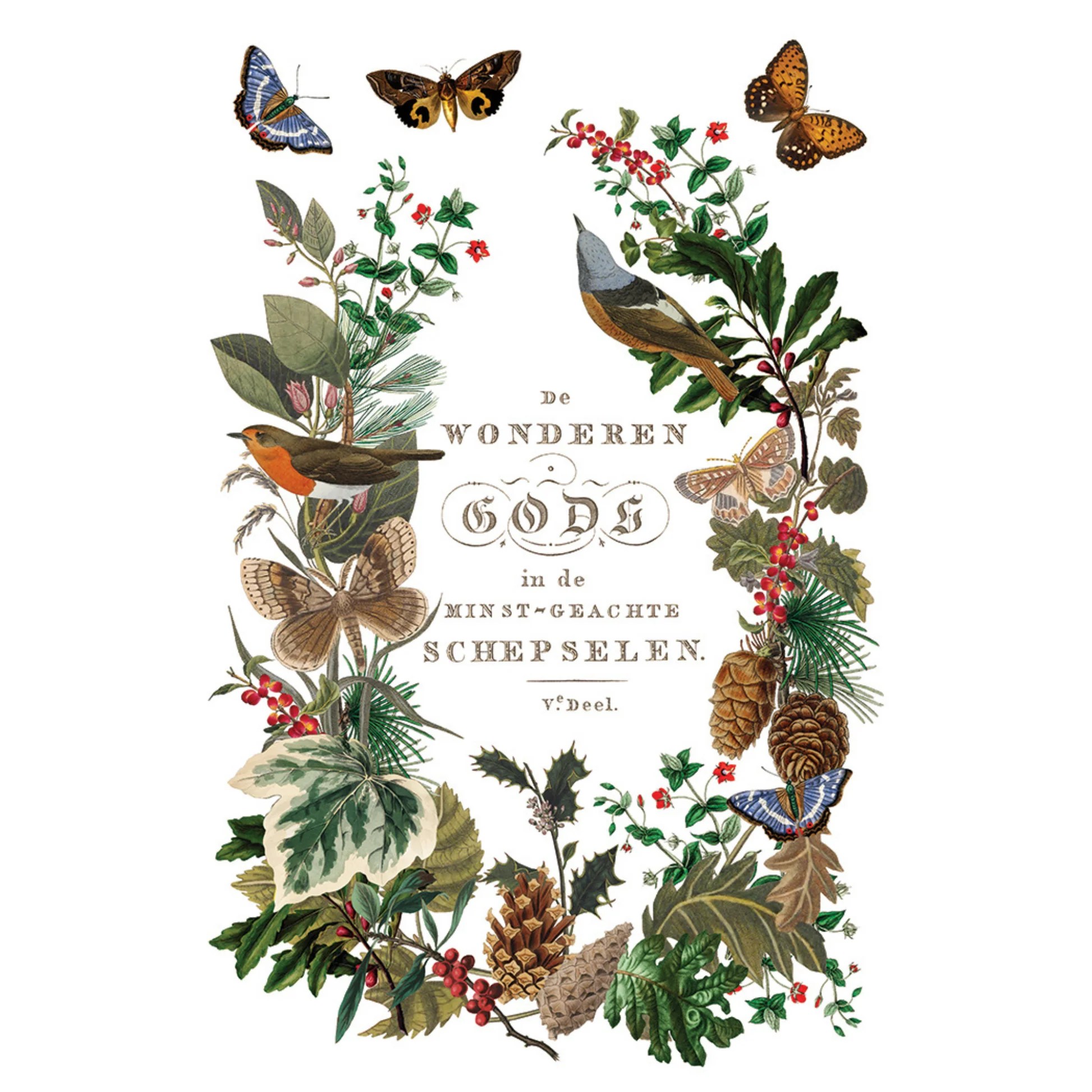
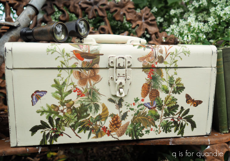
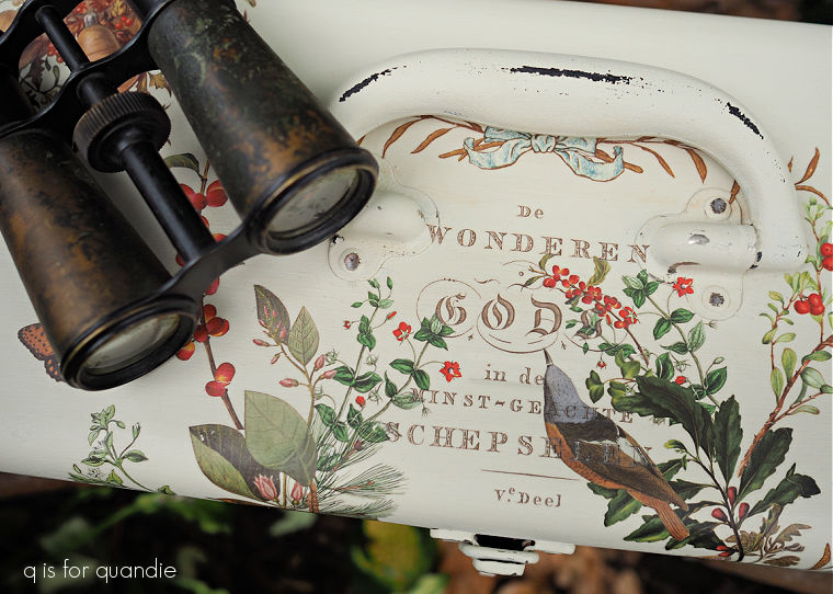
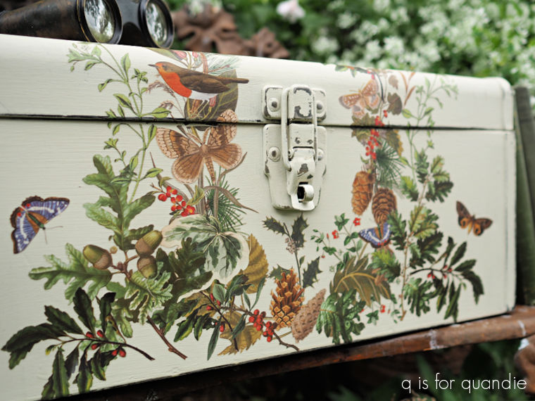
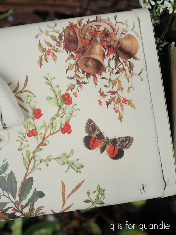
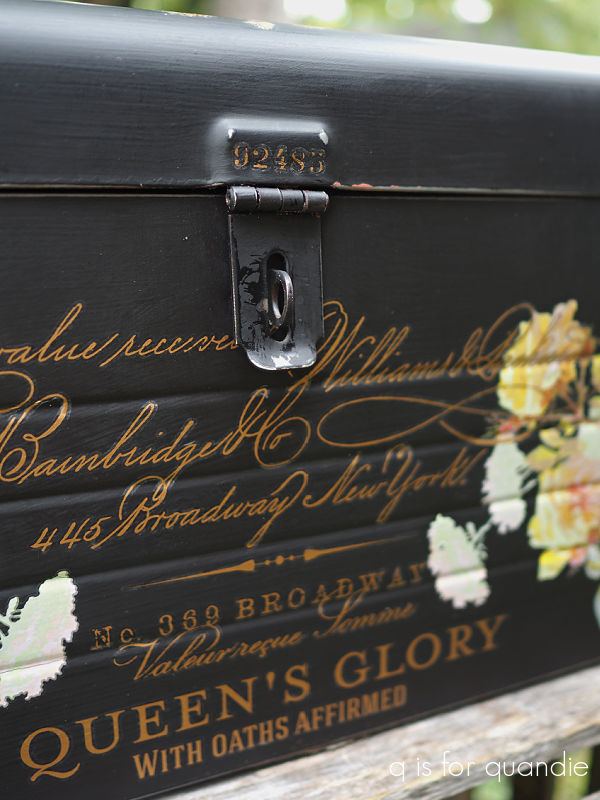
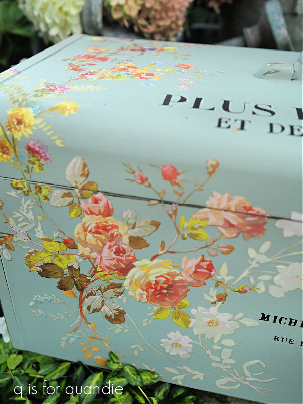
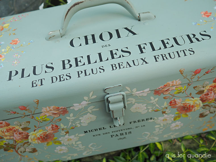
I also found that I could still order both of the transfers that I used on it, the I.O.D. Cosette transfer for the wording and the Dixie Belle Evergreen and Holly transfer.  Both are older transfers, but I was easily able to find them online.

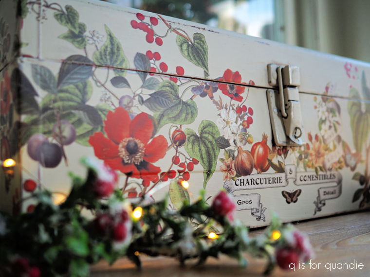
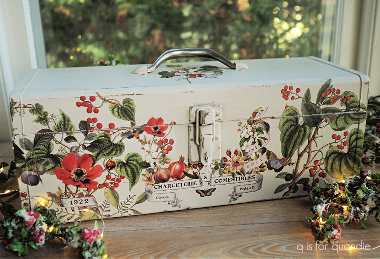
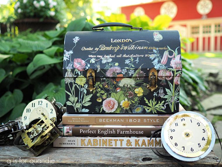
So I decided to simply copy my own work and make another one just like it.

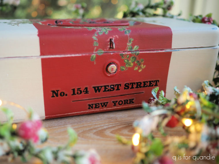
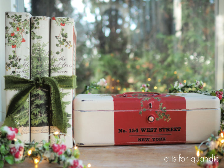
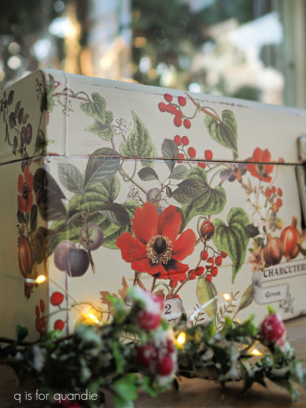
It’s not an exact duplicate.  This toolbox has two latches rather than a single centered one like the first toolbox.  But otherwise they are pretty much the same.

I also switched up a couple of other elements.  The older toolbox was painted in Dixie Belle’s Drop Cloth, this newer one is painted in Ecru.  The Drop Cloth definitely has more of a yellowish cast to it and you can really see that with them side by side.

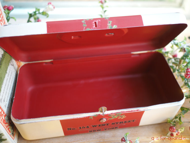
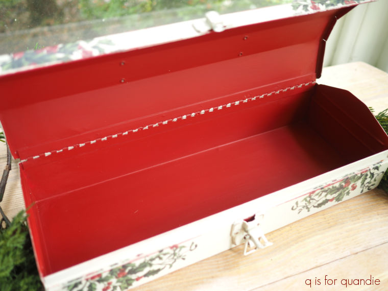
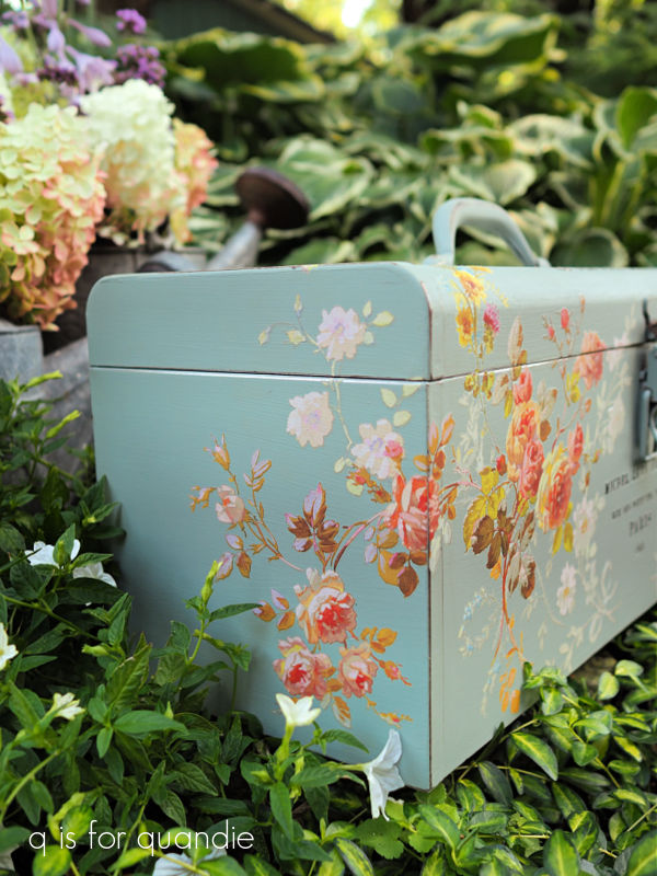
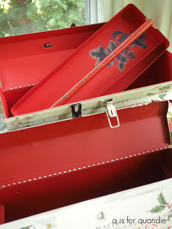
I also opted for a different color on the inside.  The original toolbox has Dixie Belle’s Honky Tonk Red on the inside, and I painted over that Oxford Fog with Barn Red on the new one.

It’s a subtle difference, but the Honky Tonk Red (top toolbox) is a bit brighter than the Barn Red.

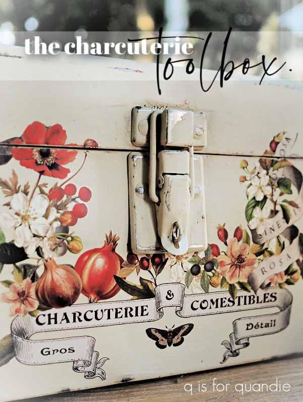
By the way, I’m not sure that you can really see it in this next photo, but the Bonding Boss did do its job and prevented the rust from bleeding thru that Barn Red.

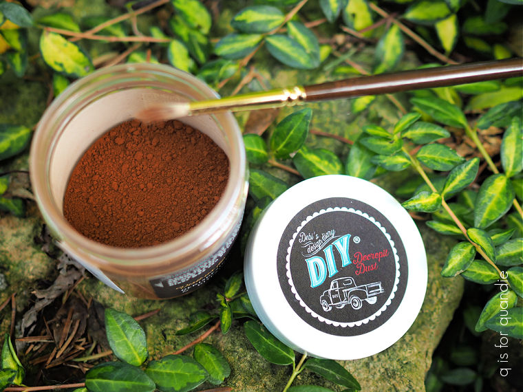
For those of you who may not be familiar with this product, it’s a combination of two of Dixie Belle’s original products, Slick Stick and B.O.S.S.  The Slick Stick was a product that improved adhesion over slick surfaces, and the B.O.S.S. ‘blocks odors and stops stains’.  Now one product does all of that, the Bonding Boss.

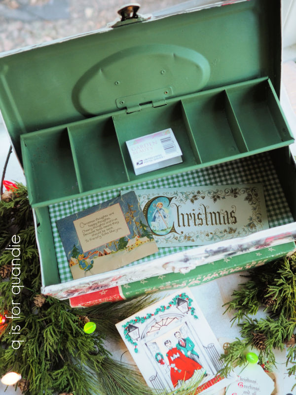
There is one other significant difference between the two toolboxes, the first one had a tray that I painted up.

This newer one also came with a tray, but I didn’t bother with painting it.

That’s because I’m planning to keep this 2nd toolbox now.  Since I always used the previous one for those glass toppers, I didn’t have a use for the tray.  I suppose I could have come up with some sort of use for it, but I never did.  It really was just something I had to store somewhere while the rest of the toolbox was in use.

So now I plan to sell the original with the tray, and keep the 2nd one with no tray for myself.  I will definitely be pulling it out again this Christmas to display my toppers.

By the way, I fully realize that this is WAY too early to be sharing Christmas decor.  However, I plan to have some holiday merch at my upcoming occasional sale which is precisely one month away (Saturday, October 4).  So I am getting cracking on some things for that and I hope you’ll forgive me for the early holiday post.  But then again, this gives you guys plenty of time to order these transfers for yourself and make your own Christmas toolbox, so maybe early isn’t such a bad thing.

What do you think?

the oxford fog toolbox.

I’ve been patiently waiting to share today’s toolbox with you guys!

You see, Dixie Belle sent me the new colors from the Countryside Collection of their Silk paint in advance of the release.  So I immediately went and painted a toolbox in one of them, and then realized I wouldn’t be able to share it for weeks!  I should have read the fine print first 😉

In fact, I painted this one before any of the toolboxes that I shared during toolbox week!

And then I had to keep it hush hush until the new colors were revealed.  And I’ll let you in on a secret, I’m not good at keeping secrets.

But I made it!  And now I can share, so let’s start with the ‘before’ of this toolbox.

It was pretty basic, in good shape but a very drab color.

After my usual prep of cleaning it well, lightly scuff sanding it and giving it a base coat of Dixie Belle’s Bonding Boss, I painted the interior in DB’s Blue Grass.

Then I painted the outside in the new Countryside Collection color called Oxford Fog.

I just knew these two colors would pair up beautifully.

They are two different styles of paint.  The Silk paint is a water based all-in-one acrylic paint with a built in primer and top coat.  On the other hand, the Blue Grass is from DB’s line of chalk style paints.  Chalk paint doesn’t always require a primer, but I like to add additional protection from bleed-thru with the Bonding Boss when painting over rusty metal with both styles of paint.  In addition, for durability the chalk paint should be top-coated with hemp oil, wax, or a clear water based sealer.  I used Dixie Belle’s flat clear coat to seal the interior of the toolbox.  Furthermore, although the Silk paint doesn’t require a topcoat, the transfer does.  So I finished off the outside of the toolbox with some of Dixie Belle’s clear wax.

While technically you could mix these two paints together since they are both water based, I’m not sure I would recommend that.   However, you certainly can use both on the same project like I’ve done with this toolbox.

Once my paint was dry, I added some florals from the I.O.D. Saint Germain transfer.

Gosh those florals are gorgeous, aren’t they?

I wrapped them around the sides …

and up over the top.

Next up I pulled out my precious stash of I.O.D. Label Ephemera transfers.  For those who aren’t familiar, I call them ‘precious’ because this transfer was retired several years ago and is very hard to find now.  I have a steadily dwindling stash of them, but unfortunately it’s not going to last forever.

Anyway, I chose some sections of text from Label Ephemera and applied them next.

I followed that up with that coat of clear wax that I mentioned earlier.

I staged my photos of the toolbox in the shade garden, but I also placed a couple of watering can flower arrangements behind it for added color.

I think the Quick Fire Fab hydrangea, hosta flowers and some verbena bonariensis made a pretty combo.

With fall just around the corner, followed closely by Christmas (I know, way too early, but they will be here before we know it), I’m wondering if I need to lay off the florals for a while.

Or do you think florals can be used year ’round?  Leave a comment and let me know.

Meanwhile, this toolbox is for sale.  Check out my ‘available for local sale‘ page for more details (sorry, I don’t ship my items).

Thank you to Dixie Belle Paint Co for providing the beautiful new Oxford Fog and Blue Grass paints used for this makeover.

all that glitters.

A few weeks back my friend Jackie gave me some toolboxes.

Well, I’m collectively calling them toolboxes, but really there were a couple of toolboxes, a tackle box and even a lunchbox.

The outside of the lunchbox was black, and when I opened it up I found that the inside was a shiny gold.  So with that combo in mind, I decided to take some inspiration from the books that I recently painted …

After giving it a good wash, I touched up the interior color with a fresh coat of Rust-Oleum Metallic Gold spray paint.

Then I freshened up the exterior with a coat of Dixie Belle’s Caviar.  Once dry, I pulled out the I.O.D. Wilde Bloemen transfers and started adding florals to the front of the lunchbox.

Once those were all in place, I added some gold typography from the I.O.D. Étiquettes transfer.

To play up the gold a bit more, I used some of Dixie Belle’s Gilding Wax in Gold on the latches (after having painted them with Caviar along with the rest of the lunchbox).

I followed all of that up with some of DB’s Big Mama’s Butta as a top coat.  I found that the Big Mama’s started removing a bit of that Gilding Wax though.  I’m not sure if that was because I didn’t wait long enough for the Gilding Wax to harden, or if the Butta and Gilding Wax aren’t compatible.  To be on the safe side, perhaps adding Gilding Wax last would be the way to go in the future.

Either way, the problem would be easy enough to solve by adding more Gilding Wax to the latches.  But I think I kind of like the worn look that resulted so I’m leaving them this way.

They say that all that glitters is not gold, but in this case it is … well, shiny metallic gold anyway.

What do you think?  Leave a comment and let me know.

the richardson & gould toolbox.

Welcome to the final installment of toolbox week.

Did I save the best for last?

I think that’s up to you, so be sure to leave your choice for best toolbox from toolbox week in a comment below.

Even if you don’t think that today’s toolbox is the best, it is definitely the largest.

Here’s how it started out.

Super rusty.

That much rust requires extra work in the prep stage.  I started by cleaning it with Dawn dish soap first.  Once dry, I sanded heavily using my Mouse sander and some 150 grit paper.  Then I had to clean it again, followed by leaving it in the sun to dry thoroughly.

Once dry I applied Dixie Belle’s Bonding Boss.  As I’ve mentioned before, the Bonding Boss does not specifically prevent rust.  Actually any paint job will help prevent future rust, as will keeping the toolbox dry and out of the elements.  The Bonding Boss is meant to prevent any remaining existing rust from bleeding through the paint.  Although I did sand away quite a bit of it, there is still some rust left behind.  The bottom of the box had the most rust, so I gave that part two coats of Bonding Boss (as per the instructions) to be extra sure it did the job.

Next up I painted the interior in Dixie Belle’s Cottage Door.

I then applied one of I.O.D.’s Floriography paint inlays inside the lid.

Next up I painted the exterior of the toolbox in two coats of Dixie Belle’s Drop Cloth.  Once dry, I sanded to distress the edges, wiped away the dust and then started applying roses from I.O.D.’s Rose Botanical transfer.

I started with some of the largest roses on either side of the top, and then filled in with smaller ones on the front.

Next up I cobbled together some other bits and pieces from random transfers.  The “Richardson & Gould’s” at the top is from the old Seeds transfer from re.design with prima (retired design from years ago).  The London/Edinburgh stuff at the bottom is from the I.O.D. Label Ephemera transfer (also retired, and I’m starting to scrape the bottom on my stash of those).

I’m not 100% sure where the bee came from.  I went through a bit of a bee phase back in 2022 …

and I bought a lot of transfers that included some bees from both I.O.D. and re.design with prima.

I also added some old Tim Holtz rub-on transfers to the latches.

They are a tiny detail, but tiny details can be fun, right?

I finished everything off with a coat of Dixie Belle’s clear wax.

As with all of the toolboxes I’ve shared this week, this one is available for local sale (check out the details here).

I hope you’ve enjoyed toolbox week as much as I have.  I definitely had fun giving all of these boxes a new look.

I really don’t think I can pick a favorite, I like something different about each one.  I love the homemade feel of the Northern Grown toolbox.

And I really love that pretty Dixie Belle Secret Path lavender color inside the Memoires toolbox.

The neutral simplicity of the Industries toolbox definitely appeals to me and would work best with my own decor …

and I was surprised to discover just how much I liked the deep violet colors paired with the avocado green of Holy Guacamole on the Dark Side of the Moon tackle box.

Last, but not least, I love the roses on the Richardson & Gould toolbox that I shared today.

I hope you’ll take a minute to leave a comment and let me know which of the five toolboxes was your favorite!

the dark side of the moon tackle box.

My submission for day no. 4 of toolbox week is actually a tackle box rather than a toolbox, but I hope you’ll ignore that technicality.

I purchased this way back in May 2024.  It was in good shape, and the colors were decent.

I thought perhaps I could just sell it ‘as is’, but no.  It’s been in two of my Carriage House occasional sales now with no takers, reinforcing my opinion that I have to paint and embellish these items in order for them to be marketable.

So after giving it a quick scuff sanding, a good cleaning and then a coat of Dixie Belle’s Bonding Boss, I painted the inside in DB’s Holy Guacamole.

I painted the outside in Dixie Belle’s Ecru.  Once dry, I started adding some florals from a couple of different I.O.D. transfers.  Most are from Sarah Featon’s Botanicals, but some are from Wilde Bloemen.

I chose most of them based on that dusky deep violet color.

Although some I chose just because they were white and green only.

I wrapped the florals around each side from the front.

Once the florals were all in place, I added some wording from the I.O.D. Label Ephemera transfer.

And, as you may have noticed, I even added a bird to this one.

I also painted the handle in the Holy Guacamole.

I purposely chose to ‘pose’ this tackle box in the garden right in front of my Dark Side of the Moon astilbe.

That dark purple of the astilbe foliage (back right) works perfectly with those florals.

For a non-purple loving girl, I sure seem to be gravitating towards the purple these days.

What do you think of this one?  Leave a comment and let me know.  Also, be sure to check out my ‘available for local sale‘ page if you are in the market for a dark side of the moon tackle box.

the industries toolbox.

It’s Day 3 of toolbox week, and when working on today’s project I thought I’d go in a slightly different direction.  A little less floral (although yes, there are still some flowers), and a little less pink, or green.

But first, here is the before.

I thought this one was in decent shape, but when I got started sanding and cleaning it, I realized that the bottom was pretty rusty and had even rusted through in a couple of small spots.

So right from the beginning I thought I might not want to use too many expensive transfers or paint inlays on this one.  There’s a chance that no one will even want it, and I’ll certainly have to price it lower than the others.

That meant I could just play around with a bit though.

I started with a rather neutral color scheme.  I painted the interior in Dixie Belle’s Sawmill Gravy, and the outside in their Dried Sage.  It has been a bit since I’ve worked with this pair, and I forgot how much I like them.

Once the Sawmill Gravy on the interior was dry, I realized I needed to do something about those small holes.  So I pulled out some decoupage paper from re.design with prima called Dark Damask.

I used Dixie Belle’s flat clear coat as a decoupage medium and applied it to the inside bottom of the box.  It ended up working beautifully to cover up those holes, and it goes perfectly with my neutral color scheme as you’ll see in a minute.

Next I pulled out some scraps from the I.O.D. Cosette transfer.

Some of you may remember that I’ve used bits and pieces of this particular transfer on a variety of things.  Most of the wording in the center of the design went on a toolbox.

I used some of the other lines of text on toolboxes too …

and I even used some of it in my dollhouse bathroom.

All I had left of it was the floral design, which is beautiful, but I just haven’t managed to come across just the right piece to put it on.

So I decided to chop it up and use some of it on this toolbox.

After adding just that bit to one side, I rather liked the asymmetrical look so rather than add more of it on the other side, I decided to just add some typography from the I.O.D. Label Ephemera transfer.

And that was it.  After giving it a coat of Dixie Belle’s clear wax, I decided to call it done.

I think this one would be perfect to hold office supplies on your desk, or to put on a bookshelf next to some vintage books.  If your decor is more neutral (as is mine), it would fit right in.

In fact, if no one buys this one I may just keep it for myself.

Also, FYI, I decided to head over the The Painted Heirloom to order another Cosette transfer.  I happened to see that is is currently on sale (as of yesterday anyway) for $28, and since so far I’ve gotten 3 toolboxes plus one dollhouse bathroom out of it, that seems like a bargain to me.

The industries toolbox is for sale locally, be sure to check my ‘available for local sale‘ page if you are interested.

Also, be sure to leave me a comment and let me know if you like this one.

the memoires toolbox.

Toolbox week continues today with this one that was admittedly nothing special originally.

It’s not particularly vintage looking, and it’s red which is not my favorite color to work with.

However, it is in great shape and it’s a nice size.  Not too big, not too small.

After peeling off both of those labels on the front, I gave this one a good cleaning with Dawn dish soap.  Then I gave it a light scuff sanding followed by a coat of Dixie Belle’s Bonding Boss.  Although this one didn’t have any rust that would bleed through my paint, it did have a pretty shiny, slick surface.  The Bonding Boss will help my paint adhere to that.

Next up I pulled out the I.O.D. Saint Germain transfer.  I knew I wanted to use it on this toolbox, so I thought I would pick a color from it for the inside of the box.

Some of the leaves have this pretty muted purple in them …

so I decided to go with Dixie Belle’s Secret Path for the interior including the tray.

Once my two coats of Secret Path were dry, I sanded over them with one of Dixie Belle’s sanding sponges.

I like to use these when I want to have a more gentle approach to sanding.  In this case, I didn’t want to go through to the red that was underneath, I just wanted to smooth out my paint giving it a lovely buttery finish.

After sanding and wiping away any dust, I added a scrap from an old I.O.D./re.design with prima (before they parted ways) transfer to the handle.

That means ‘first edition’ in French, and will make a little bit more sense when you see the rest of it.

Next up I painted the outside of the box in one of the new colors from the Dixie Belle Southern Roots collection called Magnolia.  I would say that this color is just a wee bit brighter than the Drop Cloth that is my usual choice for a warm white.

After two coats of the Magnolia were dry, this time I sanded a bit more vigorously using my Mouse sander and 220 grit paper.  I wanted to add some wear, and I decided it would be OK to have a little red showing on the outside of the box since my transfer has some red in it too.

You may remember I used the I.O.D. Saint Germain transfer once before on a toolbox.

I’ve also used it on a 2nd toolbox that I can’t share with you just yet.  You see, I painted that one in an as yet unreleased paint color from Dixie Belle.  So I can’t share it until the official reveal date which is going to be sometime in August.  I can tell you that I absolutely love it, and I can’t wait to share.

But in the meantime, I love this Saint Germain transfer so much that I ordered two more of them.

  That ended up being a lucky thing, because I used both of them on this toolbox.  Let me try to explain.  As you can see, this transfer comes with 8 pages of different elements.  But I wanted just one particular, slightly more delicate looking section on this toolbox.

So I used just a part of the florals on pages 3 and 4 on the front of the box.  But then I decided I really wanted to continue them on up and over the top and down each side a little bit.  So I used those same bits from my second transfer to do that.

That’s probably way too much explanation for most of you, but I just wanted to make sure it was clear that you could not replicate the exact look of today’s toolbox using just one Saint Germain transfer.  Just in case anyone is want to copy this look.

It may seem a little crazy that I purchased two transfers to complete just one little toolbox, but I didn’t actually plan it that way.  I wanted two of them because this transfer is so pretty I knew I would want to use it over and over again.  I can easily get 5 or 6 toolboxes out of each one.

After the florals were in place, I added some more typography from the rest of that old I.O.D./re.design with prima transfer called Memoir.  I did alter it a bit by removing some scrolly bits that I didn’t like.

This is where the ‘first edition’ on the tray makes a little more sense since the rest of the typography basically says something about the Marquise de Cremy’s memoires ‘written by herself’.

So hey, if you’re planning to write your memoires, this would be a great place to keep the first edition.

Or, perhaps this toolbox would be perfect for holding memories in the form of old photographs instead.

I added a top coat of Rust-Oleum matte spray sealer both inside and out on this toolbox, and with that it was done.

This toolbox is for sale if you happen to be local, and in need of a stylish way to store your memoires.  Or your old photographs.  Or your art supplies, your hot glue gun, or the t.p. in your outhouse 😉

Be sure to check my ‘available for local sale‘ tab for more info.  Also, be sure to tune in tomorrow for another segment of toolbox week!

toolbox week.

It may be shark week over on the Discovery Channel, but here on q is for quandie it’s ‘toolbox week’!

As you know, I’ve been picking up a lot of toolboxes lately, like this haul from the So. St. Paul garage sales.

And then this one from Spring Lake Park.

Then my friend Sue told me about a sale down the street from me where I found two more.

My friend Jackie also grabbed some toolboxes that were ‘free at the curb’ for me.

So, yeah, I have a lot of toolboxes to work on, so why not make a week of it!

Let’s start with this toolbox that I picked up at the So. St. Paul city wide garage sales.

I thought it had a bit of a homemade vibe.

As much as I liked the worn blue paint that was already on it, these metal boxes really don’t sell for me ‘as is’.  So of course I gave it a fresh paint job … on the outside anyway.  I left the inside alone.

It was clean, there wasn’t any rust, and I like that galvanized look.

I prepped the outside for paint by first giving it a good cleaning, then a light scuff sanding.  After rinsing away any dust, I applied a coat of Dixie Belle’s Bonding Boss and left it to dry overnight.

Next I gave the toolbox two coats of Dixie Belle’s Ecru.  Then after sanding to distress the edges, I simply applied one of I.O.D.’s Seed Catalogue transfers.

I did have to cut off the “Northern Grown” portion of the transfer to then position it above the handle, but that was easy enough.

This transfer is a particularly good one for me since it makes this box feel local.

See it there at the bottom?  St. Paul, Minn.?  Perfect.

After adding a top coat of Dixie Belle’s clear wax, I called this one done.

I wonder what the original purpose of this box was.  It’s a bit small for holding tools.  Could it have been used as a lunchbox?  What do you think it once held?  Be sure to leave a comment and let me know.

Regardless of its original purpose, I think it would work well for holding all of your ribbon and string.  I would also be perfect for your desk top, holding various office supplies like a stapler, tape and post-it notes.  And of course, you could also put it in the outhouse to keep the t.p. dry.

Remember Ellie who purchased my ‘rusty crustiest’ toolbox to use in her outhouse?  She followed through and sent me a photo.

I think it’s perfect!

If you need a toolbox for your outhouse, or for any other purpose, the Northern Grown toolbox is for sale locally, check out my ‘available for local sale‘ page for more details.