shoo fly, don’t bother me.

Remember this little box that I picked up at the Goodwill near my mom’s house?

It’s nothing special, just a little box with a curved lid.  But I thought it would make a fun painting project.

After getting it home, I gave it a good cleaning and then got right into painting.

I painted the inside in one of Dixie Belle’s newest colors called Thicket.

Then I painted the outside of the box in another new color, Ecru.

Once dry, I sanded the edges to distress and then started adding transfers.

The black and white floral is from the I.O.D. Brocante transfer, and the color florals are from their Floral Anthology transfer.

The little bit of typography on the front of the lid is from an old re.design with prima transfer called Paris Valley.

And the “specimen no. 9” on the bottom corner is from a Tim Holtz rub-on.

Last but not least, how about those flies?  I put one on the top of the box …

and one on the front.

The flies are from one of the newer I.O.D. transfers called Wilde Bloemen.

Looking at those little flies on the box I can’t help but think of the Portrait of a Woman of the Hofer Family that was painted around 1470 by an unknown artist.  Are you familiar with it?  It belongs to the National Gallery in London.

If you look closely you’ll notice that this woman was painted with a fly on her headdress.

Not only does no one know who painted this or who the subject is, we also don’t know why she was painted with a fly on her head.  Some think that the purpose of the fly is simply to show how good the artist was at creating a very realistic painting.  Another possibility is that the fly was some sort of little trick, to make viewers attempt to shoo it away.  The subject is also holding a sprig of Forget-Me-Not’s, so perhaps the fly is symbolic.  The fly is often associated with death, so maybe this was a posthumous painting of this woman so that she would be remembered.  Again, no one really knows.

But for my part, I can imagine this woman constantly having to shoo a fly away while sitting for her portrait.   Eventually she gave a little smile and said to the artist ‘you might as well put it in the painting’ as her own little joke, and he did.

But now I wonder, why did I choose to put a pair of flies on my box?  They aren’t exactly pretty.  I do like the realistic feel they add though.  They give the box a ‘dark academia’ sort of vibe, like it belongs in a entomologist’s study.

I will admit that when I first saw those flies in the Wilde Bloemen transfer I wasn’t sure if I would ever use them, but now I kind of love what they added to this box.

What do you think?  Would you add a fly to one of your masterpieces?  And why do you think the unknown artist painted a fly on his subject’s headdress?  Leave a comment and let me know.

some late April thrifting.

After the rather poor results from my garage saling and thrifting forays in Las Vegas, I had to get a fix as soon as I returned home from the trip I took out to my mom’s last week.

Luckily, I came home last Wednesday and my friend opK is always up for a little thrifting on Thursdays.  So I was able to jump right in for some good upper mid-west thrifting.

We decided to head a little further afield this time, across the border into Wisconsin.  My hairdresser had recently told me that her favorite thrift store is River Revival in Star Prairie, so we decided to check it out.

As soon as we walked in the door we knew we were in a well done thrift store.  You know they’ve taken some time with their displays when you are greeted by this sight.

How cool is that?

Their prices were really good, and they had quite a few nice pieces of furniture.  I found a few goodies to bring home.

I couldn’t resist the little blue and white creamer.  I think it will make the perfect vase for smaller flowers such as the scilla that is currently blooming in my garden.

Lily of the Valley will be pretty in it as well.

The price on these salt & pepper shakers made them too good to pass up.

For now I’ll be adding them to my own non-collection …

But to be honest, I’ve been considering pricing all of these up for my next sale and moving on.  Then again … maybe I’ll keep them 😉

I was inspired to grab the coffee cannister by Ginger Chick Rehab.

She has done quite a few fun projects with these, usually adding floral foam and then a variety of fillers like bottle brush trees, vintage ornaments, and such.  Check out her YouTube channel for more details and inspiration.

At only .99 for the tin, I knew I had to give it a whirl.  The fact that the lid was missing was a bonus, because this way I don’t have to feel guilty about removing and discarding a lid.

I also grabbed a wooden recipe box.

I’ve been keeping an eye out for these while thrifting over the winter, and I haven’t been finding any of them.  Which is a bit odd since I used to see them all the time.

This one needed just a quick repair with some glue and clamps.

Once repaired, I gave it a quick scuff sanding and after wiping it with a damp cloth, I added a coat of Dixie Belle’s Bonding Boss.  There was a distinct possibility that the existing finish would bleed through my paint, so better safe than sorry.  The Bonding Boss will prevent that bleed thru.

I then gave it a couple of coats of Dixie Belle’s Cottage Door on the inside.

That was followed by a couple of coats of Dixie Belle’s Drop Cloth on the outside.

Next I decided to once again try my hand at stamping.  I pulled out the I.O.D. Ephemeral Type stamps and my VersaFine Clair ink in Pinecone and applied a stamp to the top of the box.  Then, like a complete novice, I decided it would be OK to apply transfers to the sides of the box while I waited for the ink to dry.  Of course, I then handled the top of the box without thinking and smeared the freshly stamped image.  Duh.  So, I painted back over it and tried again.  That is definitely a bonus with the stamps over transfers.  If you mess one up, you can reapply over and over if necessary.

The 2nd time around I waited for the stamp to fully dry before adding my transfers.  Dry time will depend upon your environment.  If it’s humid it will take longer.

Finally I added some florals from a three different I.O.D. transfers, Rose Botanical, Wilde Bloemen, and Catharina.

I finished it all off with a coat of Dixie Belle’s clear wax on the outside and their flat clear coat on the inside.

Finally, I also picked up another toolbox at River Revival.

It was within my designated price range ($10 or less), so I snatched it up.  I’ve already given it a makeover, but I think I’ll save that for a separate post.

After our stop at River Revival we planned to hit up a garage sale that wasn’t too far away.  Unfortunately, we hadn’t read the fine print and after driving out to it we discovered that they weren’t going to be opening until 1 pm.  Since it was only around 11 a.m., we didn’t want to hang about for 2 hours.

So instead we headed to Acme Junk Co in Amery, Wisconsin.

I’ve popped in here a few times, and unfortunately I tend to find that their prices are a bit out of range for me.

They have some amazing dress forms …

But, at $350 or so, they are too rich for my blood.

That being said, I did find something to splurge on.

I just fell in love with that little painting in its ornate gold frame.

I thought it would be a perfect addition to the gallery wall in my q branch.

For now I’ve hung it just above my desk, but I may end up re-arranging the entire gallery to give it a place of honor.  Then again, it’s in the perfect spot for me to admire it while I sit here typing up blog posts!

These thrifting trips are just tiding me over until garage sale season starts here in Minnesota.  The big neighborhood sales start in earnest the first weekend in May, so it’s just around the corner.  Be sure to stay tuned!

french flower buckets.

I have a definite fondness for French flower buckets.

I was planning to fill this post with some interesting history about them, but these days it seems like all the internet wants to do is tell us where to buy stuff.  Have any of you noticed that?  You google something hoping to get some background info on it, and all you get are links to purchase one.

I eventually found this definition:  the phrase “French flower buckets” likely refers to the galvanized metal buckets used to transport and store flowers, which are a common sight in the European floral industry, and are sometimes associated with French floral markets.

Well, OK then.  Not terribly enlightening.  True, they are usually galvanized metal.  But they are also tall and are often tapered from top to bottom.  They also typically have handles at the top, but not always.

They also are usually round.  But I think you can still count this next one as a French flower bucket even though it is oval instead.

Although they are often just galvanized metal, sometimes they are enameled.  I have a lovely vintage yellow enameled one.

While I would never paint one of the vintage enameled buckets, I have painted quite a few of the galvanized ones over the years, usually in white.

Although I have tried other colors as well, like the Dixie Belle Dried Sage on this next one.

That brings me to the pair of French flower buckets that I thrifted recently.

The first bucket has a black rim, and I always love the contrast of the black with a warm white so I went with my standby Dixie Belle Drop Cloth on that one.

To prep it for paint I simply washed it well with some Dawn dish soap and hot water.  Then I applied two coats of the Drop Cloth.  Once dry, I sanded to distress it and after wiping away any dust, I applied one of the I.O.D. Traditional Pots transfers.

For the 2nd bucket I decided I wanted to step outside of my warm white comfort zone, so after the same prep I gave it two coats of Dixie Belle’s Apricot.

After the paint dried and I had distressed it a bit, I added one of the roses from the I.O.D. Rose Botanical transfer.

So pretty!  Perfect for spring.

By the way, I added a coat of Dixie Belle’s flat clear coat over both of these buckets for durability.

I don’t think I can pick a favorite, how about you?

a visit to sin city.

I’m back from my latest visit with my mom.  For any of you readers who may be new here, my mom lives just outside Las Vegas, Nevada and I am just outside St. Paul, Minnesota.  So a visit with my mom is usually a great way to get away from cold weather.  The typical temps in her area in early April are in the upper 70’s or low 80’s, which is about perfect.

Unfortunately, they were having above average temps this year.  The day we arrived it was 97°.  In fact, the first 4 or 5 days were in the upper 90’s and then it ‘cooled down’ to the upper 80’s on our last two days.  I was definitely not acclimated to that kind of heat!

We still managed to get out and about a bit despite the heat.

My mom lives just around the corner from her local Goodwill store, so I always try to get in there to see if I can find any goodies that will fit in my luggage.

I did come home with a few things this time around.

OK, I admit, it doesn’t look like much.  But I’m looking forward to giving these items a makeover.

My sister and I also decided to check out a few garage sales on Saturday morning, but as per usual they were pretty pathetic.

I guess throwing a bunch of unmarked boxes of stuff on your driveway counts as a garage sale in Nevada.

Also, everything is generally no more than 10 to 20 years old or so.  Certainly nothing that would qualify as ‘vintage’.

I think that speaks to the fact that the population in Henderson, NV grew from approx. 175,000 people in 2000 to nearly 350,000 today.  In other words, most of those people moved to the area within the last 25 years.  And apparently they bought a lot of cheap decor when they did.

For those of you who always comment on how awesome the garage sales look around here …

I get it.  We are lucky to have some pretty darn good garage sales in the midwest.

After stopping at a few different sales, my sister and I gave up and decided to head to a ‘vintage & craft market’.  Quite honestly, that was equally as bad.  Unless you happened to be in the market for some bedazzled horseshoes, in which case it would have been perfect for you.

I’m always suffering from massive garage sale withdrawal in early spring as I wait for our season to start in May, so I tend to be optimistic about the sales near my mom even though I’m always disappointed.

We also decided to spend a night on the strip this visit.  It has been more then 10 years since we’ve been down to the strip and it has definitely changed.  We ended up strolling down the LINQ Promenade.

This is an outdoor shopping area that leads to the High Roller, which is the Las Vegas version of the London Eye (if you’re familiar).  According to my online research the Las Vegas version is 170′ taller than the London Eye, and it did hold the record as the tallest ‘Ferris wheel’ in the world until it was surpassed by the one in Dubai.

By the way, if you look closely at the sky in that photo above you can see the lines for the Fly LINQ zipline.  People were whizzing by overhead, which was a bit freaky.

I will also say that this area had a stronger aroma in the air than Amsterdam … if you know what I mean.

Some things on the strip haven’t changed much.  Caesar’s Palace still looks the same.

As does New York, New York …

and Paris.

You can also still see the fountain show at the Bellagio.

Speaking of the Bellagio, that is where we stayed for our one night on the town.

The view from our room on the 19th floor was amazing.

It was fun to watch the fountain show from there, especially at night.

But otherwise there isn’t much to recommend about the Bellagio aside from its fairly central location, and the conservatory (which I’ll be sharing on Sunday).  The hallways and rooms are feeling a bit tired, and were also a bit smelly.  The hallway carpet looked quite dirty to me.  Considering that we paid $485 for one night’s stay, I expected something a bit nicer.  While there are quite a few restaurants to choose from within the hotel, most of them are also quite pricey.  The buffet is $75/person for dinner and the prices go way up from there.  So if you want a quick bite to eat at a reasonable price, you have to walk somewhere else.

That’s probably not a big deal for most, but when you’re there with your 84 year old mother who uses a walker, it’s a bit of a problem.

We ended up having to leave mom at the hotel with a take-away sandwich while my sister and I walked across the street to Ole Red where we enjoyed some live music with our dinner.

That was an unexpected bonus since the band was really pretty entertaining, and we had a ring side seat.

All in all, it was a nice visit.  But as always, I’m happy to be home again.  I’ve got a few projects to get going on, and I think I’ll even be able to get out in the garden this weekend.  So be sure to stay tuned to see what I get up to!

a late winter thrift haul.

 Both my friend opK and I are suffering from serious garage sale withdrawal.  Although there may be a handful of sales as early as April, garage sale season doesn’t really start here in Minnesota until the first weekend in May.  So we still have a ways to go.

In the meantime, we are trying to make do with thrifting even though it has been very hit or miss for us lately.  So last week we hit up a couple of local Goodwill stores as well as a Turn Style consignment store.  The prices are always a bit higher at Turn Style, but I still can usually find one or two things to buy.

Both opK and I found some fun things this time out, starting with those brass apples.

They are quite heavy and look to be genuine brass.  I have already given them a quick polish with some Brasso and will be selling them on.

I purchased these owl bookends to flip as well.

I thought they had a bit of a mid-mod vibe about them.  I tried googling to see if I could find them online, but although I found scores of mid-mod owl bookends I didn’t find this exact pair.

I thought that little faux bird cage would be nice with some succulents inside.  I happened to have some faux succulents on hand, so I decided to give it a try.

I purchased the globe simply because it was bargain priced and I just couldn’t pass it up.

 The stand is metal rather than plastic, and I always think of that as a sign of age and/or quality.

The fact that it says ‘Union of Soviet Socialist Republics’ on it tells me that it’s pre-1991 and thus definitely qualifies as vintage.

The watering can is a Smith & Hawken and in good shape.

I picked it up since this brand is known for good quality garden implements.  I haven’t decided yet whether I will keep it ‘as is’ to use in the garden (since my last vintage watering can sprung a leak), or if I’m going to paint it to be more of a decorative piece.  Decisions, decisions.

I am definitely going to paint up the French flower buckets.

And I picked up three different kinds of boxes to paint up as well.

So I’ve got some fun small projects to get working on and I plan to share the results soon.  Be sure to stay tuned!

another windfall of toolboxes.

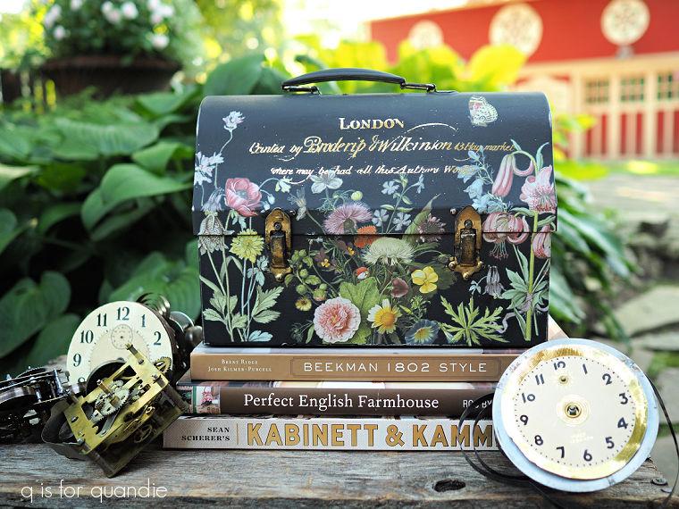
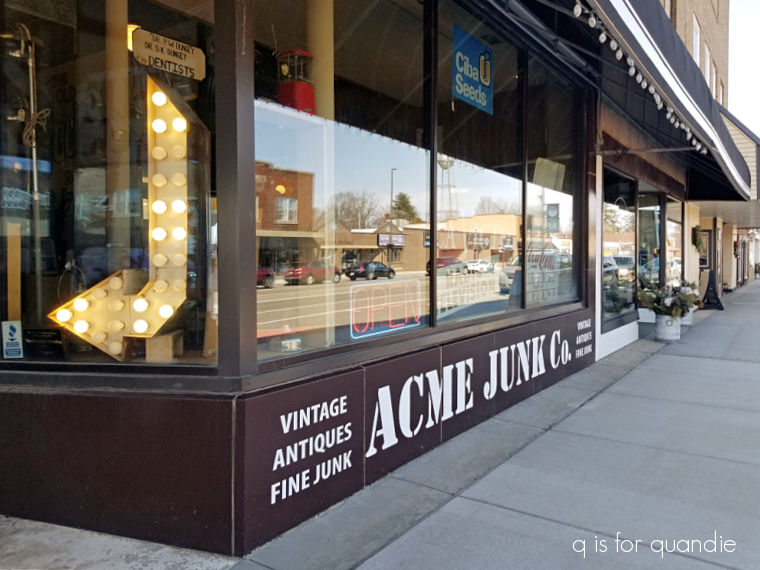
To avoid suffering from serious garage sale withdrawal, my friend opK and I headed out to do some thrifting last week.

We stopped at a couple of Goodwill stores, where we found precisely nothing.  Why has Goodwill gotten so bad these days?  It seems like even when you do find something interesting, it’s priced too high to consider.

But we also stopped at a Habitat for Humanity ReStore and that’s where I found a windfall of toolboxes.

You may remember that back in May of last year my friend Kathy gave me an entire trunk full of metal boxes, so I decided that the collective noun for them must be ‘windfall’, you know, like a murder of crows or a school of fish.

Well, OK, this windfall of boxes wasn’t quite as big a score as that pile from Kathy, but it was pretty good for a frigid day in January.

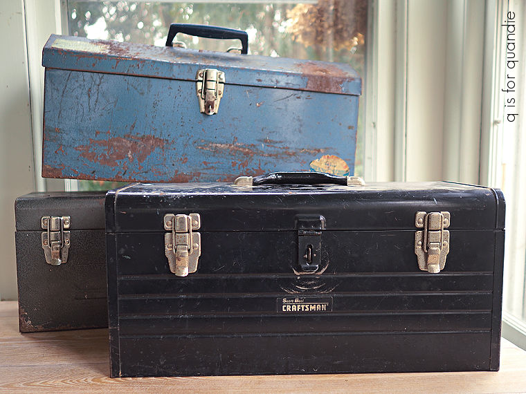
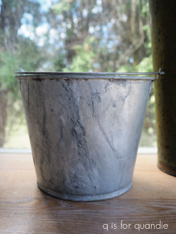
I was quite happy to come across these because I’m down to only having smaller tackle boxes and lock boxes in my stash.  I’ve been wishing I had some larger toolboxes to work with, and now I do.

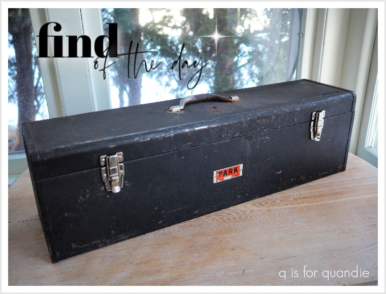
The blue one is probably in the worst shape.

It has quite a bit of rust both inside and out.  But I love the shape of it.

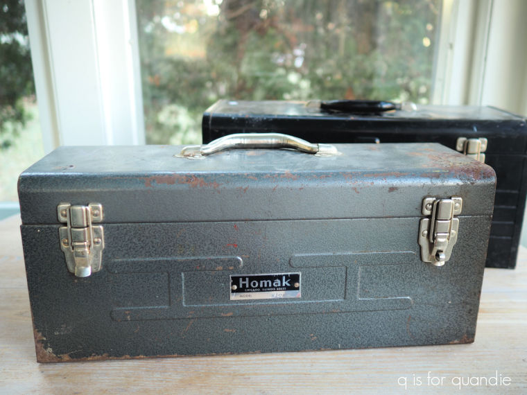
The Homak toolbox is in slightly better shape, and I like the metal handle (v. the plastic one on the blue toolbox).

Both of those were only $5, so right in my price range.

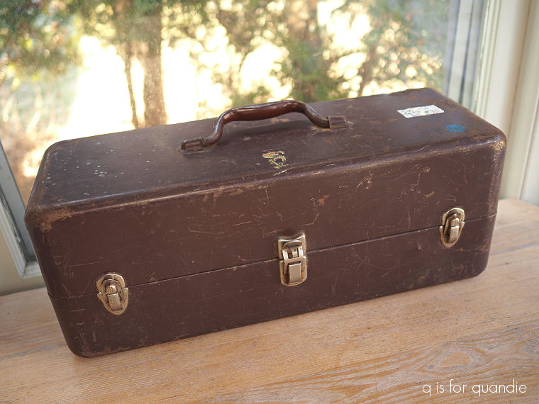
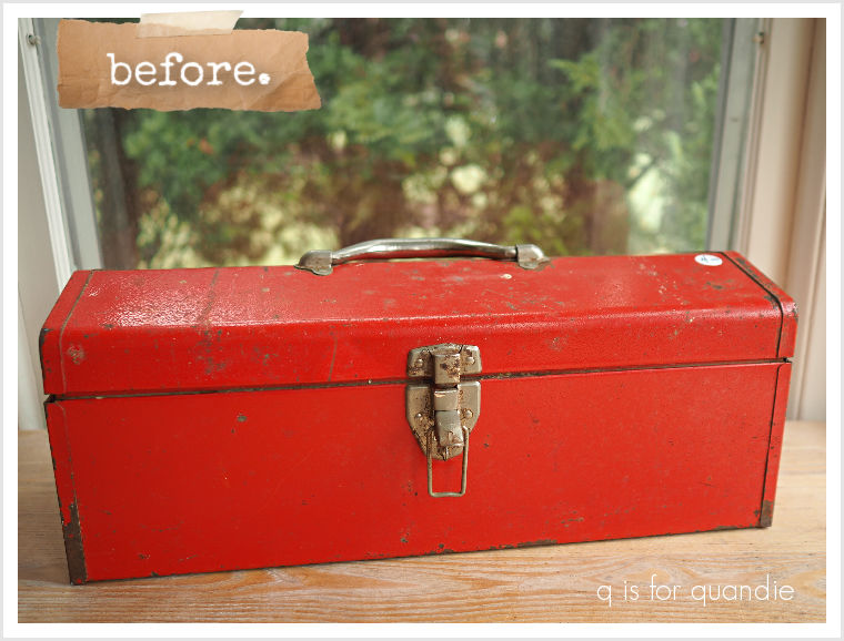
I generally like to pay $10 or less for my toolboxes, but I splurged on this last one at $15.

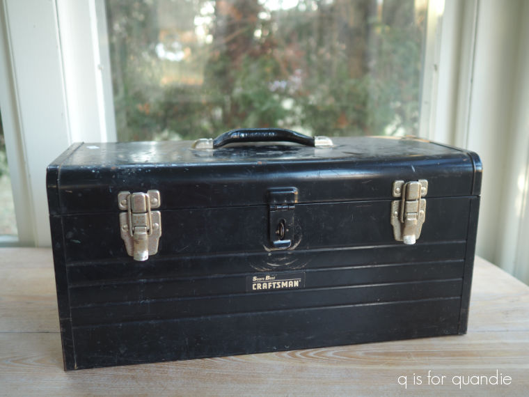
If my friend Neal is reading this post, he’s probably cringing a little inside at the thought of me painting this one.  It’s a vintage Craftsman toolbox and he says there are serious collectors of these out there.  But I will be painting it (sorry Neal).

A few of you have commented in the past that you can’t seem to find toolboxes where you are, so maybe check out a ReStore if there is one near you.

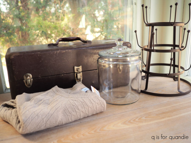
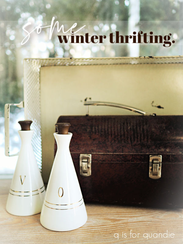
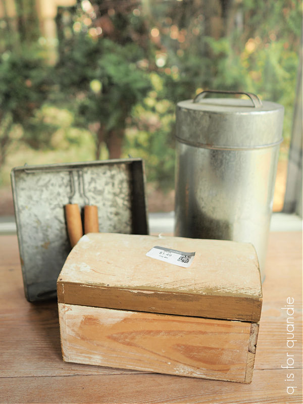
Aside from the toolboxes, I brought home just a few things from another thrift store we visited called Restored (not to be confused with the Habitat ReStore).

I grabbed this stool.

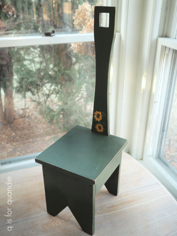
I definitely didn’t care for the 90’s country vibe, but I knew I could do something with it.  The sunflowers had to go, as did the forest green color.

After sanding off the sunflowers, and scuff sanding the rest of it, I gave it two coats of Dixie Belle’s Sawmill Gravy.  Then I went through my transfer stash and came across an old re.design with prima transfer, back when the I.O.D. sisters were designing for them.

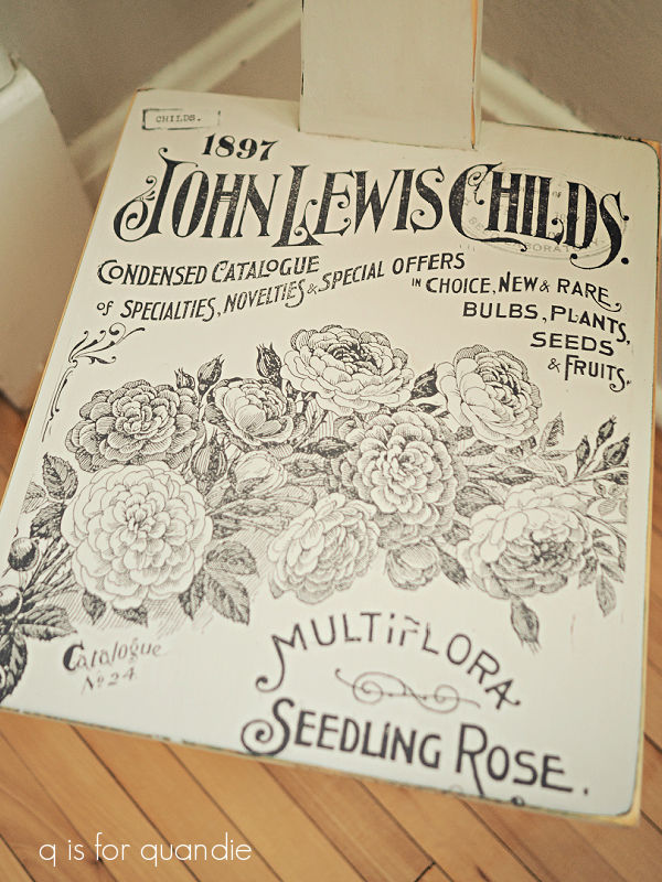
This transfer originally had a lined border around it, but that didn’t fit my stool quite right.  I trimmed that border off and then did just a little re-arranging of some elements so that it would fit.

Once the transfer was applied, I sanded the edges to distress and then added a coat of Dixie Belle’s Big Mama’s Butta to protect the finish.

I couldn’t pass up this coat rack made from a drawer front from an old spoon carved dresser from the thrift shop either.  The price was right, the bones were good, so I just needed to give it a little bit of an update.

After removing the hooks, I scuff sanded the surface and then added two coats of Sawmill Gravy.

I went back to the old stash of transfers again and found some bits and pieces of the long retired Seeds transfer (also an old redesign with prima transfer).

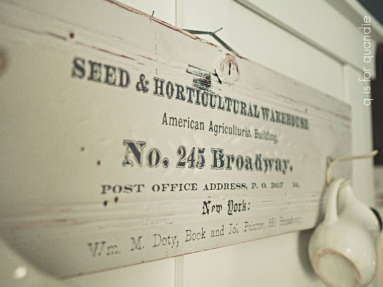
This transfer hadn’t held up well in storage, so I had to discard some sections and then cobble together just the bits that were still usable.  But it worked out perfectly for this drawer front.  It always feels good to use up something that has been in the stash for a while, doesn’t it?

After applying the transfer, I added a topcoat of clear wax and then just added back two of the original 4 hooks.

Today’s q tip:  transfers deteriorate over time, especially if they are not in a sealed package.  They will dry out and either come loose from the transfer sheet (which is what happened here), or they will just become less sticky and more difficult to apply.  These older transfers came in a flimsy box rather than a tube or as a flat sheet like they do now and those boxes really allowed them to dry out.

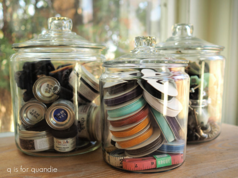
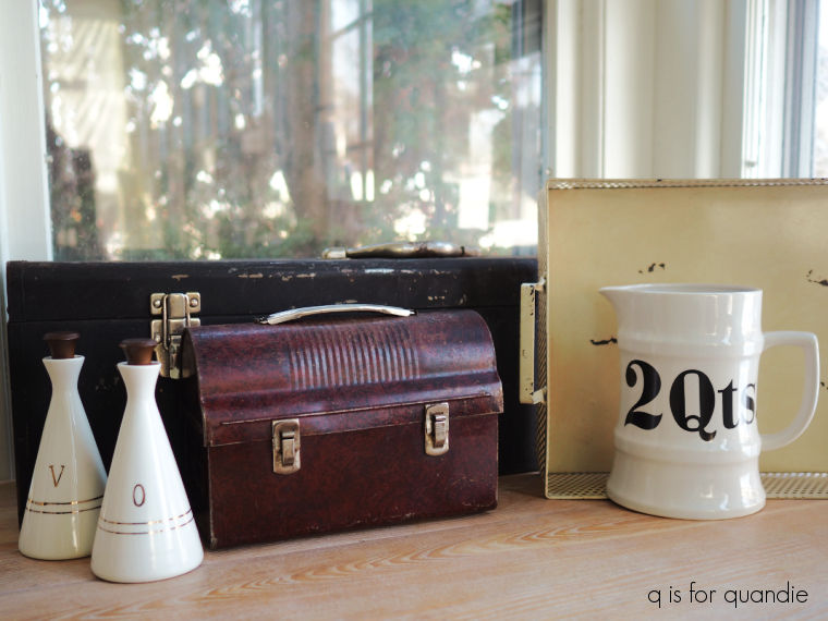
I also purchased a handful of smaller items while thrifting over the last couple of weeks.

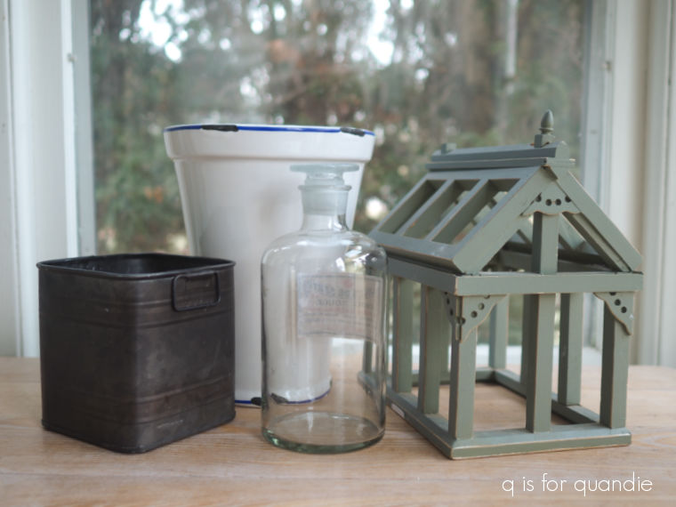
I’ve given most of them a makeover already.

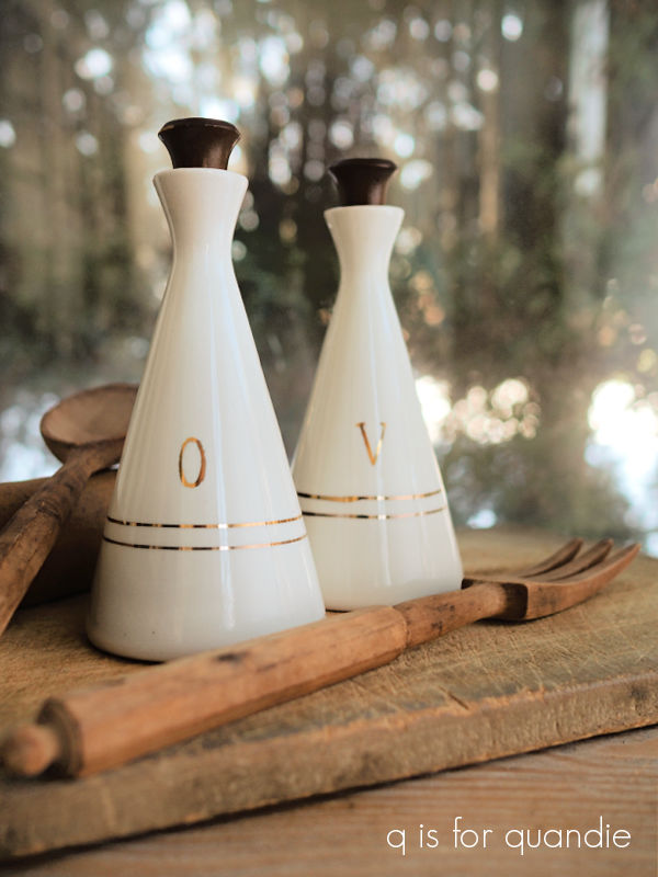
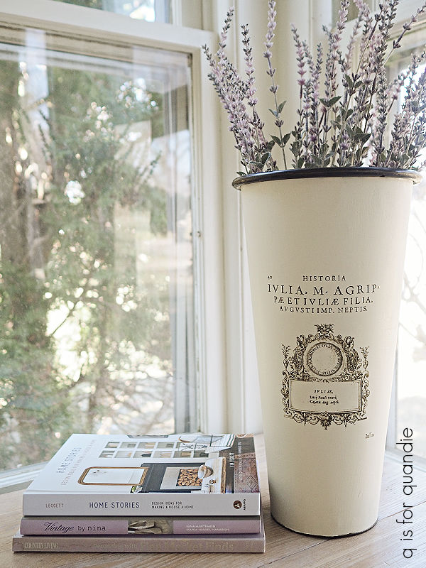
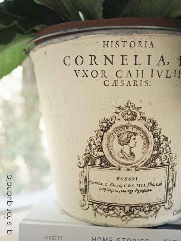
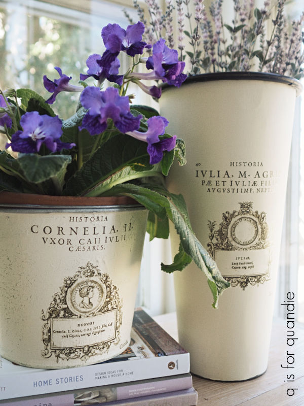
I simply added one of the I.O.D. Traditional Pots transfers to the tall white pot.

That transfer set comes with white, black and blue transfers.  This is one of the blue ones.  I love adding the blue ones whenever I find a pot with a blue edge like this one.

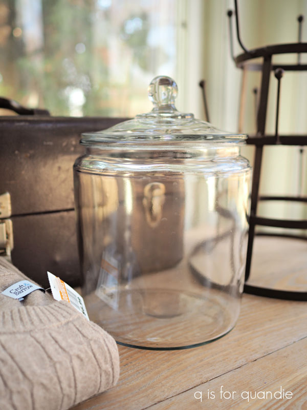
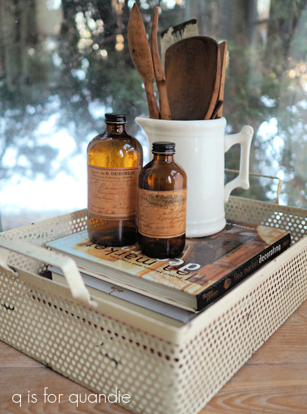
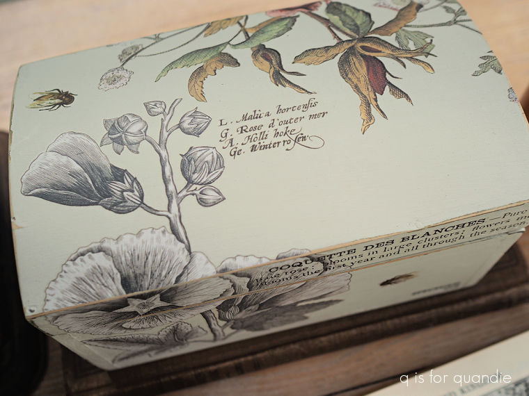
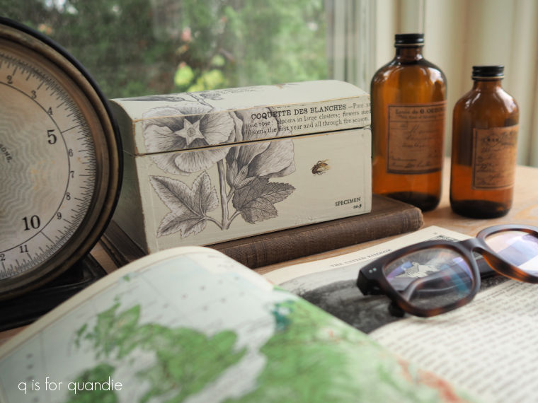
The glass jar came with a kind of blah label (sorry, I didn’t get a photo of it), so I soaked it off and added a different label.

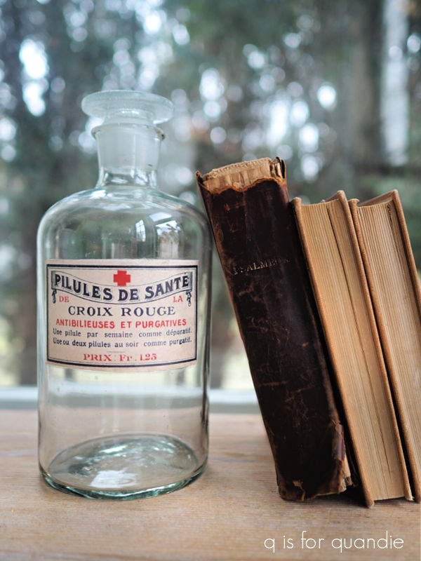
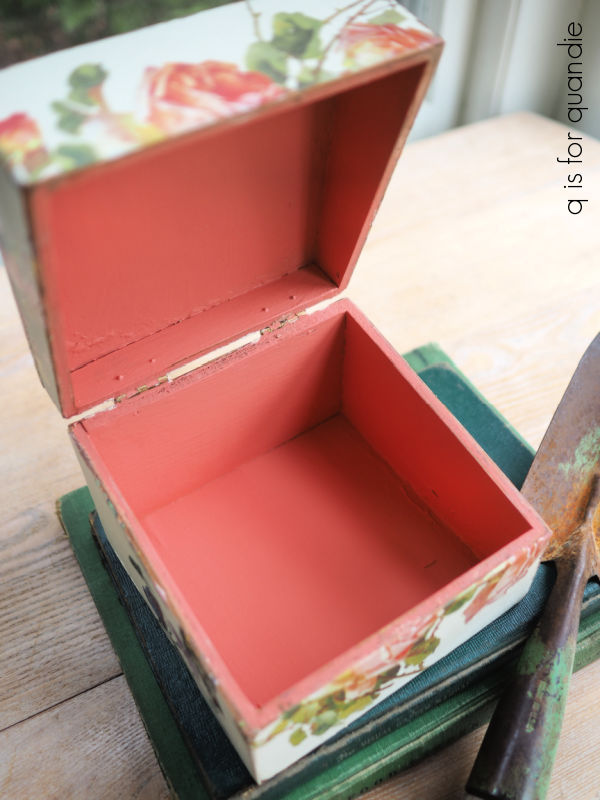
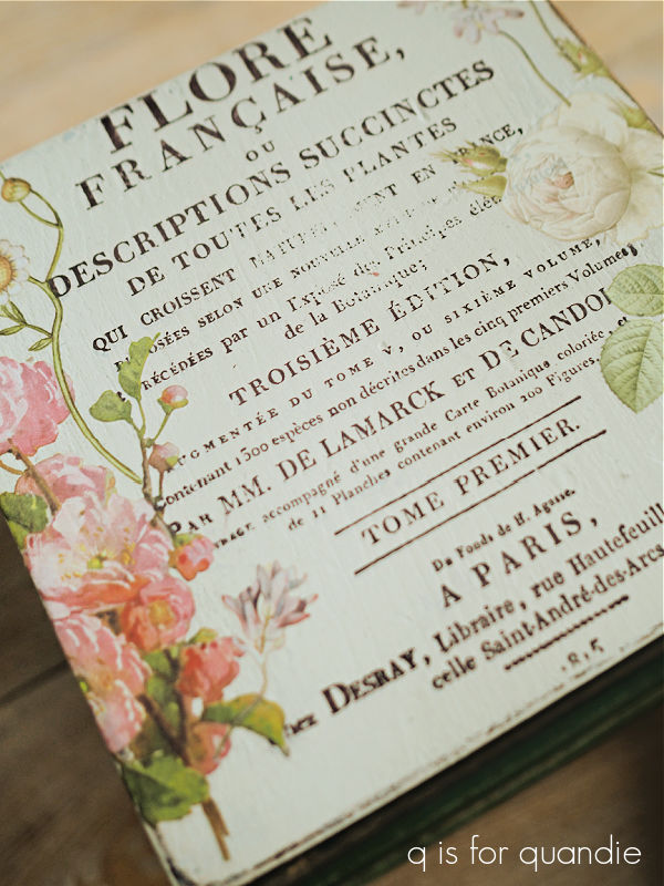
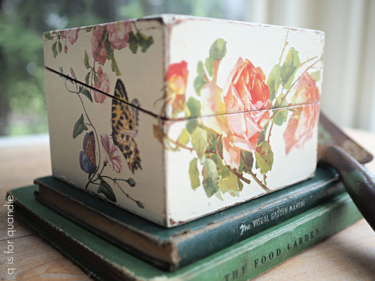
Well, technically that is not a label.  It’s from the Roycycled Label Masterboard decoupage paper.

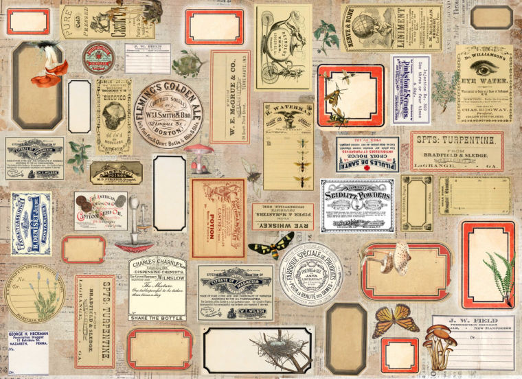
I don’t do a lot of decoupage projects, but this paper was just too good to pass up.  Look at all of those fabulous labels.  I also put one of the labels on a bottle that I had on hand.

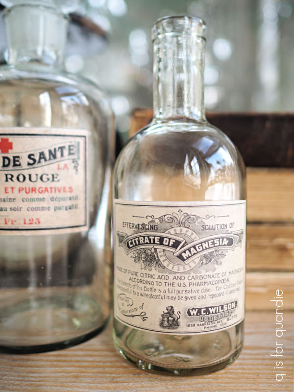
And then I put one on the square metal container from the thrift pile.

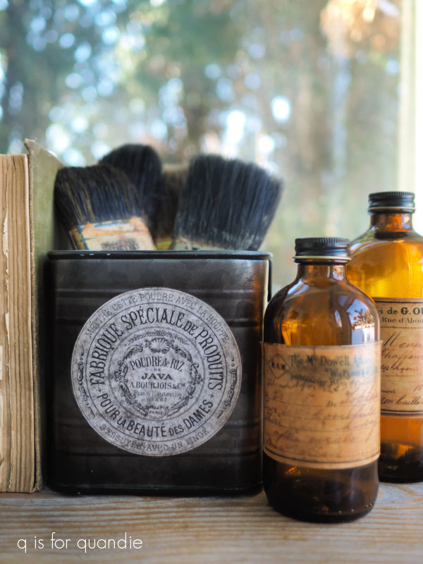
Unfortunately, I forgot to take into account the slightly transparent quality of the decoupage paper.  In hindsight I probably should have painted that container first.  What do you think?

The last item remaining from thrifting is this little ‘greenhouse’.

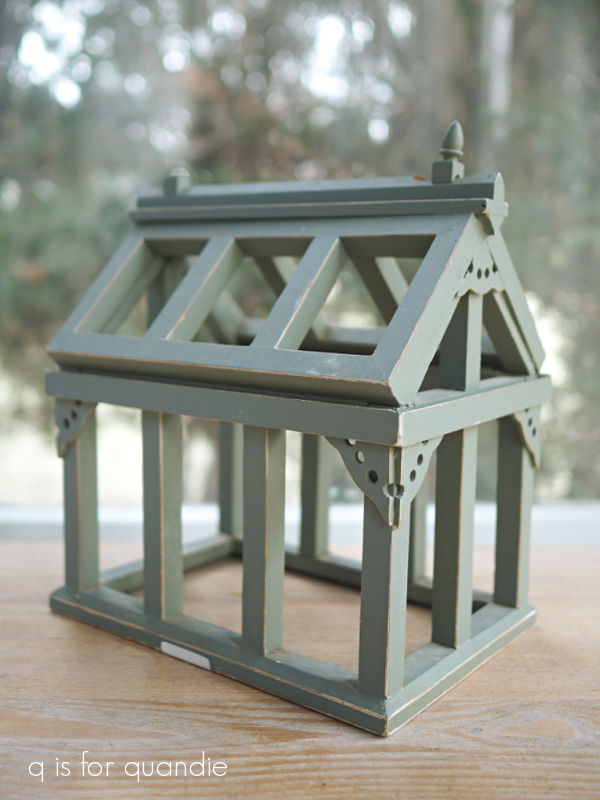
I plan to paint it, and will probably add wording of some kind to it, but first I have to deal with the broken finial (one finial is intact, one is broken off).  I need to find a replacement for that, so we’ll have to come back to that one.

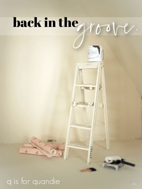
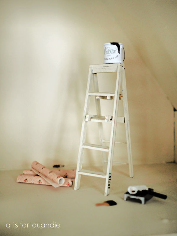
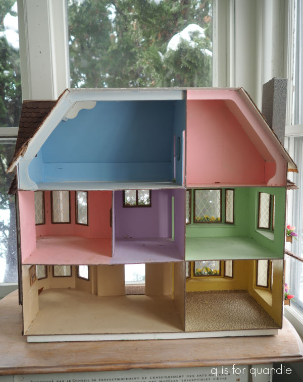
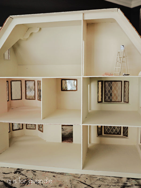
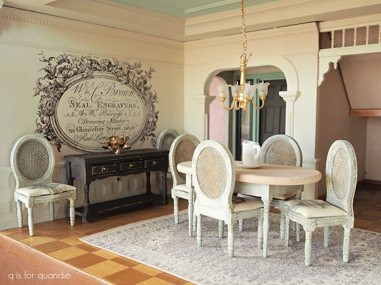
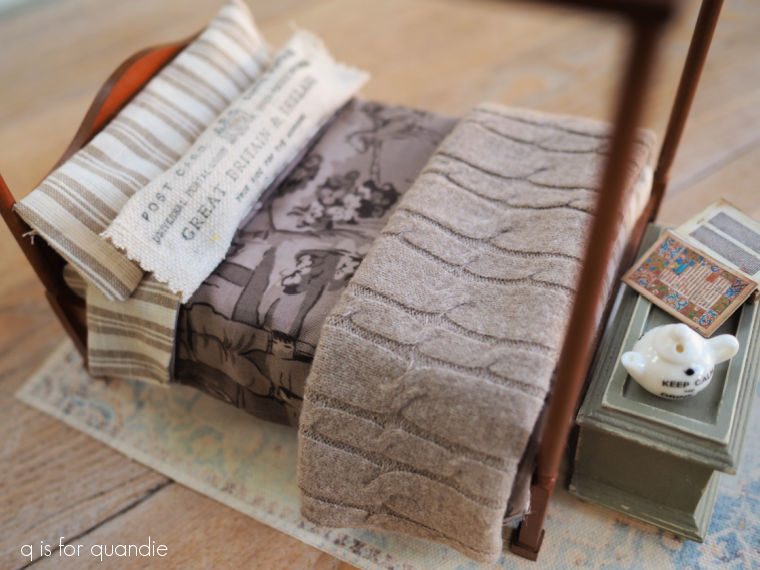
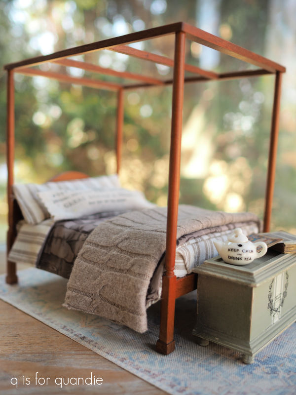
Meanwhile I need to get back to my dollhouse project.  It’s taking up all of the space on my workbench (a.k.a. my baby grand piano), which makes it difficult to do other things … like paint toolboxes!

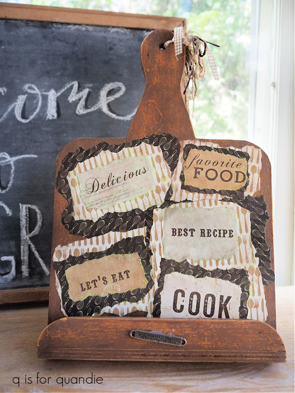
Here’s a sneak peek at the room that’s coming up next week.

So be sure to stay tuned!

the day for metals.

My friend opK and I hit the thrift shops last week and I came home with a nice little pile of things to makeover.

I’m always looking for wooden items to paint, but somehow I ended up with mostly metal items this time around starting with this trash can.

This is made out of heavy duty galvanized metal, the foot petal still works perfectly and it just needs a good cleaning.  I did a quick online search and found this exact trash can for sale on Wayfair for $81.99.  But I’m wondering, should I paint mine?  The one on Wayfair almost looks like it has a bit of a wash over the metal …

and I also see some rusty spots.  What do you think, leave a comment and let me know, add a wash or leave it alone?

Next up is this little group of items.

The little bird on a cage is already perfectly rusty and fabulous, and he’s going to fit on the urn in the front.  But first I’m going to rusty up that urn with some of the Dixie Belle Patina paint.  In fact, I’m going to rusty up all three of those other items.

Next up are a couple of buckets.

The tall one was a simple makeover.  After cleaning it up, I gave it a couple of coats of Dixie Belle’s Drop Cloth and then added an I.O.D. transfer from the Brocante set.

It already had a nice black rolled rim, and I’ve painted a couple of similar pieces in the past that ended up looking like enamelware.

As for the smaller bucket, it had some strange textural flaws.

I don’t know what that is, but I couldn’t sand it down so I decided to just work with it.  I mixed some of Dixie Belle’s Sea Spray texture additive with some of their Dried Sage paint and then stippled it onto the bucket with a chip brush.

Once dry I sanded it lightly to knock back some of the peaks.  Then I added a coat of Drop Cloth over it, and once dry, sanded again.  Finally I added another of the Brocante transfers.

Now that it has an overall texture, the drippy looking clumps don’t stand out at all.

I love the end result on both buckets.

I did manage to find a couple of non-metal items while out thrifting that day.

I’ll admit that I was a bit hesitant about the chalkboard.  I think the chalkboard phase might be over.  But it’s one of those more authentic vintage chalkboards with a little wooden rail to hold the chalk.

So I thought I’d take a chance on it.

After giving it a good cleaning, I refreshed the wooden frame with some brown wax and then I simply added a little different wording to it.

Now we’ll see whether or not it sells.

As for the other item, it’s a cookbook holder.

Someone had decoupaged it to within an inch of its life.  That’s three layers of torn paper, all decoupaged into place.  It took me forever to get those off.  It involved lots of soaking with water, scraping with a razor blade and finally some sanding.

I wanted to give it a far more subtle look so after painting it with Dixie Belle’s Dried Sage, I simply added a paint inlay from the I.O.D. Melange set.

Those artichokes seemed like the right touch for a cookbook holder.

While opK and I were heading from one thrift store to another, she spotted an estate sale sign so we hit the brakes to check it out.  It ended up being the estate of some serious antique collectors.  They had collections of antique crocks and stoneware jugs, old glass bottles, vintage soda pop bottles, and interestingly enough, mortar and pestle sets.  I bet there were at least 20 or more of those.

As can often be the case at professionally run estate sales, most of the prices were too high for me.  But I did come home with a couple of things.

I couldn’t resist the little enamelware pot.  It was $18, so a little steep for me but not outrageous.

After washing it up, I decided to add an I.O.D. transfer to it.

I’m sure that antique purists will be horrified by that.  But the transfer could be easily removed down the road when I get tired of it, or if I eventually sell it on to someone who doesn’t like it.

But for now I’m planning to keep this little pot and use it as a vase.  And I think that transfer made it just a little more special.

As for the other items, they are hose guards.  At least I’m fairly sure that’s what they are.

If you aren’t familiar with hose guards, you put them at the edge of a garden bed to prevent your garden hose from dragging through the plants.  I purchased some plastic hose guards last summer and they didn’t even last through one season.

These are super heavy, maybe cast iron?  I’m not sure what material they are made out of, but I think they’ll be far superior to the plastic ones.  And at only $5 for all 5 of them, they were definitely a bargain.

So overall it was a successful day of thrifting.  Which of my finds is your favorite?  And what about that trash can, would you add a wash?  Leave a comment and let me know.

champagne taste on a beer budget.

I went to a fantastic vintage sale recently with my friend opK (it was Haupt Antiek Market for any of you locals who may be familiar).  They had several really lovely, and authentic, French blue enamelware pitchers.  At $98 each, they were a bit out of my price range though.

However, when I got back home I remembered that last summer a good friend of Mr. Q’s offered me a trio of metal French style pitchers.

Unfortunately, they weren’t the authentic French enamelware kind.  But even though these are inexpensive knock-offs, I thought it would be fun to try to give them an authentic look using paint.

The first pitcher to get a makeover was this one.

I initially planned to give this one a rusty look with the Dixie Belle Patina paint.  So after cleaning it and then giving it a base coat of Dixie Belle’s Midnight Sky chalk paint, I gave it the rusty treatment using their Iron paint and Green spray (for full instructions on this process, check out this how-to post).

While it did turn out exactly as expected, it feels a bit boring to me (more on that in a minute).

I then moved on to the next pitcher.

After cleaning, I gave it two coats of Dixie Belle’s Drop Cloth.  Then I added a transfer from the I.O.D. Brocante collection.

I then gave it a spotty rust treatment.

I’d recently seen a YouTube video by The Provincial Farmhouse where she used the Dixie Belle Iron paint and Green activator spray to add some rust to a metal tray that she was painting to look like faux enamelware.  So I decided to give that a go on this pitcher.

Basically I just dabbed some of the Iron paint onto my pitcher here and there and then used a brush to dab the spray over the wet Iron paint (spraying it wouldn’t have given me enough control).

Over time that rust will continue to develop and look more authentic.

I love the sense of age that this added to what otherwise looked like a rather freshly painted pitcher.

After being inspired by those authentic French pitchers at Haupt Antiek Market, I pulled out the Miss Mustard Seed milk paint in French Enamel for the third pitcher.

It had a very shiny factory paint job both inside and out, so after giving it a good cleaning, I painted it with a base coat of Dixie Belle’s Dried Sage.  I knew the milk paint wouldn’t stick to that shiny original paint.  The chalk paint will adhere nicely to it though, and the milk paint will adhere nicely to the chalk paint.

Once I had the French Enamel paint on, I gave this one some spotty rust as well.

And as you can see in that photo, I did get a few small chippy spots.

I added a topcoat of Dixie Belle’s clear wax to this one.

I loved the end result, and I especially loved the French Enamel color, so I brought my somewhat boring rusty pitcher back out and painted over the rust with the rest of my already mixed milk paint.

I noticed that the milk paint was getting a little chippy, and then I remembered that I had added a dark wax to a couple of spots on this pitcher.

So those waxed spots were resisting the milk paint, while it adhered fairly well in the non-waxed areas.

I wanted to preserve that chippy look but still prevent more paint from flaking off, so I gave the pitcher a quick spray with some Rust-Oleum matte spray sealer.  Once that was dry, I followed it up with another two coats of Dixie Belle’s flat clear coat.

And with that, all three pitchers have been transformed.

Now, I fully realize that none of these are going to pass as authentic French enamelware.  But rather than a price tag of $98, I’ll probably mark mine somewhere in the $18 range instead.  So for those of us with champagne taste on a beer budget, these would probably do just fine.

What do you think?

the barn makeover.

You’ll remember the mini barn that I purchased at my local Goodwill.

It was missing a bit of trim, and a section of wall between the two doors, so I sent it over to Ken’s workshop for some repairs.

He replaced that section of wall, the trim on six of the windows, and one of the little door latches …

and he also added a little trim to the loft opening.

Next up I gave the entire barn a scuff sanding, and after wiping it down I gave it two coats of Dixie Belle’s B.O.S.S. in grey.  I didn’t really need to block any stains, but I thought it would be easier to cover that red and green if I had a grey primer down first.

In hindsight, I wish I had painted the entire barn in a dark color such as DB’s Coffee Bean first so that I could have distressed my final paint back to the darker color.  In the end, I could see both the grey B.O.S.S. and the green when I later attempted to distress the roof.  Rookie mistake.

Next up I painted the roof and the interior of the barn in Dixie Belle’s Dried Sage, and the exterior walls in their Drop Cloth.  It still took two coats of paint to cover the grey primer, so again, I would have been just as well off with a darker paint.  Once my paint was dry, I experimented with some different colors on the window trim.  I tried a bright white (DB’s Fluff) first, which was distinguishable from the Drop Cloth, but I didn’t like it.  I tried Coffee Bean, but I didn’t like that either.  I even considered just painting them with the Drop Cloth, but ultimately I decided to go with the Dried Sage.

After a bit of sanding to distress them, I think they look good.

Next up I pulled out Dixie Belle’s Farmhouse silkscreen stencils

I especially thought the Fresh Eggs one would be perfect on the side of the barn.

I cut up the one with the chicken and just used the typography on both the other side …

and the front of the barn.

Once all of my paint was dry, I gave everything a coat of Dixie Belle’s clear wax.

And that brings me to the lights.

As I was working on this project I kept thinking how fun it would be to have some barn lights over the doors.  So I went on Etsy just to see what was available out there.  I ended up finding the perfect lights at Miniature Crush (although I ordered them through Etsy, you can also order items directly from Miniature Crush, and as a bonus for me, they are also located in Minnesota).

They came in a matte black color that was rather one dimensional though.

I wanted them to look galvanized so I pulled out some of Dixie Belle’s Gilding Wax.  I started with the Zinc, but it was too dark and barely showed up over the black.  So then I tried the Silver, which looked pretty good but was maybe just a bit too bright.  I went back and added a bit of the Zinc over the Silver, and I still didn’t love it.

It doesn’t quite look authentic to me.

So then I pulled out the Dixie Belle Patina Paint in Copper, along with the Green activating spray.  I first removed as much of the Gilding Wax as I could with a q tip dipped in mineral spirits.  Then I painted over the lights with the Copper paint, and followed that up by dabbing the activating spray over the wet paint using a small brush.

Eureka!  So much better.  The totally look legit now.

One quick note about these lights.  They are battery operated, and they have a little switch on the side to turn them on and off.

To get to the battery (which is replaceable) you have to screw off the back part of the base.  So you can’t really glue these lights in place permanently.  Instead they come with a tiny adhesive magnet on the back.  You apply the adhesive side of the magnet to your item, then the light fixture hangs onto the magnet.  Here’s the thing, that means they come away pretty easily.  And that makes this item unsafe for small children who could pull them off and choke on them.  So they would have to be removed if you wanted this to be a child’s toy.

In addition, the lights were $19.99 each!  So now I have an additional $40 invested in this makeover.  I’m not sure that was a wise decision, especially since I plan to try and sell this one.

But all of that being said, I sure do love how they look!  And maybe someone else will as well.

I initially thought I would stop here, but then I was at Hobby Lobby and I came across a miniature weathervane.

And at only $2.99, it was so much cheaper than the lights!  So how could I resist?

I gave it the same treatment as the lights using the Copper patina paint.

The verdigris patina develops pretty quickly with the Copper paint.  And doesn’t the weathervane also look so much more authentic now?

I had to drill a hole in the roof of the barn to attach it, but that was fairly simple.

And with that, my barn makeover is complete.

How cute is that?  I much prefer my toned down neutrals to the red and green.

What do you think?

If any of you locals just can’t resist adding this adorable barn to your decor, check out my ‘available for local sale‘ page for more details.

I bought the farm.

I’m not gonna lie people, my creative well has gone a bit dry lately.  I’m still struggling with tooth extraction pain, and it took a while to get over the cold I brought home from Florida.  OK, I haven’t exactly ‘bought the farm’, but I definitely haven’t felt very creative lately.

In addition, I’m heading out of town again tomorrow, this time on a solo trip to visit my mom.  So it seemed like a the wrong time to get started on any sort of more complicated project.

I did manage to get out for some thrifting with my friend opK earlier in the week though.  I didn’t find much, but I thought I’d share my very meager haul with you guys.

We started out at a Goodwill where I made just two purchases.  First up, this amber bottle.

I brought it home, gave it a good wash and then added that faux French apothecary label.

I did some similar amber apothecary bottles in February last year …

and I thought they turned out quite nicely, so I tried it again.  I shared the source for printing those labels back in that post, so you can find that there if you’re looking for it.

The labels are easy to apply with some Mod Podge.

Since I already had the Mod Podge out and some labels printed, I decided to add labels to a couple of other jars I already had on hand.

I’ve had that pair of jars for ages and they originally had a much more faux looking paper label on them.  I soaked those labels off to replace them, and these are so much better.

These jars have the cutest little galvanized lids.

I also found this dollhouse barn at the Goodwill.

It needs a little TLC, but I couldn’t help but be reminded of the dollhouse that I fixed up back in December.

That was such a fun project to work on, so I’m thinking this one will be more of the same.

Here’s the other side …

I had to laugh when I brought it up to the register and the clerk said “oh, I see you’ve bought the farm!”  LOL.

Anyway, the barn has already gone over to Ken’s workshop for a few repairs.  I’m looking forward to giving it a fresh look.

We headed to a spot that was new to me next, the St. Vincent de Paul Thrift Store in St. Paul.

By the way, can I just point out that it was a beautiful sunny day and the sidewalks were completely clear of snow and ice on the sunny side of the street.  This is not the norm for Minnesota in February, but I’m loving it!

Unfortunately, I think their sidewalk sign was a bit of false advertising.

I didn’t find any hot deals.  However, as we were waiting in line for opK to make some purchases I saw a shoebox full of old photos so I started flipping through them and this one caught my eye.

Just look at those stern faces!  These guys were very serious about their sport.

The basketball … wait … is that a basketball?  I guess I’m not 100% sure about that.  Is there some other sport played with a ball that looks like that?  Or is that what basketballs looked like in 1929?

Well, whatever it is, it says “E.F. HS 28 – 29” on the ball.  There are no markings on the back of the photo, so that’s my only clue.  So the age of the photo is obvious, but no idea where it was taken.

The photos were priced at a mere 15 cents each, so I thought I really should take it home with me.

I really have no plans for its ultimate fate, but for now I’ll just enjoy displaying it somewhere.

And that’s it.  I only purchased three things.  I’m really looking forward to garage sale season because I am not finding much at the thrift stores these days!

As I mentioned, I’m headed off to my mom’s tomorrow.  She has a to-do list all ready to go for me.  So far I’m doing her taxes, cleaning out her fridge and her closets, and replanting some of her pots on the patio.  I’m looking forward to just spending some time with her though, and maybe enjoying some sunshine and warm weather.  Once again I don’t have any blog posts planned during my absence, but hopefully I’ll be ready to get busy on some creative projects when I get back home again!