
Mr. Q and I have lived in our house for a little over 35 years. That’s a long time, I know.
When we first bought it in 1988 we considered it a ‘starter home’ and planned to build equity for a few years and then move on to something bigger and better.
Instead, we fell in love with this house, despite the really drafty windows, the treacherous basement stairs and the world’s smallest bathroom. Even now I can’t imagine how we’ll ever be able to sell this house, whenever it comes to that.
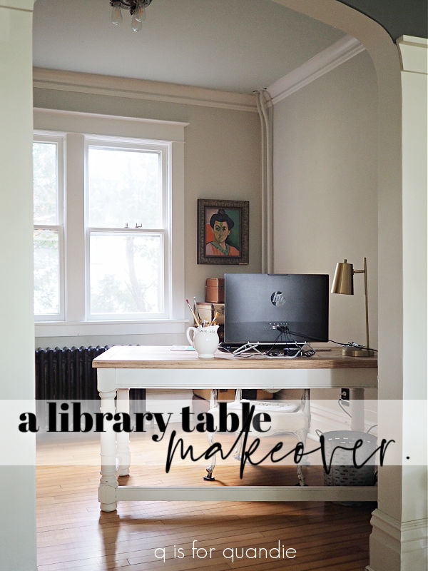
But I digress, this post is actually about making over the q branch, which is what I call my study … or the room where I write this blog. I only brought up how long we’ve been in this house to explain why this will be the 5th time I’ve painted this room!
Let’s review, shall we?
First, let me back up for a minute and describe the room. It is a small, square-ish room that is just off the piano room … or what was originally the formal dining room. It doesn’t have a closet, and it doesn’t have a door. It has a wide arched opening into the piano room.

I often wonder what the original purpose of the room was back in 1904 when our house was built. It may have had a regular door back then, I’m fairly sure that the wide, arched openings between this room, the piano room, the living room and the front hall are not original. And in fact, we added the one between the kitchen and the piano room. So it’s possible this room was intended to be a small, main floor bedroom for someone who couldn’t do the stairs … an elderly parent perhaps? I’ve also often wondered if it was originally a small kitchen of some kind, before the house had indoor plumbing.
Regardless of its original purpose, I struggled for years to create an identity for the room.
The first use we came up with was as a space to display my dollhouse. My dad made the dollhouse for me when he retired early, and I sure can understand why he made it so elaborate now that I’m also retired! He had some time on his hands.
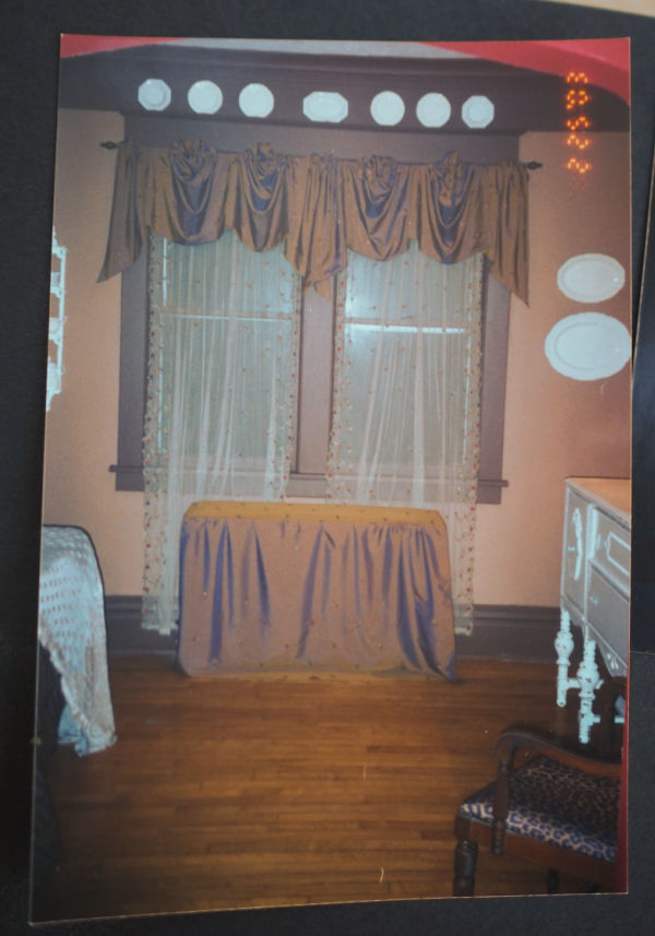
I papered the room in a mauve and cream pinstripe paper, and painted all of the trim in a matching dark mauve. Here’s the only photo I could find from that look.

Ugh! I can’t believe I once liked that look! Remember balloon shades? LOL, what can I say? It was the 90’s.
Next I went through my ‘red phase’. I painted the living room and piano room walls red. That definitely didn’t work with the mauve, or with the big pink dollhouse. So the dollhouse got moved upstairs and then …for some unknow reason I decided to paint the room brown! Can you imagine? Brown?!
Well, you don’t have to imagine, here’s a really bad quality photo …
Yikes! Not much better than the mauve.
The room still didn’t have an identity at that point and we never actually used it for anything.
But then I decided that I needed a home office/craft room and the room underwent makeover number 3. I painted the walls chartreuse, and the trim went back to white.

Yep, bright green walls with black furniture. I loved it for a while, until I didn’t anymore.
The next transformation was when the q branch’s identity became fully formed. I once again painted the walls, this time in what I thought was a neutral greige, but was really more just plain beige, and I painted the ceiling a very pale blue.

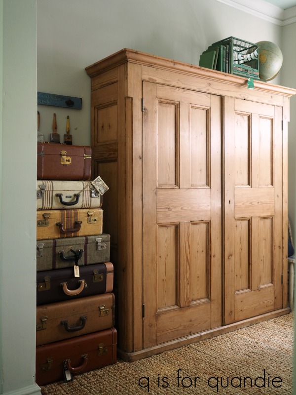
That was back in 2015. Since then I’d made a few changes to the furniture, bringing in my English cupboard …
and most recently, changing out my desk.
I have to say, I never really loved that wall color. I often admire the all-white, pale neutral sort of look in other people’s spaces, it can work well if there are a variety of shades ranging from pale greige to creamy white, and a variety of textures. But somehow it never quite works for me.
So after 9 years of that look, it was time to change it up again.
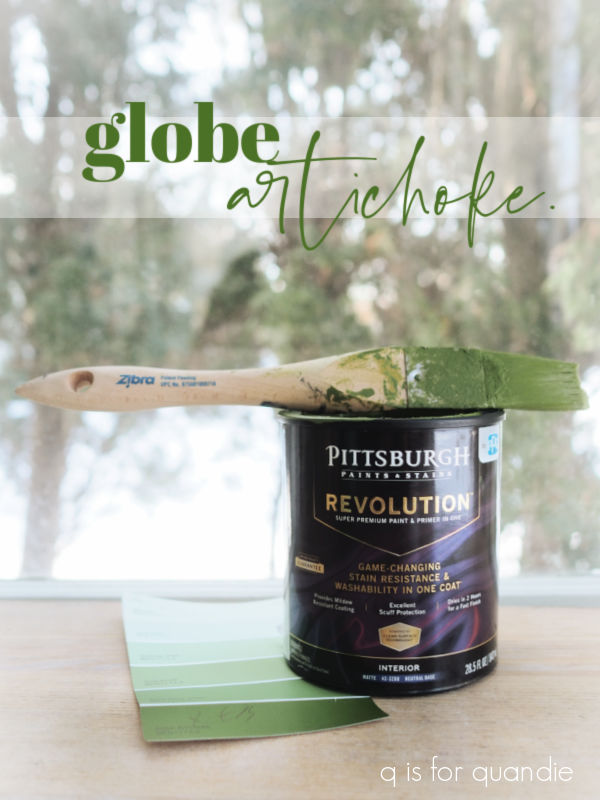
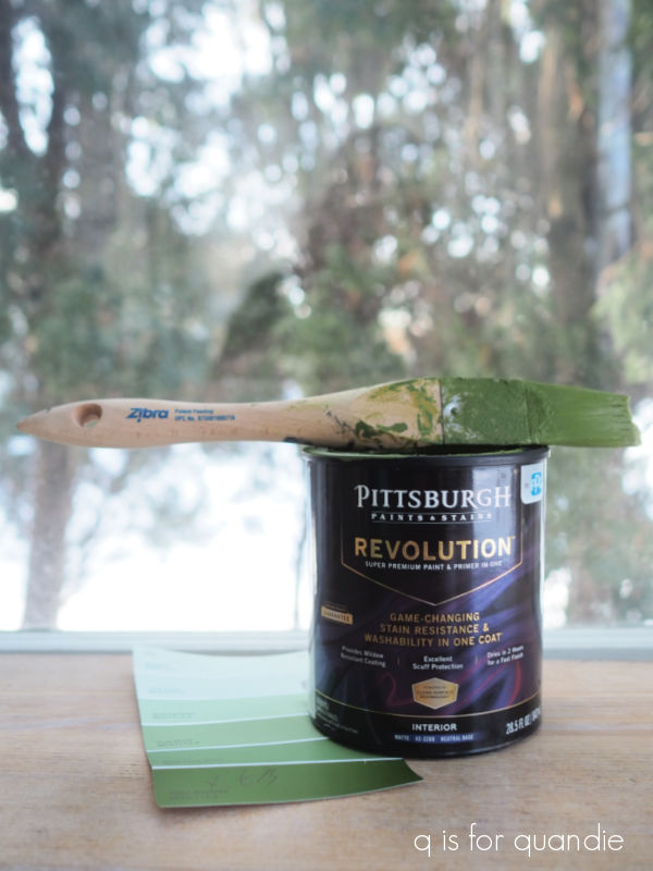
The first step was to pick a new wall color. I’d been drooling over dramatic shades of dark green over on pinterest, so I went to Home Depot and looked through the paint colors. I picked out a color called Alfalfa Extract, it looked perfect.

So I had them mix up a color sample jar for me and I brought it home.
I painted up a Sure Swatch paintable test swatch and put it on the wall. Then I studied it under different lighting conditions. That was when I realized that the room is pretty dark. It has west facing windows, but there is a tall arborvitae hedge just a few feet from the windows. It’s great for providing privacy, but it also blocks a lot of light.
The color that looked perfect in the brightly lit store was too dark for this room. Even after waiting almost a week for a bright sunny day to light it up, it was still too dark.
So then I went to Menards and picked up a couple more options. The first of these was so close to the Alfalfa Extract that I didn’t even bother to put up the swatch, but the 2nd was a bit lighter and also a bit more olive.

When I first painted up the Sure Swatch with Globe Artichoke I thought for sure that it was not going to be the right color. It was too light, and way more olive than I thought I wanted. But I painted the swatch in the piano room, which gets a lot more light. When I put the swatch on the wall in the q branch (these swatches have a post-it note like stickiness on the back), I realized that it was exactly what I was looking for.
The moral of my story? You really need to test paint colors in the room you’ll be using them in before making a decision. If I have learned anything after painting, and re-painting, the rooms in our house for 35 years, this is it. So many factors can influence how a color looks on your walls; natural light, artificial lighting, floor color, and/or ceiling color.
So once my color was chosen, I spent a couple of days last week painting the walls of the q branch in Globe Artichoke.

And I love it! The pine cupboard really pops against the rich deep olive, as does my desk.

You may have noticed that I did not paint the radiator pipes that go up the wall in the corner behind the desk. That’s because the temps were below zero outside, so those pipes were too hot to paint. Ditto behind the radiator itself. I’ll have to save those areas for warmer days, and that may be sooner than I thought since they are predicting temps in the 40’s for next week.
I also think I’m going to want to repaint the ceiling now. The pale blue isn’t quite right with the green, I think it needs to go back to white. I am on the hunt for a new desk lamp (I think the current one is too small), a possibly a new chair and/or rug. I also want to find some olive green throw pillows for the living room sofa so that I can tie in a bit of this wall color out there too.
One last thing for today, I wanted to mention that I did all of the cutting in along both the crown molding and baseboard without any taping. I used the Zibra Triangle brush and it worked beautifully.
So if you have any rooms to paint, you might want to consider picking one up. I purchased mine at Home Depot. Now I just have to get it clean after all of that hard work!
OK, so I’m a little afraid to ask what you guys think of this color. I know dark walls aren’t for everyone, but I seem to be drawn to them. What do you think?

I LOVE the color Globe Artichoke! It looks rich & beautiful in that room! Love the cupboard, too! Wish you lived next door to me…we could paint up a storm together! I love all your beautiful toolboxes. You have such wonderful taste! Thanks for the ideas!
LikeLike
Thanks so much Marilyn!
LikeLike
PS…what brand of paint is ‘Globe Artichoke’?
LikeLike
It’s the Pittsburgh Paints that’s shown in my photo, and FYI it is no. MEN7173-6
LikeLike
I love the green you choose! I plan to repaint my kitchen/DR beadboard this year. It’s already sage green but I want to go darker.
LikeLike
I bet you’ll love it darker!
LikeLike
We just built a “modern farmhouse” out in the country and I chose Egret white by Sherman Williams for the entire house. It’s beautifully greige and the undertones change with the light throughout the day, sometimes warmer sometimes cool. All of the trim is Simply White (BM) I have a boatload of the Samplize neutral colors that I stuck to the walls and moved around the house. We have an abundance of natural light streaming in and I love my choices. Having said all of that, I think your darling little house is just perfect for whatever “dark” color you choose. Globe Artichoke has a lot of personality! Maybe consider trimming the hedge to let in additional natural light and it would look even more amazing! Enjoy your space and thanks for sharing your journey.
LikeLike
I’m sure I would love your house with all of that lovely bright light! As for the hedge, it’s a monster that really needs to be removed entirely. That’s going to be a huge job though, so it’s not high on the list.
LikeLike
I think the green is absolutely striking with the white woodwork. And I love your pine cupboard!
LikeLike
Thanks so much Cyndi!
LikeLike
Green of almost any shade is my favorite color. I love it and that pine cupboard against that green is perfection. Thanks for the walk down memory lane. I also had those balloon curtains 😂 what were we thinking?!?! Enjoy your “new” space.
LikeLike
LOL, I know, right? What were we thinking?
LikeLike
The balloon shades were all the rage thanks to Southern Living. We all had them somewhere in our home. I am glad the Farmhouse style is finally losing its appeal and we are going back to having more color in our lives.
LikeLike
I LOVE LOVE LOVE the color!! Beautiful job🙌🏻 and I love seeing the makeovers through the years-makes me feel better about mine-oh my word!!! I did brown once too!! And I painted a tiny bathroom dark red and PAINTED a RED plaid on that ceiling-T E R R I B L E😂😂😂😂
your room is perfection😍
LikeLike
LOL, but I bet you loved that red plaid ceiling at the time 🙂
LikeLike
I was prepared to not like, but LOVE it! The richness of the green is a perfect foil for the wood. Now I’m eyeing a deep brown red wall that worked in my craftsman stage….thanks for the inspiration!
LikeLike
You’re very welcome!
LikeLike
I loved the walk down memory lane! I had mauve stripes and flowers and a balloon shade at one point too! My worst was a yellow and blue very loud floral wallpaper in the kitchen. And a floor that was fake brick linoleum. Ahh the good old days. 🤣. But I do love the green. Seems very fresh and energizing.
LikeLike
LOL, it is funny to look back isn’t it?
LikeLike
I’m with Cherie… any shade of green and I’m in! I absolutely love the depth of color. Very updated. As for the balloon shades, I’m giving myself grace to love every design trend my house has undergone. We love those things at the time, then we move on. And it’s ok! I’m painting an accent wall in my living room green, but am going to go darker now because of this post. Thank you for the inspiration!
LikeLike
I’m glad I inspired you to go dark! I do love my dark walls, especially at night in the winter. It’s so cozy to have a lamp or two creating pools of light in a snug, warm space.
LikeLike
Love it!
LikeLike
Thanks Ruth!
LikeLike
I love your green walls! I didn’t think I was going to from the swatch but it looks fabulous and really makes the desk pop! Great choice. 😍
LikeLike
I really didn’t love the color on the swatch either, but once it was up on the walls in my space I loved it too!
LikeLike
I like the green. It looks good with your floors, can get and desk. What did you do with the beautiful empire desk you originally had?
LikeLike
The black one? I sold it. It wasn’t very comfortable for me because of that base (take another look at the photo). I was constantly trying to figure out where to put my feet!
LikeLike
Love the green!
LikeLike
Thanks Debra!
LikeLike
Love the green walls!! I’ve been thinking about changing some colors in my house and now I am sure a green must be the new color. I love the way it looks in the Q branch! Thanks for sharing the color history of the room too. I loved seeing the metamorphosis!
LikeLike
It has definitely gone through some changes over the years 😉
LikeLike
I love it! I wasn’t quite sure seeing the photo of the swatches but the finished room looks terrific. I agree that the ceiling would look better white. It was fun to see all the changes it has gone through. Thanks for sharing.
LikeLike
Yep, painting the ceiling is definitely going on the to-do list!
LikeLike
I admire your bravery to go bold (as I remain content with my safe neutrals). Thank you for showing us the many fun possibilities out there!!
LikeLike
Well, as they say, it’s only paint. One of the easiest, and least permanent ways to change up a room 🙂
LikeLike
I’m usually not a green fan, but it really works with your room!! It was interesting to see the prior colors you used. Remember the mauves and blues of the early 90’s? (I may have gotten started a little late) Not sure what I was thinking?? lol Paint is fun and the cheapest part of a remodel!!! 🙂
LikeLike
I totally remember those blues … and I also remember them paired with peach. Still not sure how Peach Fuzz got to be the 2024 Pantone color of the year. Yikes!
LikeLike
It looks really good in person. Especially with all the pictures you put on the wall.
LikeLiked by 1 person
Oh I love it!! I am seeing a lot of green in home dec…like a garden, you can never go wrong with green.
LikeLike
I totally agree!
LikeLike
Gorgeous!
LikeLike
Thanks so much!
LikeLike
Love the walls Bear with me on the ceiling; Something along the line of a powdered lavender
LikeLike
Hmmm. Not sure I’m ready for a lavender ceiling Neal!
LikeLike
I love the dark dreamy color! I certainly makes your cabinet pop for sure! I got such a kick out of seeing your past rooms. When I first married, I had a mauve recliner with a floral sofa. I had balloon shades everywhere! I thought they were beautiful. LOL gag me! It’s so funny how our tastes and style change and Thank God they do.
LikeLike
Dark walls are showing up in all the decorator magazines. You are “in.”. 🙂
LikeLike
I’ve been noticing that too, I’m sure that seeing it everywhere is what inspired me to give it a go.
LikeLike
I love it! It truly brings your love of all things green outside into your space!
LikeLike
Thanks Shelley!
LikeLike