
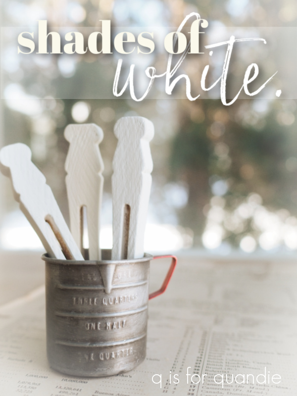
Hey guys, tomorrow is Mr. Q’s birthday! I thought maybe we could celebrate with a giveaway so be sure to read all the way to the end to get all the details on how to qualify for the giveaway.
Actually, the idea for this post has been brewing since way back in October when I compared the different shades of black Dixie Belle paint.
I think someone suggested that I do the same with shades of white at the time, and that sounded like a pretty good idea to me.
So I went to the Dixie Belle website to review all of the different shades of white, and guess what? There are quite a few of them! There are 4 in their chalk style paint line and 5 in their all-in-one Silk paint line.
That’s a lotta white.
So I’ve decided to break them down into separate posts (and separate giveaways). Today I’m just focusing on the chalk style paint … and oh, not all 4 of the colors that Dixie Belle includes in their ‘white’ category. I neglected to include Buttercream. I think of that as more of a pale yellow or cream rather than a white, so I hope you’ll forgive me.
For today that leaves us with Fluff, Cotton, and Drop Cloth.
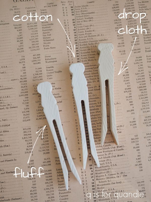
If you’ve been following me for any length of time, I think you know which is my favorite!
Drop Cloth!
I’ve used this color on a multitude of pieces.

Seriously. I don’t think I could even begin to count all of the things I’ve painted in Drop Cloth.

Dixie Belle describes this color as “a stylish linen white with a touch of warmth,” and that pretty much nails it. I really prefer working with a warm shade of white that you can bring into your home and it doesn’t instantly make all of the other white items look dull.
When standing alone, Drop Cloth reads as warm white to me. It’s only when you put it right next to a bright white that it appears so much darker.
I am not a fan of a harsh, bright white and that brings me to the Cotton. Dixie Belle has this to say about Cotton: “Cotton is our purest white, perfect for a clean and classic look. This color is for anyone who wants to decorate their home with stark simplicity.” Yep, that pretty much sums it up.
The fact that I’m not really a fan was readily apparent when I tried to find samples of my work in this color. The best I can do is the table runner that I shared back at the end of December.
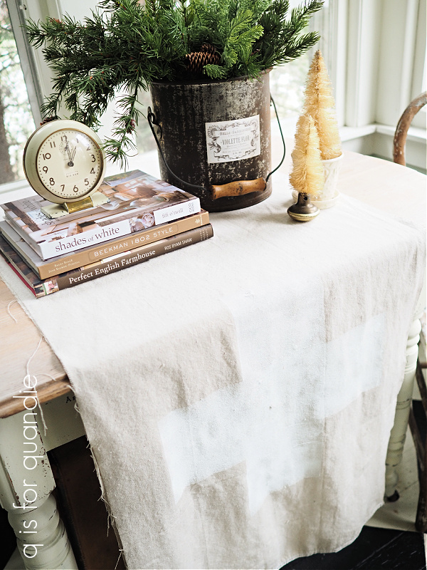
I ended up painting that swiss cross on the drop cloth in Cotton because my usual go-to white, Drop Cloth, was … well, duh!, the nearly the same color as the drop cloth itself (no wonder they named it that!).
I also used the Cotton on the Skate Rental sign that I shared last week, just to do the laces on the skates.

That brings us to Fluff. Dixie Belle describes Fluff as “a serene, soft white with a slight gray undertone.” Spot on again. I have to say, if you are wondering what a color really looks like, read the description. Many times the photos can be deceiving. It’s so hard to get a color right on a computer screen. But I find that Dixie Belle does a really good job of describing the colors.
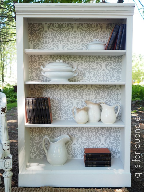
Once again, examples of Fluff are few and far between on my blog. I did use it on this bookcase.
And here is Fluff on a picture frame.
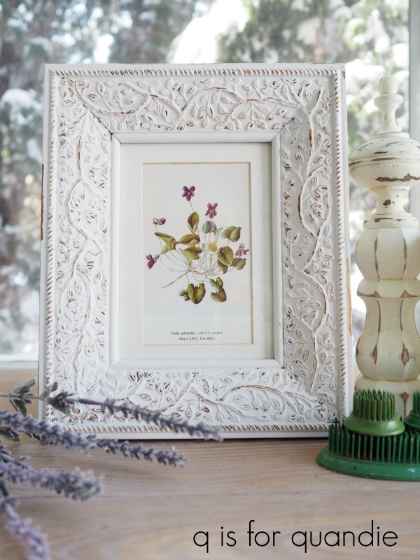
It would be fair to say that when I want a whiter white than Drop Cloth, Fluff would be my choice.
Speaking of Shades of White, have you seen Fifi O’Neill’s newest book by that name?
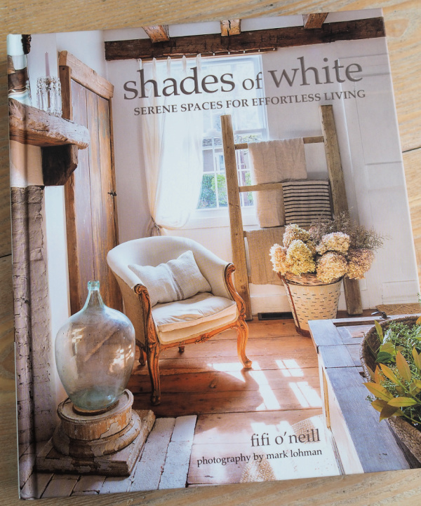
If you are a fan of decorating with white, vintage and pale wood tones, you will love this book.
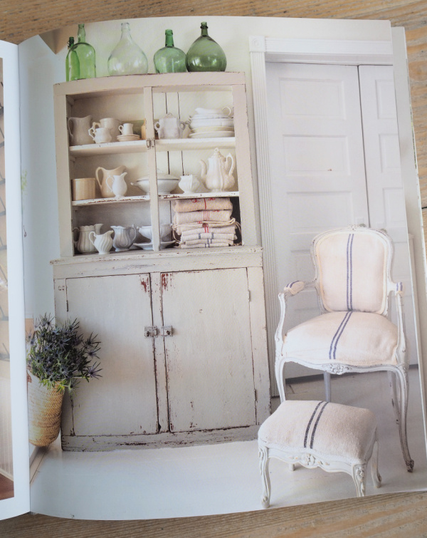
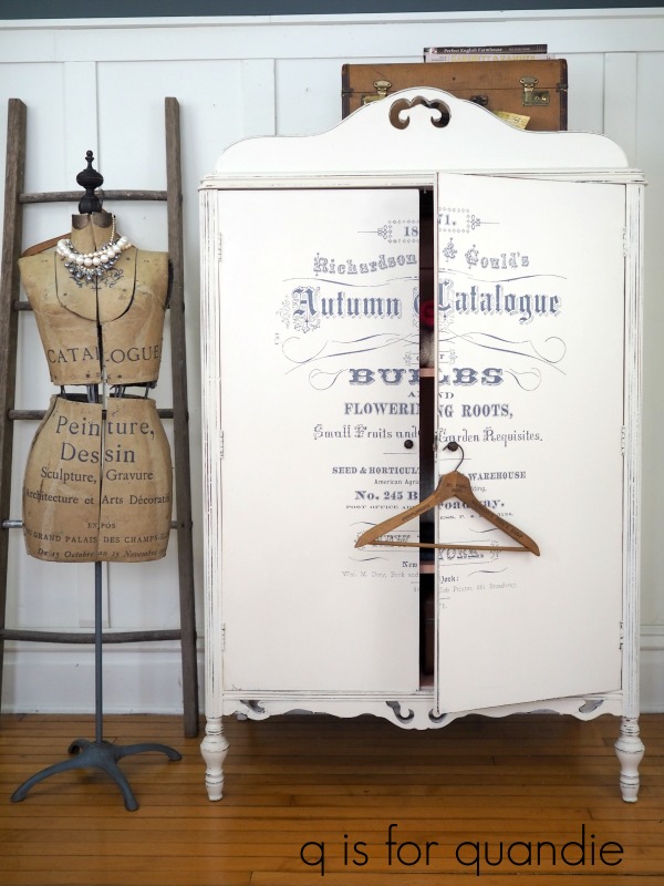
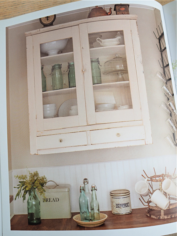
I’d say the trick to making a mostly white color scheme work is using varying shades of white such as white with the barest hint of grey like the cupboard above. Or warm white walls with a brighter white beadboard wainscoting like shown below.
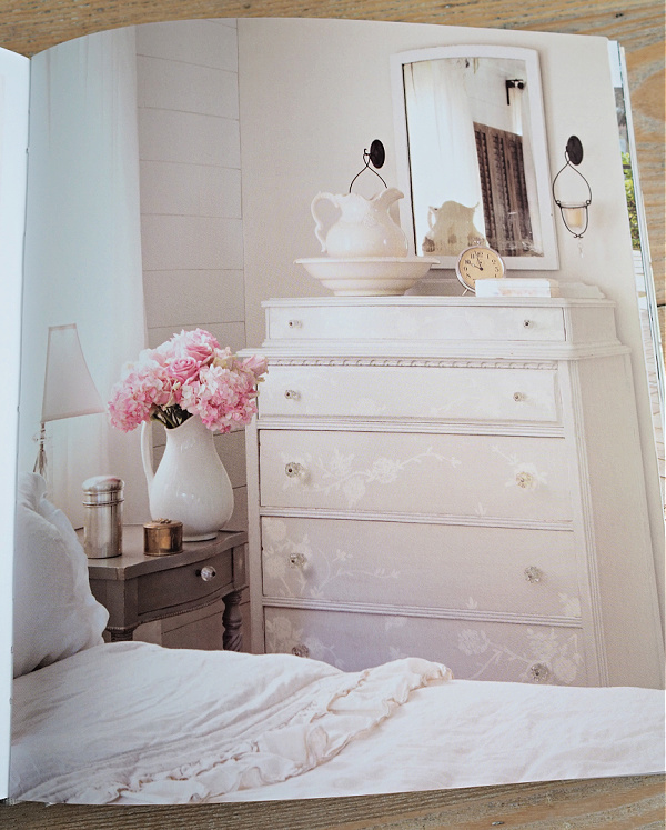
And of course I love the tone on tone look of this next dresser …
So, in other words, one can embrace all of the shades of white and allow them to mix together.
And that brings me to my giveaway!
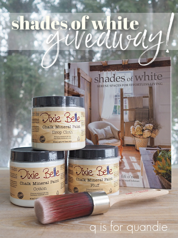
The lucky winner of today’s giveaway will receive a copy of Shades of White, 16 oz. of Drop Cloth, Cotton and Fluff, and the medium oval paint brush from Dixie Belle.
The rules: Simply leave a comment (if nothing else, wish Mr. Q a happy birthday) on this blog post to be eligible to win.
Your comment must be left on this blog post, not on Facebook or Instagram. You are not required to follow my blog, although it would be awesome if you did!
I will randomly draw the name of a winner for today’s prize from all of the comments left on this post by Sunday, February 27, 2022 at the stroke of midnight (U.S. Central time).
The fine print: no purchase necessary, you must be 18 years of age or older to win, void where prohibited by law, the number of eligible entries received determines the odds of winning, approximate retail value of prize is $135, if the prize is not claimed by Friday, March 11, 2022 another name will be drawn at random to win, blah, blah, blah.
Thanks to Mr. Q for ordering the book for today’s giveaway from amazon.com, and thank you to Dixie Belle Paint Co for continuing to provide me with products that I can give away 😉 Good luck!

Happy birthday Mr. Q!!! I hope you have a wonderful day.
Great post on shades of white. I am a huge fan of monochromatic color schemes. I especially love different shades of whites combined. Looks like a fun book. I have followed Fifi for years she has a real talent for creating beautiful spaces.
LikeLiked by 2 people
Happy Birthday Mr Q
LikeLiked by 2 people
Happy Birthday Mr. Q! Thanks for helping with all the projects!
LikeLiked by 2 people
Who would have thought there were so many shades? Great explanation.
Happy birthday Mr Q.
LikeLiked by 2 people
Happy birthday, Mr. Q. Hope you’re enjoying Ms. Q ‘s retirement as much as she is!
My all time fav color is white and boy oh boy could I get ideas from this book! Just my style of decorating, too!
LikeLiked by 2 people
Happy, happy, happy birthday Mr. Q. Tomorrow is my sons b-day, on Wed. is my daughters b-day !!
Thanks for the great post on white. I’ve been into Gustavian lately and this answered many questions.
LikeLiked by 2 people
I wanted to try drop cloth on a bench but my buy-on-the-spot source was out so went with cotton. Put dark wax on it to tone down the WHITE. Would still love to try drop cloth, and that brush would sure be a bonus. Thanks.
LikeLiked by 1 person
Great idea to tone down the Cotton with some dark wax!
LikeLike
Hope you have the happiest Birthday, Mr. Q.! and Mrs. Q, thank you for the very helpful post!
LikeLiked by 2 people
Mr. Q., so happy to wish you a happy birthday with many more to follow!
As for white paint, it is the hardest one to choose, in my opinion. I have a small fortune in white paint samples and would love to have a few more.
LikeLiked by 2 people
I wanted to use drop cloth but my buy-on-the-spot source was out so went with Cotton. I added dark wax to my bench and warmed up the white nicely. Still need to try drop cloth. That brush would be a bonus. Oh, and happy birthday Mr. Q.
LikeLiked by 1 person
First and foremost Happy Birthday Mr. Q! It was lovely to meet you awhile back, picking up the “Jardin” sign.
Linda, I love your work! Most of my life, I have leaned towards darker paint colors, but I’m slowly changing some things over. It’s such a clean look. Thanks for all the inspiration!
LikeLiked by 2 people
Hi Melissa! Hope you’re enjoying the winter and not missing Florida too much 😉
LikeLike
The numerous shades of white are as overwhelming as the many shades of gray. These descriptions are very good and it’s so helpfully to have the range of white narrowed down to a few choices. Your color comparison posts are nice to reference. Have you done dark blues? I’ll have to search your blog.
LikeLiked by 1 person
I have not compared the dark blues. I’ll have to add that one to the list 🙂
LikeLike
Happy Birthday Mr. Q! My family has many February birthdays, including my own, so I think people born in February are extra special! I get so much inspiration from this blog…keep up the good work.
LikeLiked by 2 people
My favorite Dixie Bell white is fluff, I like the grayish tone to it. I have used cotton and drop cloth a fair bit, too. I love drop cloth paired with putty or other brown tone paints, it really sets them off. I like fluff paired with French linen. I agree that cotton is a little stark. And happy birthday Mr Q, may it be a fun filled day for you!
LikeLiked by 2 people
Love the idea of pairing Drop Cloth and Putty, I’m going to have to try that combo!
LikeLike
I’m a Drop Cloth girl myself but I do like to use different shades for visual interest. I love the contrast between the 2 whites in your picture above of the frame painted in fluff and the finial beside it.
LikeLiked by 1 person
Happy Birthday Mr. Q! I have followed you for years, I even say to my hubs Quandie says…. (even though I know your name is Linda).
I tend to use Fluff more than Drop Cloth or combine the two. I also like Sawmill Gravy and Fluff combined on a piece.
LikeLiked by 2 people
I usually pair up Sawmill Gravy and French Linen, but I may have to try it with the Fluff. Great idea Jane!
LikeLike
Happiest of all Birthdays Mr. Q!
LikeLiked by 2 people
Happy Birthday Mr Q!!
Are you going to do a blog about the different shades of Gray next? You could have a lot of fun with that one!
LikeLiked by 2 people
Another great idea! And there are plenty of shades of gray to choose from too!
LikeLike
Thanks for the review. Happy birthday
LikeLiked by 2 people
Thanks for the review. Happy birthday mr Q
LikeLiked by 1 person
Man! I love this blog. I’ve followed for a long time, and don’t always comment. I never feel bored or tired with the content, and your style is consistent throughout the years. I will be reading as long as you post! Best wishes for your birthday, Mr. Q!
LikeLiked by 2 people
Thanks so much Toia! It’s always good to be reminded that there are lots of people reading who rarely comment. I myself rarely comment on the blogs I read 😉
LikeLike
Happy Birthday Mr.Q and manymore
LikeLiked by 1 person
Thanks for another helpful post! I just finished a project using Dixie Belle’s sawmill gravy and it reads as a deeper gray-white next to French Linen, almost a stone color. I find that some colors of the same type of paint go on smoother than others – can that be possible? Happy Happy Birthday to Mr. Q!
LikeLike
I always struggle to describe Sawmill Gravy, but I like ‘stone color’. I never really saw it as a beige until I read the Dixie Belle description calling it a “smooth beige”. It really is a sort of pale greige that changes depending on what color it is next to.
LikeLike
Blessings for a happy birthday Mr. Q! I have really enjoyed so many of your posts and all of the wonderful pictures and stories shared in it. Thanks
LikeLiked by 1 person
Happy Birthday, Mr. Q! Thanks to both of you for the opportunity to win! We recently purchased our first house and I’m obsessed with white, so I’m trying to add as much as I can in different ways. After doing furniture myself for years now DB paint is still on my “to-try” list, so I appreciate the possibility to try it through this giveaway. ☺️
LikeLiked by 1 person
Thanks for the information. It was very helpful to see the subtle differences side by side!
LikeLiked by 1 person
Happy Birthday, Mr. Q! Today’s post was so helpful to me. I have struggled trying to figure out the different Dixie Belle whites as you never seem to see each of them right next to one another. This has helped immensely. Thank you for sharing!
LikeLiked by 1 person
HAPPY BIRTHDAY mR. q!!
love your blogs,
LikeLiked by 1 person
Happy Birthday, Mr. Q. Enjoy your day! 🎂🎁🎉🎈
This is a very generous giveaway. Thanks for the chance to win.
I confess to being a Drop Cloth girl myself. Of course, having raised 3 boys, I’ve come to see stark whites as just a blank canvas for dirt & a fingerprint depository. lol I agree Drop Cloth is gorgeous by itself, but I also love that it blends beautifully into some of DB’s more muted colors.
Love when you compare the shades of different colors. It’s really very helpful.
LikeLiked by 1 person
Happy Birthday Mr.Q!
LikeLiked by 1 person
Love this post! Thanks for sharing. Getting ready to start white projects and this helped me a lot. 🙂
LikeLiked by 1 person
Happy birthday to the Mr.! My granddaughters 13th birthday is this Friday…but I bet you won’t be celebrating yours the same way by going to hang out at Mall of America all day. Lol. And to the Mrs… I was so happy when I was reading the blog and I knew your favorite shade of white…it’s those little things in life….keep up the good work on your blog!
LikeLiked by 1 person
Happy birthday to The Mister. I love the idea of defining and illustrating all the shades of white, and black. Maybe you could do blue next.
LikeLiked by 1 person
There are SO many blues! In fact, there are 17 colors listed on the DB website under ‘blue’. Yikes! I’d definitely have to figure out a way to narrow that down.
LikeLike
Happy Birthday, Mr. Q! Congrats on another trip around the sun!
LikeLiked by 1 person
This was a really nice comparison of Dixie Bell whites (chalk paint), and looking forward to the comparison of their silk paints. I also enjoyed the comparison of blacks when you wrote that post, and seeing the colors on actual pieces of furniture is really helpful.
Also, a very happy birthday to Mr. Q!!
LikeLiked by 1 person
Happy Birthday Mr Q!
I happen to love Fluff!
LikeLiked by 1 person
Happy birthday to your hubby. I’m also a February baby.
I love decorating with neutrals and just received the book as a late Christmas present. If I happen to win, I would give the new copy to my friend who just gifted me with the book. The book is gorgeous!
LikeLiked by 1 person
Sending loads of birthday wishes to Mr. Q.! Wishing him a wonderful day filled with all his favorite things!
I love all three Shades of White but I must admit, Drop Cloth is my favorite! It’s just so perfect for so many things. My 2nd fav is Cotton however after seeing that beautiful picture frame, I’m thinking I need to give Fluff a try.
I just love your style, thanks so much for every post, they truly keep our creative juices flowing.
LikeLiked by 1 person
Happy Birthday Mr. Q…Hope you have a WONDERFUL DAY!! ALWAYS love your posts!!
LikeLiked by 1 person
Happy Birthday, Mr. Q. Stay warm!
LikeLiked by 1 person
Happy birthday Mr Q! And, I am thankful our mutual friend, Kathy D, introduced me to your blog. Love it all!
LikeLiked by 1 person
I’m thankful for our mutual friend too 🙂
LikeLike
Happy 🎂 birthday Mr. Q!!
LikeLiked by 1 person
I’m totally with you on your choice of white Miss Quandie! There’s white and then there’s “WHITE!!!!!”……startling how much contrast there can be! Loved the choice of the word “multitude” to describe the number of your Drop Cloth projects……..so perfect 🙂 So, I see that Mr. Q is a fellow Aquarian! (I’m Feb 1st) Many happy returns to Mr. Q! For he’s a jolly good fellow!
LikeLiked by 1 person
Nope … he’s a fish! I guess technically he is pretty close to the cusp, but for the most part he is a Pisces!
LikeLike
Love Whites !!!!!
Happy birthday Mike 🙂
Love your blog Linda ♡
LikeLiked by 1 person
Love your blog. HBD Mr. Q.
LikeLiked by 1 person
Happy Birthday Mr. Q! Here’s a “q tip”- have a wonderful day with your amazing wife! Here’s to a great 2022!
LikeLiked by 1 person
Thanks for this enlightening post…who knew WHITE could be so complex?
Happy birthday to Mr. Q. It happens to be my youngest daughter’s 33 birthday (yikes, how did that happen?) as well as my God-daughter’s 44. Great day to be born!
LikeLiked by 1 person
I love your work! Everything you do is so pretty! It’s a good thing that I don’t live close to you because I would want to buy all of your stuff! I also really enjoy that you don’t have all of those pesky pop-up ads! You’re very talented. Thank you for taking the time to share with all of us. Happy Birthday to Mr. Q!
LikeLiked by 1 person
Fantastic giveaway! Thank you for sharing your treasures 🙂
And Happy Birthday to Mr. Q!
LikeLiked by 1 person
Whites have always boggled my mind since I can’t pick one out based on an image and because I seem to see colors differently than others. The paint companies that accurately describe the different shades do help a lot. Your blog post will be a lifesaver the next time I paint something white!
Happy Birthday Mr. Q!!! May you live long and prosper with your Lady Q by your side.
LikeLiked by 1 person
I am a total newbie in the world of furniture painting, and it’s been interesting to see that there seems to be a nearly universal emphasis on neutrals, including white. I understand that most potential buyers are looking for pieces that will blend into their existing decor, but is there a color-loving customer base out there anywhere?
LikeLiked by 1 person
That is really a tough one Liz, and something I was just discussing with some of my fellow furniture painters. Pieces painted in colors always take longer to sell. It’s just the way it is, unless someone is making over an entire room and they want that statement piece in a color, they tend to buy neutrals that can be worked into an existing room. One big exception for me has been the mid-mod pieces that I’ve painted in Fusion’s Park Bench, and lovely grass green. Those always fly out the door! I usually have good luck with dark navy blue pieces too.
LikeLike