Have you ever tried caviar? I’ve tried it a couple of times. The most memorable was when Mr. Q and I were in St. Petersburg, Russia where we we tried on fur hats, ate caviar and then washed it down with shots of vodka.

But even with the vodka chaser, this delicacy is pretty much lost on me. Give me a bag of potato chips instead any day.
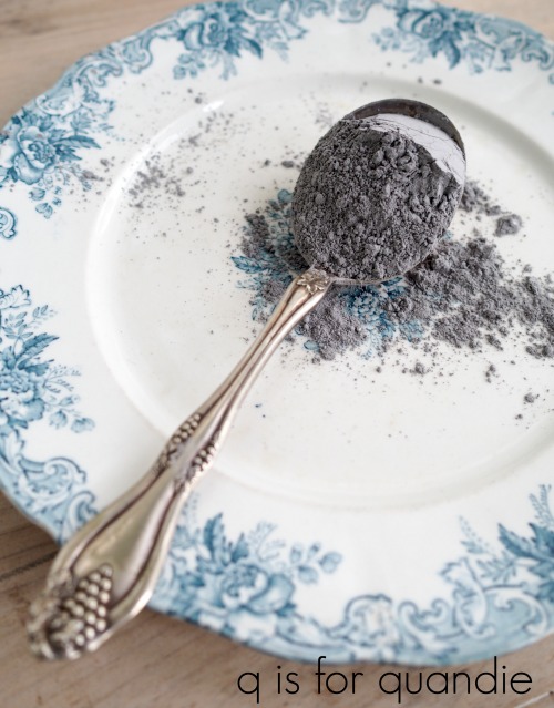
But there is one kind of Caviar that I just can’t get enough of …

Dixie Belle’s Caviar!
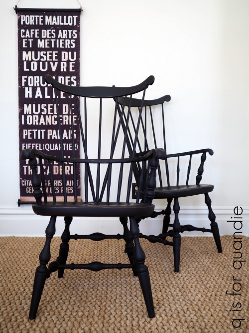
I’ve shared several pieces painted in this color over the past year starting with a pair of Windsor chairs that I painted back in February.
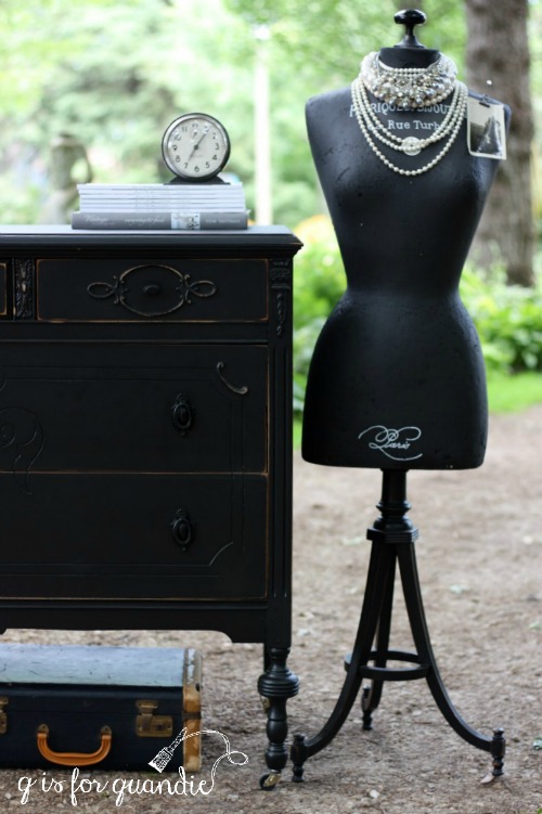
They were followed by a lovely vintage dresser.

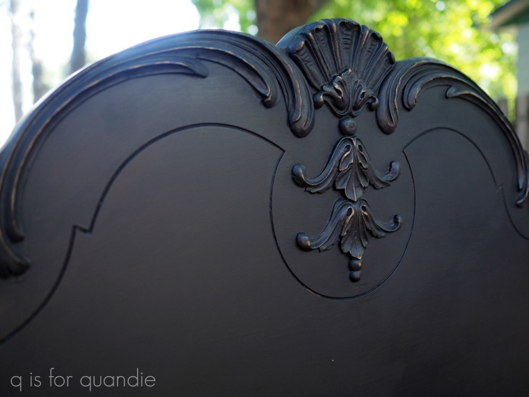
Then in July I painted a gorgeous vintage bed in Caviar.
And more recently I painted the simply beautiful hutch in this color (although the inside is painted in Fusion’s Coal Black which is a pretty good match, just a little different sheen).

On Monday I shared the latest collaboration between me and my handyman Ken, the black bench.

And I still haven’t had enough Caviar!
In addition to the bench, I painted several more items in Caviar recently. And I played around with some other ‘chasers’ including clear wax, black wax and black glaze. I started with this vintage train case (do you call it train case? or a vanity case? or a makeup case?) …

I cleaned the case first with soap and water. Then I painted it with two coats of Caviar and stenciled it with craft paint.

I finished it with Dixie Belle’s Best Dang Wax in Black.

I find it easier to apply an appropriately thin coat of wax using a brush rather than a rag. Once applied, I go over the waxed surface with a clean cloth right away to remove any excess wax. You can then wait 10 or 15 minutes and buff to a shine, but I’m not a super shine lover so I don’t do very much buffing. The brush pictured is one that I reserve exclusively for use with dark wax.

Today’s q-tip: usually I advise adding a coat of clear wax prior to adding dark wax, but with pieces painted in black that isn’t necessary.
Next I painted a library chair in Caviar, and then finished it with Dixie Belle’s Best Dang Wax in Clear.

I have to admit that I didn’t notice a whole lot of difference between using the clear wax versus the black wax over the Caviar. Also, as an FYI, I used Dixie Belle Best Dang Wax in Brown on the vintage dresser above which worked beautifully as well. So if you have a particular color of wax on hand already you could just use that over the Caviar, no need to buy a special wax.
Next I painted this rather heavy wooden tool box in Caviar, stenciled it and then tried something different for the topcoat. I used the Dixie Belle Black Glaze.

I applied the glaze using a cheap foam brush.

It went on so easily and the glaze seems to add just a tad more sheen than the wax does.

I actually finished this toolbox before I finished the bench that I shared on Monday. It was my guinea pig for the glaze. It went on so easily and looked so good that I went ahead and used the black glaze on the bench too.
One thing to keep in mind is that some of the water based poly’s are not recommended for use over black because they can become streaky. For that reason I tend to stick with wax, glaze or hemp oil when adding a top coat to black.
If you haven’t tried Dixie Belle’s Caviar, you absolutely should. And although I wouldn’t recommend following it up with a vodka chaser, I do think clear wax, black wax or the black glaze are all great choices!