the herbier box.

I’ve got another box makeover for you today, and once again I forgot to take a ‘before’ photo.

Well, no worries, it was basically just a dark brown stained wood before I gave it its new look.

This box definitely appears to be homemade, maybe some sort of high school shop project?

See those grooves that have been cut in to either side of the box in front?  I think they were meant to be decorative, they are on all four sides.  But they are pretty wonky.

Anyway, as you can already see, after my usual prep of cleaning, scuff sanding and a coat of Dixie Belle’s Bonding Boss, I painted the outside of the box in their Drop Cloth.

After sanding to distress the edges, I applied some of the florals from the new I.O.D. Flora Greca all the way around the box.

I’m calling this the front …

but you could just as easily call this the front …

As for the box top, I dug deep into my transfer stash and pulled out my old favorite, the I.O.D. Label Ephemera transfer.

As most of you know, it was retired years ago.  At this point, I buy one whenever I find it at a reasonable price, but they are getting harder and harder to find.

Now, I have to first apologize to any French speakers out there.  I re-arranged the layout of a few of the lines of text to get them to fit nicely on the box top.  I suspect they may not make a lot of sense now.  I hope it’s not too crazy.

As you can see, the top of the box is not hinged, it comes right off.

That brings me to the inside of the box.

It’s painted in Dixie Belle’s Blueberry with a top coat of their flat clear coat.

Along with the Madeleine lunchbox that I shared last week, I think this little box would make a super sweet Easter basket if you filled it with some chocolate bunnies and candy easter eggs.

What do you think?  Leave a comment and let me know.

This box is for sale locally, you can find all of those details here.

the box.

Well shucks.  I could have sworn that I took a ‘before’ photo of today’s project.  But if I did, I have no idea where I stored it.

Suffice to say that one of the shop owners at Reclaiming Beautiful gave this box to me because she thought it was a good candidate for a makeover (thanks again for that Monique).

It’s started out as just a simple wood box.  Monique had tried to strip it with mixed results.  I think in the end she just figured it wasn’t worth putzing with, so she gave it to me.

After removing the latch, I gave the box a quick scuff sanding and then a coat of Dixie Belle’s Bonding Boss inside and out.  The wood definitely looked a bit red, ie. it would probably bleed through my paint.  The Bonding Boss will prevent that.

Then, well, the box sat for a while.  I wasn’t exactly sure how I wanted to finish it.  That gave the Bonding Boss plenty of time to cure.  Technically you are supposed to wait 24 hours before painting over it.  I find that it works best for preventing bleed through if you follow those instruction.

But I pulled the box back out a week or so ago and gave the interior a couple of coats of Dixie Belle’s Cactus.

Next up I painted the exterior in their French Villa.

Both of these colors are from their Silk All-In-One Mineral Paint line.  I tend to prefer using their chalk paint line usually, but every now and then it is nice to use a paint that doesn’t require a topcoat.  Well, technically it also has a built in primer so I’m not sure I really needed the Bonding Boss.  However, I hadn’t chosen my paint colors yet when I started with that step.

Next I brought out one of the new transfers from I.O.D., By Any Other Name.  There are four different images of white roses in that set.

I used all four on top of the box with the excess draping down on the sides.

I added some typography from the I.O.D. Saint Ouen transfer to the front of the box.

I then added a few insects here and there, also from the By Any Other Name transfer.  As a final touch I also added the “Tag No. 9757” which is from Tim Holtz.

OK, that takes me to the “latch” which really isn’t a functioning latch.  I didn’t really think it through when I decided to add that.  Somehow I thought it would work to actually keep the box closed, but of course it doesn’t.

But I liked the look of it so much that I kept it anyway.

That isn’t an original finish on it, I created that look using the Dixie Belle Patina Paint.  The latch started out in shiny brass, so I began by giving it a coat of the Bonding Boss to help my paint stick.  Then I gave it a quick coat of Dixie Belle’s Coffee Bean paint.  Once that was dry I dabbed on some of the Iron paint and some of the Bronze paint.  While the paint was still wet, I added the Green activating spray.

I just love the results you can get with the Patina Paint.

Now, although the paint doesn’t require a topcoat, the transfers do.  So I added a coat of clear wax over the outside of the box.

I have to admit, I wasn’t initially sure where I was going with this box.  However, in the end I quite like how it has turned out.

What do you think?  Leave a comment and let me know.

It is available for local sale, so check out the details here if you are interested.

As always, thank you to Dixie Belle Paint Co for providing their products used in this makeover.

surf’s up.

 I fully admit, I’m a sucker for attractive packaging.  So the other day when I was at Home Depot waiting for some paint to be color matched (to touch up the Carriage House), I was browsing the spray paint aisle and came across this …

This is Behr spray chalk paint in a color called Surf.  Isn’t that a nice looking can of spray paint?  Somehow it’s much more appealing than your typical can of spray paint.

Am I right?  Or is it just me?

And I didn’t even know that Behr was making a spray chalk paint, did you?

It was priced at $9.99, which is just a tad steep for a can of spray paint.  But I went ahead and threw it in the cart to give it a try anyway.

I pulled out this metal plant stand that I’d purchased at a garage sale earlier this summer to be my guinea pig.

After giving it a good cleaning with soapy water, I gave it a few quick coats of the spray paint.

One thing I noticed right off is that this spray paint does not dry nearly as quickly as traditional spray paint.  Just something to keep in mind if you plan to try it.

But it went on beautifully, and it did have a nice matte finish similar to chalk paint.

I got some paint on my hand when I accidentally touched the plant stand before it was dry, and it was not as easy to wash off as chalk paint typically is.

I didn’t attempt to distress the plant stand, so I can’t speak to whether or not the spray chalk paint distresses as easily as other chalk style paints.  I’ll have to experiment with that on another project.

I checked out the Behr website and found a blurb in the description of the product calling it a “simple two-step paint and wax process.”  However, the instructions for use didn’t say anything about having to add a topcoat, wax or otherwise.

But I would guess that it needs a topcoat for durability based on them calling it a “two-step process”, and that you can use any topcoat that you would normally use with chalk paint.

However, I didn’t add a topcoat to mine because as it turns out, this color is a bit brighter than I thought it would be and truthfully it’s not really my vibe.

So in the end, I decided to go back to the drawing board.

After first spraying over the Surf color with a matte black spray paint, I then brushed on the Dixie Belle Patina Paint in Bronze.  While the paint was still wet, I sprayed it with the green activating spray (find a full tutorial on using the Patina Paint here).

Yep, that’s fits my aesthetic much more than the bright turquoise.

The green spray created a nice bit of verdigris.

After adding a small pot of ornamental kale, I put the plant stand in my recent sale.

It almost sold.  And by that I mean that someone put it in the ‘holding area’, but then they changed their mind and didn’t buy it.

Oh well.  Maybe next time.

Meanwhile, which version did you like better?

White, turquoise or bronze?

Leave a comment and let me know.

once again, I caved.

Every time I.O.D. comes out with a new release I tell myself I’m not going to go wild.  I’m not going to order a bunch of new stuff.  I have a large stash of older stuff that I should use up.  Etc., etc.

And then I see what’s on offer and I cave.

Such is the case with the new I.O.D. Clementine transfer.

I just couldn’t resist.  Look how pretty it is!

It is one of the smaller ones, so priced just under $25.  So maybe not too much of a splurge, right?

As you can see, although this is part of the I.O.D. 2025 Holiday Collection, it doesn’t have a super strong Christmas vibe.  I’d say the colors make it feel more fall-ish.

To begin with, I decided to try one out on a cannister that I brought home from the Goodwill store near my mom’s house (back right).

I clearly must not have been too impressed with the result the first time I painted it back in May because I never even shared it here on the blog.

I did put it in my spring sale, but it didn’t sell.

So clearly no one else was too impressed with it either, it was due for a do-over.

I sanded it down and then gave it a coat of Rust-Oleum’s Ultra Matte black spray paint.

Once the paint was fully dry, I simply applied one of the Clementine transfers.

Then I sanded the entire thing lightly using one of Dixie Belle’s sanding sponges.  I find that they work really nicely on a curved surface.

I will note that you can see some brush strokes under that Rust-Oleum paint.  Although it’s called ‘Ultra Matte’, it actually does have a bit more sheen that I expected.  And sheen always highlights brush strokes.  Just something to note.

I finished things off with a top coat of Dixie Belle’s clear wax.

I loved the way the Clementine transfer looked over the black paint, so I pulled out a stash of French flower buckets that my friend Sue found at a garage sale for me.

After giving three of the buckets a couple of quick coats of the Rust-Oleum Ultra Matte black and letting them dry, I applied some more of the Clementine transfers.

You’ll notice that the finish is much smoother when not applied over previously brushed on paint.

Once again, after a quick, light sanding, I finished them off with some clear wax.

The colors in the one with the pink cabbage in particular inspired me to fill them with some of my dried hydrangeas.  The deep rose color of my Quick Fire Fab hydrangeas were a perfect match.

While my dried Limelights were perfect for the one with the oranges.

All of these will be available at my upcoming occasional sale.

I hope some of you locals can make it.

Stay turned for next week when I’ll be sure to share my address and any other sale details.

As for the rest of you, did you cave in and purchase any of the new I.O.D. transfers?  Or am I the only one who can’t seem to resist them?  Leave a comment and let me know.

the ombré nesting boxes.

Recently my friend Terri gifted me with a set of nesting boxes.

These are the real McCoy, made out of wood rather than heavy cardboard.

The green wasn’t really working for me, but not to worry, Terri knows me very well and intended for me to paint these.  She won’t be offended that I didn’t like the green.

I thought this might be a good opportunity to use some of the new Countryside Collection colors from Dixie Belle, so I pulled out 4 of them that I thought would work beautifully together on the boxes.

However, after painting each box in one of the colors, I decided that the Oxford Fog was out of place.

So I decided to add in a color from Dixie Belle called Gardenia instead.

So, from top to bottom we have Gardenia, Chantilly, French Villa and Truffle.

They created a lovely neutral ombré sort of look.

I don’t know, is ombré still in?  Apparently it depends who you ask, some sources say it’s out, others say it’s making a come back.  Either way, I’m loving it on these boxes.

After painting each box, I sanded them to distress the edges and then finished the bottom three with a mixture of Dixie Belle’s Big Mama’s Butta mixed with some of their brown wax.

Before adding a topcoat to the top box I decided to add a paint inlay from I.O.D.

This is from the Floriography set.

After letting it dry, and then spraying the inlay with some Rust-Oleum matte clear spray to seal it, I also added a coat of the butta and wax mix to this box.

I staged my pictures using an urn that I picked up at a garage sale this summer.

I did debate leaving it ‘as is’, but it just didn’t feel quite right with that pinkish toned terracotta coming through the faux paint job.  So I gave it another kind of faux paint job using Dixie Belle’s Patina Paint in Iron paired with the Green Spray to give it a rusty look.

This was one of the items I did on my assembly line rustification day.

I filled it with some dried flowers from my new Quick Fire Fab hydrangea hedge.

These have a darker color than my usual Limelight or Vanilla Strawberry hydrangeas.

I also used a stack of old books.

I purchased that old bible at a garage sale, and I’ve never been able to figure out why there is paper lining the spine of the book.  I don’t think the spine was meant to be open, that just happened over time.  By when was it lined with that paper?  If any of you know when or why this technique was done, please let me know in a comment.

And also let me know what you think of the ombré nesting boxes!

more summer reading.

I was so pleased with the results that I got with the books that I painted a couple of weeks ago that I decided to keep the black set for myself.

And then make some more!

So I went back to the thrift store and purchased another six books and got to painting.

This time I was a little smarter about my selection and I only purchased those books that were already black.  I still had to paint them, but it only took one coat, and I didn’t have to worry about getting the inside edges of the covers.

After painting all six books in Dixie Belle’s Caviar, I pulled out the same two I.O.D. transfers that I used last time to add to them; Wilde Bloemen and Étiquettes .

I also used the Dixie Belle Gold Pen to add some horizontal lines here and there.

I finished them off with a coat of Dixie Belle clear wax.

For the 2nd set of three books, I decided to try a different floral.  This time I went with the I.O.D. Saint Germain transfer.

Isn’t that pretty over black?

Now I’m thinking that I’ll need to use this combo on a toolbox!

Although that being said, I think those florals would look pretty over Dixie Belle’s Ecru or Drop Cloth too.  On books or toolboxes.

OK, so which floral do you like better?

Wilde Bloemen on the left or Saint Germain on the right?

Leave a comment and let me know.

assembly line rustification.

I had a couple of rusty things at my sale last May including a tall planter, some old iron bedsteads, and a small statuette.

And they were among the first things to sell.  I think that must mean that other people love this rusty look as much as I do.  So I’ve been stocking up on stuff to rustify (excuse the made up word) for my next sale.

I’ve been salvaging various planters from my neighbors Ken & Arlene.  Arlene is no longer able to garden and the pots have been sitting around empty for a couple of seasons now.  Ken was just going to toss them, so I saved them from the trash heap.

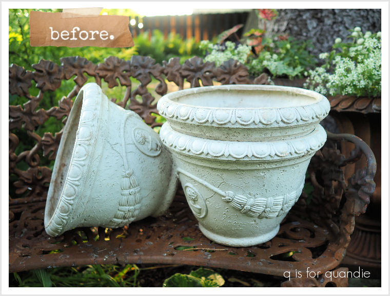
These will look fabulous with the rusty treatment.

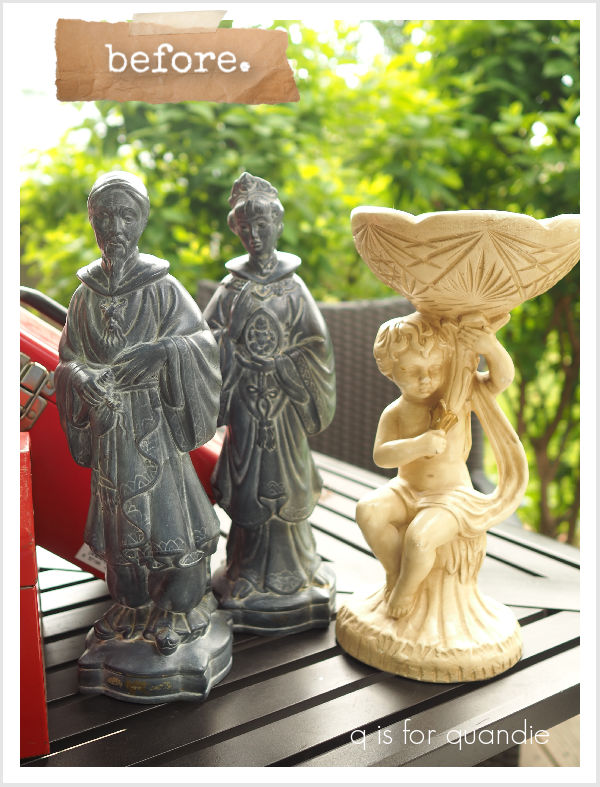
I’ve also got a pile of random stuff like the ‘statues’ that I bought at a garage sale this summer …

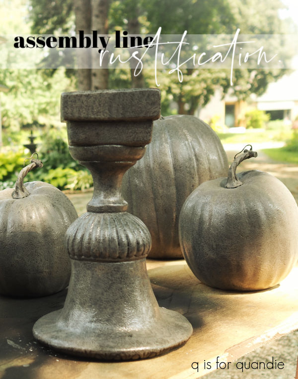
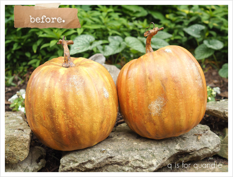
And I also have some faux pumpkins to make rusty for fall.

Since I have so many things to make rusty, I decided to tackle it assembly line style.  Basically I put out a variety of worktables, line everything up and then work my way down the row with each step of the process.

Step 1:  Wash everything using the garden hose and some Dawn dish soap.

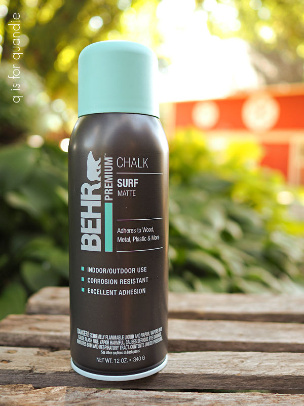
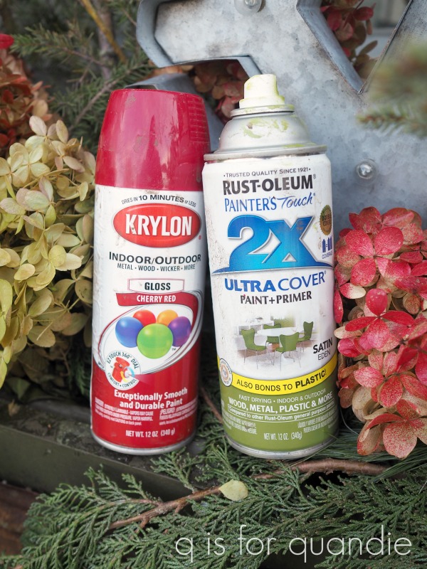
Step 2:  Spray everything with flat black primer.

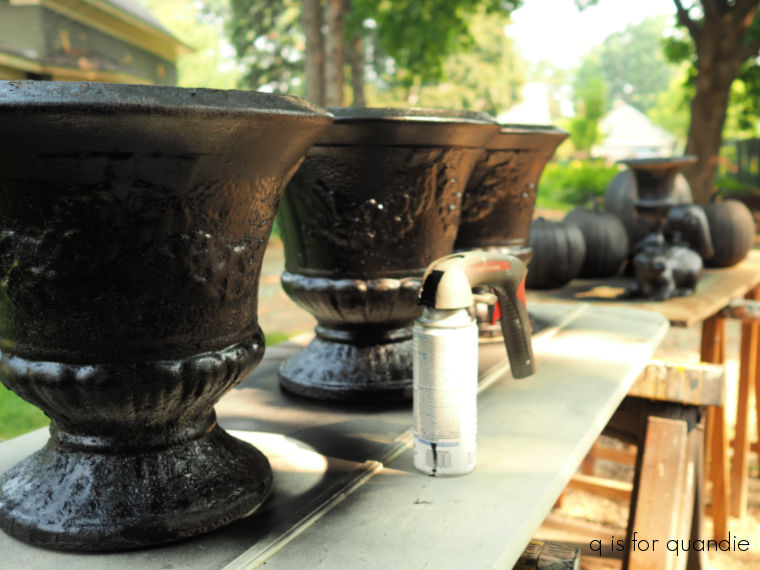
I’ve found this to be the quickest and easiest way to do a lot of items at once.  I have also used the red spray primer, which is closer to a rust color, but either one will work.  Dixie Belle also makes a primer specifically for use with the patina paints, and it’s also that rusty red color.  But it goes on with a brush, and when I’m working with this many pieces at once, spraying saves a lot of time.

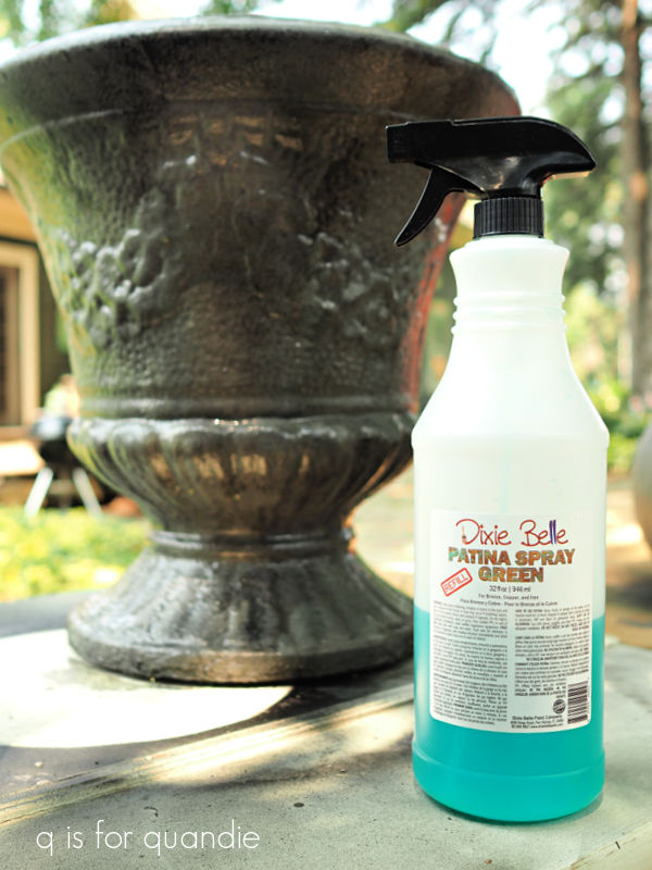
Step 3:  After mixing it well, I stipple on Dixie Belle’s Iron patina paint using their Oval Medium brush.

Of course, you don’t have to use this brush.  You can use pretty much any brush, but the job goes much quicker with a larger brush that holds more paint.

 Today’s q tip:  applying the Patina paint with a stippling motion rather than a brushing motion prevents brush strokes.  The activating spray (which is the next step) tends to pool in brush strokes making them more obvious, which doesn’t look natural on a rusty item.

Step 4:  After the first coat of Iron paint is dry, stipple on a 2nd coat and while it’s still wet, spray it with the Green Patina Spray.

Step 5:  Wait.

I find that out of all of the various patina paint/spray combos this rusty look takes the longest to develop.  If you use the Copper or Bronze paint, the verdigris appears almost immediately.  For example, I painted the pumpkin stems with the Bronze paint, added the green spray, and an hour or two later they looked like this.

But the rust takes a bit more time.  As in days, rather than just minutes or hours.

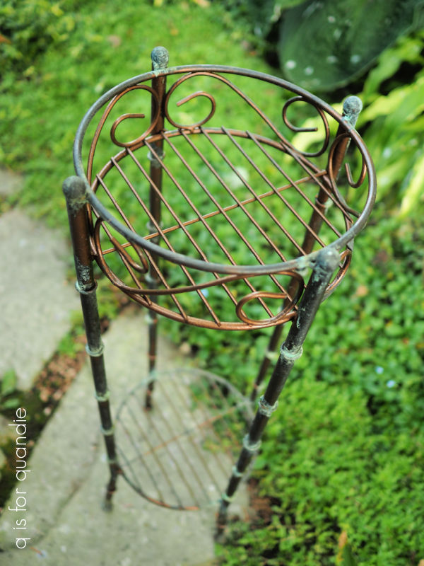
Here are the pots after 2 days.

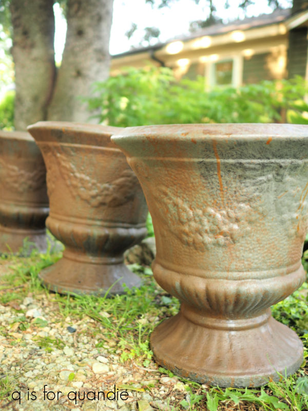
They aren’t quite rusty enough yet, but they’ll get there.

I have found that leaving the item out in the rain will really get the rust going.  When the weather doesn’t cooperate, I spray the item with tap water using the Dixie Belle Continuous Fine Mist Spray Bottle and that will help too, just not as much as rain water.

Step 6:  You have a few options for the final step.  The easiest is to simply skip using any sort of topcoat over your rusty item.  That’s my choice for anything that’s going in the garden.

Those items aren’t going to be handled a lot, so no worries about rust getting onto someone’s hands or clothing.  I’m also not worried about these items continuing to rust over time.

For the most part I have found that this finish holds up quite well outdoors without a top coat on most items with plaster items being the exception.  I’ve had to touch up that plaster pedestal shown above after a year spent outside.  I haven’t top-coated any of the items in my own garden including this bench and they’ve held up for multiple years now despite our harsh Minnesota climate.

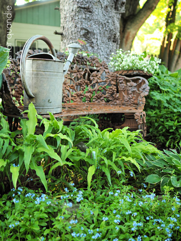
However, I purposely placed the bench in a garden bed so that no one will be tempted to sit on it.

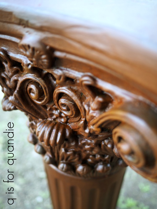
If it were going to be used for seating, I would add a top coat.  You have a couple of options.  First, you could use Dixie Belle’s Patina Guard.

This product will stop the “rusting” process and protect your patina finish (and also your pants when you sit on a rusty bench).

However, it will also darken the color a bit and add some sheen.

Here is a rusty pedestal I painted before adding Patina Guard.

And here it is after.

So just keep that in mind if you plan to use the Patina Guard.

If you don’t like that look, another option is to use a spray matte sealer over a rusty finish.  I like to do that with items that are going to be handled more frequently.

I hope the info in today’s post has been helpful, or has inspired you to try the Patina Paint.  Or maybe you’ve already tried it?

If so, be sure to leave a comment and let me know.

Thank you to Dixie Belle Paint Co for providing the Patina Paint products used in my assembly line rustification process.

my summer reading list.

I stopped off at the thrift store the other day to pick up a few books to add to my summer reading list.

LOL, just kidding.  I didn’t buy these to read, I bought them to paint.  which is not to say there aren’t a few options here that I might enjoy reading.

But I was surfing around on pinterest the other day and I came across this image …

and it inspired me to do some more book painting.

Is it just me, or does that image seem AI generated?  I don’t know, maybe it isn’t, but it just seems too perfect.  And I also saw the same exact image but in black and white.  I also couldn’t really track down the origin of this photo, it just has been shared and re-shared by individuals without any attribution.

Regardless, I was inspired by the colors and the florals on those books.

So I got out my Dixie Belle paint in Secret Path and in Kudzu to see what I could create.  After painting three of the books in each color, I started embellishing them.  I used a some floral transfers from a few different I.O.D. sets; Sarah Featon’s Botanicals, Rose Botanical and Wilde Bloemen.

Next I added a few random bits of gold typography from the I.O.D. Étiquettes transfer.

I also added some horizontal gold lines to the book spines using Dixie Belle’s Gold Marker.

Once all of those elements were in place, I gave the books a coat of Dixie Belle’s clear wax.  Then I used some of their Dixie Dirt in the color called Earth to add a little faux wear.  Dixie Dirt is a powder pigment that you can use to … well … make things look a little dirty.

I use a small artist’s brush to apply a little of the Dixie Dirt to the top of each book spine.

I kept it fairly subtle, but it definitely helped the books not look quite so freshly painted.

I kept aside 3 of the books to paint based on another inspiration pic from pinterest.

Isn’t that gorgeous?

I first painted the last 3 books using Dixie Belle’s Caviar, then I added more of the same embellishments I used on the previous books.

Only this time I used one floral transfer and applied it across all three books instead of using an individual one on each book.

And isn’t that transfer perfect over black?  It’s from I.O.D.’s Wilde Bloemen set, and it definitely has that look of a Dutch still life floral.

I have to admit that I like the black books even better than the green and purple books.

The gold elements really pop over the black.

I love the way these turned out.  So much in fact, that I’m going to keep them for myself.  I’ve already ordered more of the Wilde Bloemen transfer so that I can paint up some more too.

What do you think of these painted books?  Leave a comment and let me know.

a cat in a hat.

It has been a very difficult time for us this week as we had to say goodbye to our beloved cat, Lucy.

Lucy came into our lives nearly 18 years ago.  We weren’t planning on getting another cat, well, in fact we were planning on definitely not getting another cat.  But then we met Lucy on a visit to Mr. Q’s aunt & uncle’s house.  Apparently someone had dropped her off out in the country to fend for herself (why do people do that?).  Aunt Judy was feeding her, but they didn’t want to take her in.

Lucy was special though.  For one thing, she was very pretty.

Her fur was as soft as rabbit fur.

And that face!  She was so adorable!

But more than that, she was the friendliest thing.  Immediately upon seeing us, she came up to us and reached out to be picked up.  Once in Mr. Q’s arms, she nuzzled his ear and started to work her charms.

We tried to remain resolute.  We went home without her.  Because we didn’t want another cat.

But all night we were thinking about what a sweetheart she was, and maybe it would be OK to have just one more cat in our lives.

We went back for her the next day.  Who would have thought that she would then be in our lives for 18 years?

Lucy was special.  I know everyone probably says that about their pets, but she really was.

She loved to be held and was such a snuggler.

She was never happier than when she was riding around on Mr. Q’s shoulders.

When we went to bed at night she would impatiently wait for me to put my book down, and then she would insist that I make room for her on my pillow.  If I didn’t comply, she would literally try to get comfortable on my head. No matter how many times I tried to move her off my pillow, I would always wake up to a crick in my neck and Lucy comfortably ensconced on the pillow.

Handyman Ken always said she was more like a dog rather than a cat.  She would run up to greet him when he came out into the back yard, wanting to be picked up and petted.  He always took such good care of her when we were traveling.

I haven’t shared too much about Lucy here on the blog, just the occasional photo bomb.

She always had to check out just what it was that I was focusing on so intently.

And she had to thoroughly inspect any piece of furniture that I brought home to makeover.

And then there was the post where I was explaining that the chaise lounge on my porch was really just a glorified cat bed.

I’ve never been one of those ‘oh look at these 500 photos of my cat, isn’t she awesome?’ sort of people.  But I hope you’ll forgive me today for sharing the handful of photos that I do have of Lucy.  The fact that I didn’t take a million photos of her is in no way an indication of how much I loved her.  Both Mr. Q and I loved her tremendously.

Sadly, as we all know, cats don’t live forever.  In fact, having Lucy for 18 years was far more than we ever could have reasonably expected.

Her health had been inexorably declining over the last several years, but up until recently we felt that she still had a good quality of life even though she had clearly slowed down quite a bit.  She had more good days than bad days.  She was still demanding to go outside on a daily basis, although she had started to turn around and say ‘no f’n way’ when we opened the door and she realized the temp was below zero.  And she was still stealing my pillow.

But about a week ago she stopped coming into our room at night.  I could no longer entice her to eat, even though I tried every treat designed for finicky cats on the market.  It also became clear that she was suffering.  She would struggle to stand up, and to lie down.  Her fur had gotten incredibly matted over this past winter, and she was nothing more than skin and bones.  It was becoming obvious that we could no longer hope that she would just pass painlessly in her sleep.

So we made the impossible decision to have her euthanized.  Although I don’t necessarily want to talk about it, I do want to share that we used CodaPet.com to find Dr. Keri Wasmoen.  She was incredibly kind and so, so gentle with Lucy.  If any of you find yourself in a similar situation, I highly recommend her.

She also did her best to reassure us that we were doing the right thing, that providing a peaceful, pain-free end is the kindest thing you can do for a pet that is suffering.

But it’s also one of the hardest things I’ve ever had to do.

I’m not sure how long it’s going to be before I quit making sure that I left the basement door cracked so she can get to her litter box, or checking at the door to see if she’s ready to come in.

So please forgive me if I’m not my normal self for a while as I work my way through the grief of losing a much beloved pet.  She will be missed.

it must be do-over week.

Well, I guess it must be do-over week.

On Monday I shared the do-over of a big metal box.

Then on Wednesday I shared the do-over of a miniature credenza.

And FYI, one of my readers kindly pointed out that I put the Union Jack flag upside down.  I’m pretty embarrassed to have gotten that wrong, I hope no one took offence.  But that means I’ll need to do-over my do-over.  Luckily this is a miniature piece of furniture and not a full sized one!

Today I’m sharing the do-over of this bucket.

I painted that up last year for my Carriage House sale and I added an I.O.D. paint inlay to it.

This was my 2nd use of that particular inlay, and as you can see the result was rather faint.  For comparison purposes, here is how the first use of that inlay looked …

That crate was quite nice, but the bucket really turned out just a bit blah.  The inlay wasn’t really a good fit for it.

So I decided another do-over was in order.  After painting over the inlay with a couple of coats of Dixie Belle’s Drop Cloth, I went through my stash of transfers.  I definitely need to start using up some of the transfers that I have on hand and stop buying more new ones!

I ended up pulling out the Champs de Lavende transfer from re.design with prima.  I’d purchased this one a couple of years ago and I always planned to put it on the front of a dresser or something, but I just never did.

So even though I knew that using it on this bucket would mean cutting off about half of the transfer and discarding it (because the transfer is 24″ tall, way taller than my bucket), I decided to go for it anyway.

Before adding the transfer though, I gave the inside of the bucket a couple of coats of Dixie Belle’s Secret Path.

Then I added the Champs de Lavende transfer all the way around the outside of the bucket.

I just love the detail of that little bee.

Once I had all of the transfers applied, I gave the bucket a couple of coats of Dixie Belle’s flat clear coat on both the inside and outside.

Now, you might be thinking ‘what in the world is one supposed to do with this bucket’?  Obviously it’s not going to be used for scrubbing the floor.

But I think it would be adorable as an Easter basket.  Fill it with faux grass, a giant chocolate bunny and colorful Easter eggs.

OK, so I didn’t actually have any of those things on hand to fill the bucket for a photo, so I made do with an aluminum bunny mold and some faux flowers.  But you get the idea.

And speaking of bunnies, I have one last do-over for you.

I painted up this bunny pull toy back in February 2023.

I brought him to the shop back then, but he didn’t sell.

To be honest, I sort of forgot that I even had him.  But I came across him while looking for anything at all to put in that bucket and decided to give him a quick makeover as well.

I gave him a fresh couple of coats of Dixie Belle’s Drop Cloth, then after a good sanding to distress the paint, I added that section of the I.O.D. Traditional Pots transfer.

Perhaps the warm white will appeal to a buyer more than the former grey color did.  We’ll see.

I did take all three of these items, the bucket and the two bunnies, into the shop where I sell on consignment this week (Reclaiming Beautiful in Stillwater, MN).  So if any of you locals need to get out this weekend, be sure to stop by and check them out!