
Well shucks. Turns out I once again neglected to get a ‘before’ photo of today’s toolbox. To make up for it, I took ‘before’ photos of the next toolboxes I’m working on twice! I wasn’t sure I’d taken them, so I took them again. Turns out I already had.
It’s a bummer that I don’t have a ‘before’ of this one because it was pretty gross. It was covered in grease and grime, and it had been written on with a Sharpie.
Oh well, you’ll just have to imagine it. It took a couple of passes with the Dawn dish soap and hot water to clean it up. Once dry I gave it a coat of Dixie Belle’s Bonding Boss inside and out to improve adhesion just in case there were any greasy residues still left behind. It also blocks that Sharpie ink, that stuff tends to bleed thru paint sometimes.
This small toolbox was red to start out with, so I decided to keep it red on the inside, giving it two coats of Dixie Belle’s Barn Red.
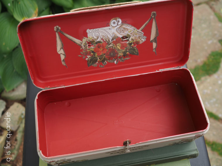
As for the transfer inside the lid, that is from one of the new I.O.D. holiday sets called Stag Tavern.
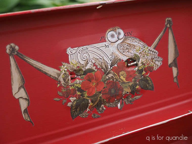
More on that in a minute.
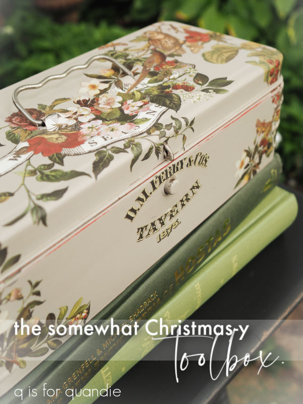
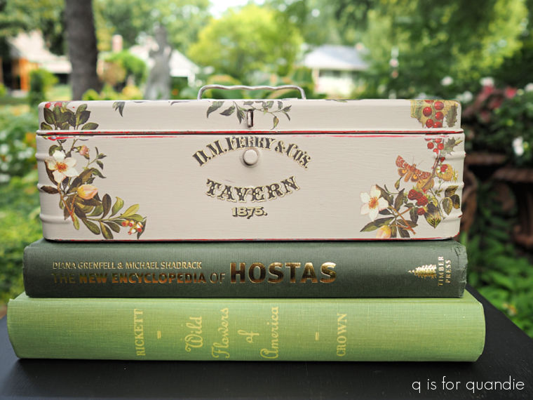
As for the outside, I painted that in Dixie Belle’s French Villa. Once dry, I used more of the Stag Tavern transfers to decorate the top and front.
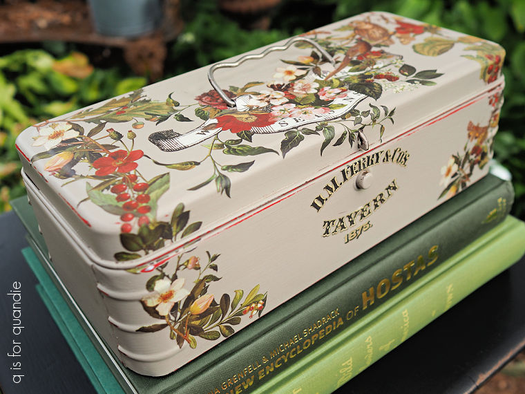
Although these transfers are from the 2026 holiday collection, I don’t think they are overtly Christmas-y.
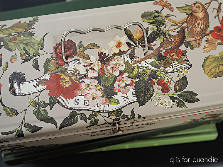
This transfer certainly has the right colors for the season, mainly red and green. And there is a little glimpse of some holly in the upper left. Then there is that ribbon with a mostly obscured message … something about seasons?
So, somewhat, but not entirely, Christmas-y.
Regardless, I do think they are gorgeous.
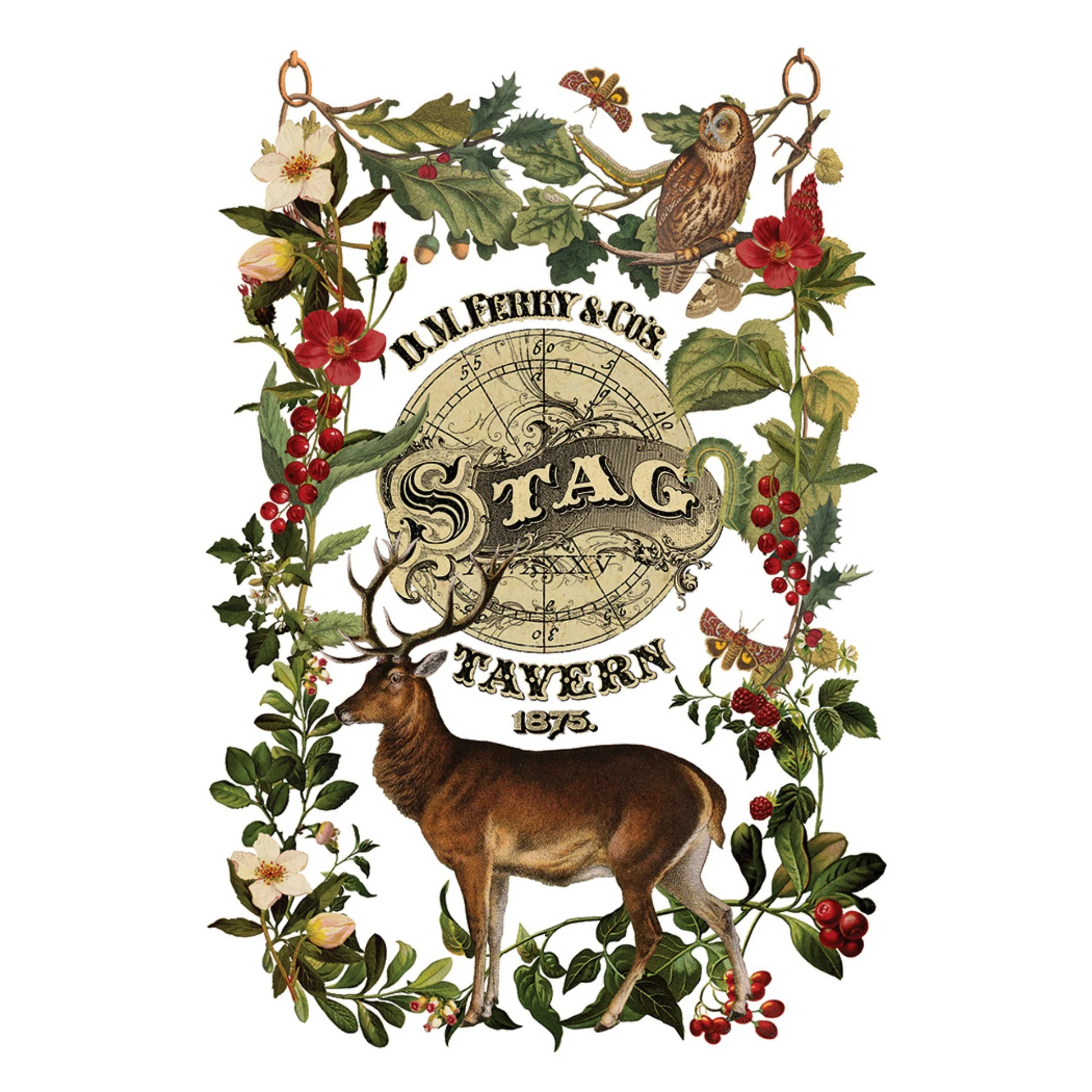
That being said, I also find them difficult to work with because most of the elements are designed in ‘portrait’ orientation (rather than ‘landscape’) like the one shown above, and that doesn’t work well on a toolbox.
Also, because the elements are fairly layered over each other, it’s difficult to separate and re-arrange them into a wider, shorter layout without losing a lot of the design.
In the case of this toolbox, I used the “D.M. Ferry & Co’s.” and “Tavern 1875.” wording, but wasn’t able to use the center “Stag” section because the stag’s horns are layered over it.
I was able to carefully trim out some of the florals to drape down the sides of my toolbox.
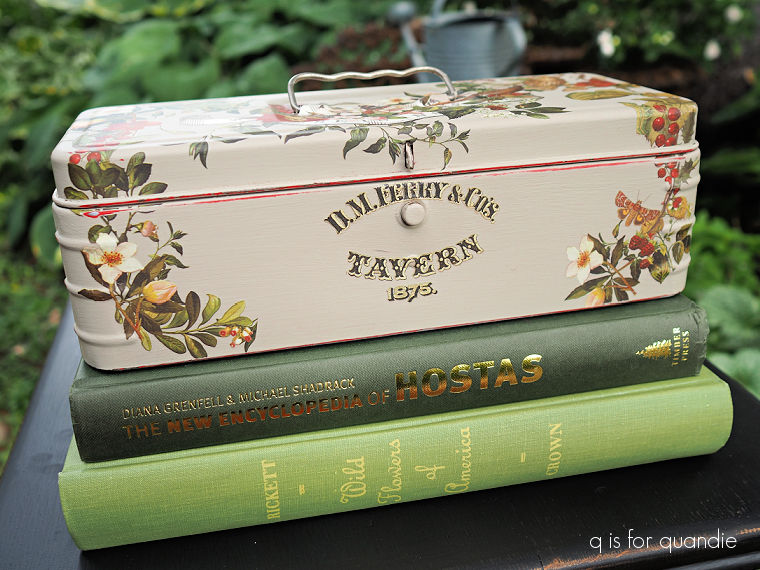
But personally I find that a transfer that includes separate elements that I can put together to suit my piece is more versatile. I suspect I might be in the minority on that though. Let me know what you think?
Let me know what you think of this toolbox too!


This toolbox is beautiful ♡ Love the transfers and colors ♡ Love It ❤️
LikeLike
I love it and am too new at transfers to comment on your question. Love the contrast in colours on inside and out!
LikeLike
beautiful! Just non-Christmassy enough to leave on display all year. The colors are gorgeous! ❤️🎄
LikeLiked by 1 person