
I really, really wanted to like the new gilded transfers from I.O.D.
![]()
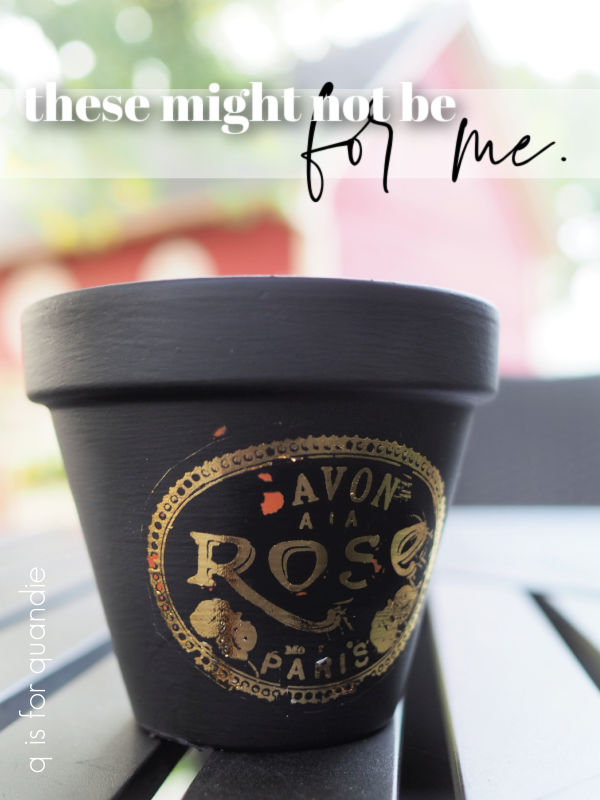
I ordered the one called Étiquettes, because it has all of that fabulous typography. I mean, just look at it. It should be right up my alley. The designs themselves are fantastic. And wouldn’t these be a great addition to some of my toolboxes?
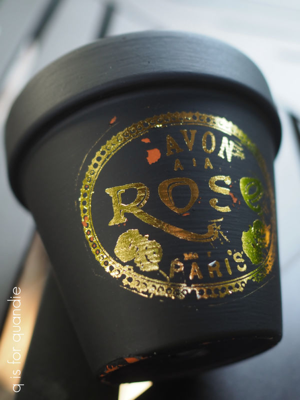
The gilded transfers are a little bit different than your typical transfer. So after watching a handful of YouTube videos on how to apply one, I pulled out a small terracotta pot and painted it black using Dixie Belle’s Anchor for a test run.
One difference with these transfers is that the entire sheet is opaque.
![]()
That makes it a little trickier to place because you can’t see what’s under it, and the usual grid lines have been eliminated. It’s also quite a bit trickier to tell whether your transfer is fully adhered without lifting it up to check behind the backing sheet. In addition, if you rub too hard on the non-transfer part of the sheet it can also rub off onto your project.
So I would say that the application process is a bit more difficult than with a non-metallic transfer.
In addition, the result with a gilded transfer is just not as crisp looking as your typical black (or blue, or white) transfer. For example, the roses on the transfer I used just look like blobs to me.
I also really struggled to get the smallest details to transfer. In this case there was some small writing above the word ‘PARIS’ that I simply couldn’t get to transfer no matter how much I rubbed. I barely even got the ‘PARIS’ to transfer.
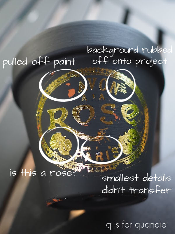
One tip from the videos I watched is to make sure that your paint is absolutely fully dry before applying these transfers. I thought mine was fully dry, but it was a humid day and I only waited a couple of hours after painting before attempting the transfer. As a result there were a couple of spots where the transfer pulled off the paint, rather than sticking to the paint.
I should have let my paint dry overnight, so that’s my fault. If you’re going to attempt these gilded transfers, be sure to give your project plenty of dry time first.
OK, so I will be the first to admit that I’m a bit of a perfectionist. I like a crisp result, and you get that with black transfers, even if they are really, really small.
So the results I got with the gilded transfer just aren’t cutting it for me.
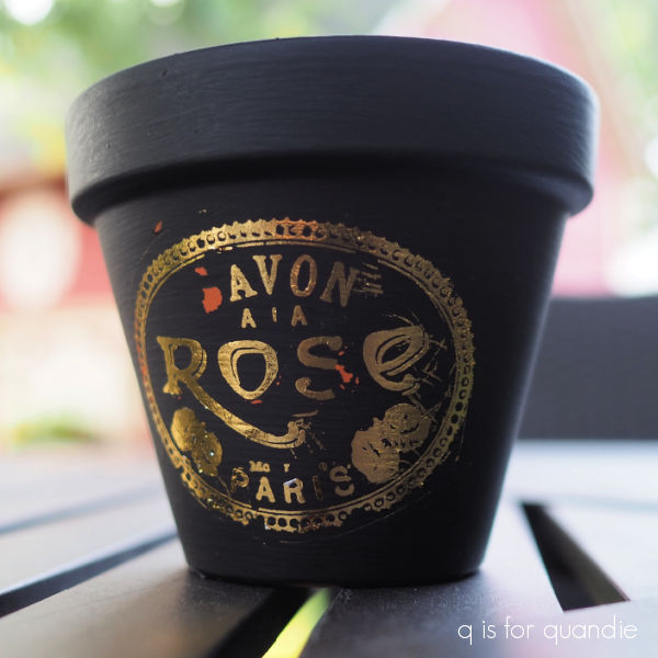
Even without my mistake of not letting the paint dry fully, I wouldn’t be happy with this result.
Back in early 2019 re.design with prima tried to create a gold leaf look with their adhesive transfers paired with their decor foils and I have to admit I didn’t like that look either. I think I used them once and then never went back to them again.
In the end, maybe it’s just that the gold leaf look isn’t for me. It’s simply too shiny for my taste. If you’ve followed me for long, you know I’m just not a fan of super shiny things. And these are very shiny, almost mirror-like.
If a super shiny look is what you’re going for, you might really love the gilded transfers.
I was hoping for a more muted look though, similar to other more matte gold transfers that I’ve used, such as the Flower Collector transfer from re.design with prima.
![]()
Or re.design’s Somewhere in France transfer.
In the end, what I’m really hoping for in a transfer is a fabulous new collection of typography in black that I can use on small projects. Is that too much to ask for?
In the meantime, I haven’t entirely given up on the gilded transfers. I’ll go back to the drawing board and practice with them a bit more and see if they grow on me. As I often say, never say never. A year from now I may decide that I love them, you never know.
Have any of you tried these new transfers? And if so, what did you think of them. I’d love to hear from you so be sure to leave a comment.

sadly, I agree. And the cost isn’t exactly low…..desperate for another decent set of black – like the Label Ephemera (I think that’s what it is called) feeling your pain!! xx
LikeLike
Yep, that’s what they were called, and I’m glad I’m not alone in wishing there was a replacement coming for that one.
LikeLike
I suspect that the rough uneven surface of the terracotta is not optimal for these. I would experiment with transferring unto very clean dry glass which is hard and non-absorbent to get a feel for how they behave. I also think that the very shiny finish would be more pleasing against pastel colors or even over one of IOD’s more recent floral releases. I have similar crazy issues with the paint transfers, and I think the amount of humidity and schmutz in the air like pollen or dust might present problems. You do beautiful work and I wouldn’t throw the towel in on these because you had an unsatisfactory result. Sometimes we have to stretch further than we anticipated, but the experience improves our work!
LikeLike
Great idea to try these on glass! I’ll give that a shot. I also think layering these over something floral might be more appealing than using them on their own. More experimentation to come!
LikeLike
I have to agree with you. I am not a fan of the shiny gold transfers, though I do like the matte gold from re.design. Fingers crossed we will see small black transfers similar to Label Ephemera in the next release.
LikeLike
Fingers crossed, but I’m not holding my breath. I’ve been hoping for a while now 🙂
LikeLike
Hi Linda!
Well, I’ve been sitting on my hands to give someone else a chance to get the Duchesses Toolbox, and I see it is still available.
I would love it! For my non-collection of toolboxes!
I can VENMO you but if you prefer cash I can do that just as easily.
We could use the silent, handsome, coffee-drinking courier method of transfer? 😉
Thanks!
Connie
>
LikeLiked by 1 person
LOL, handsome and coffee drinking, yes. Silent? Not so much 😉 Consider the toolbox yours! I’ll send it with Mr. Q on Thursday. You can just venmo me between now and then.
LikeLiked by 2 people
Typically I love the IOD transfers but these, not so much. I don’t know if a project that I would like them on. Perhaps on an amber apothecary jar. Glad you showed us the results before I invested in them.
LikeLike
Oh, I like that idea too. I may have to try that and see if I like these transfers on amber glass.
LikeLike
I was almost tempted to purchase them, but after seeing the videos and how hard they had to rub to get them to adhere, I said for the price that is too expensive for results that I may not like…I like all the IOD products, but I think this one is a miss. And since you are a pro, it just validates my decision…I will spend my funds on the other cute products.
LikeLike
There definitely are plenty of other options to choose, like the Rose Botanical transfer!
LikeLike
yes, that is the one I got. I can’t wait to see your creations
LikeLiked by 1 person
A couple years ago I purchased some small gold and silver metallic transfers that were lovely small embellishments with stars, numbers, swirly corners, arrows, etc. (I believe they were Tim Holtz). I had the exact same experience you describe with fragile transfers and difficulty with sticking, and lack of crispness in some of the transfers. They were shiny metallic as well, so that may be the nature of shiny metallic transfers overall. I don’t think your paint dryness was the culprit. I did get better at using the transfers after some experience with them and being aware of the way they worked. But I will not be purchasing any more shiny metallic transfers – thanks for sharing your failures as well as successes!
LikeLike
Now that you mention it, I think I had those same Tim Holtz transfers! Maybe ‘shiny’ and ‘transfer’ just don’t go together.
LikeLike
What if you antiqued over the whole thing to tone it down a bit. Not my taste either.
LikeLike
I did think about trying that, and it might work to tone down the shiny. I may have to give that a try.
LikeLike
I am with you on this one. I love the Somewhere in France but not these new ones from I.O.D. I am not wasting my money on this.
LikeLike