the greens of scotland.

While I was inspired by all of the shades of blue I saw in Norway on our recent trip, in Scotland it was all about the greens (and maybe the sheep!)

So when I saw this pretty green transferware platter at the Barn Chic Vintage sale, I snatched it up and decided that I needed to paint something green.

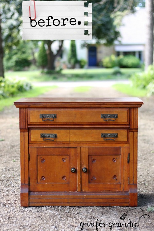
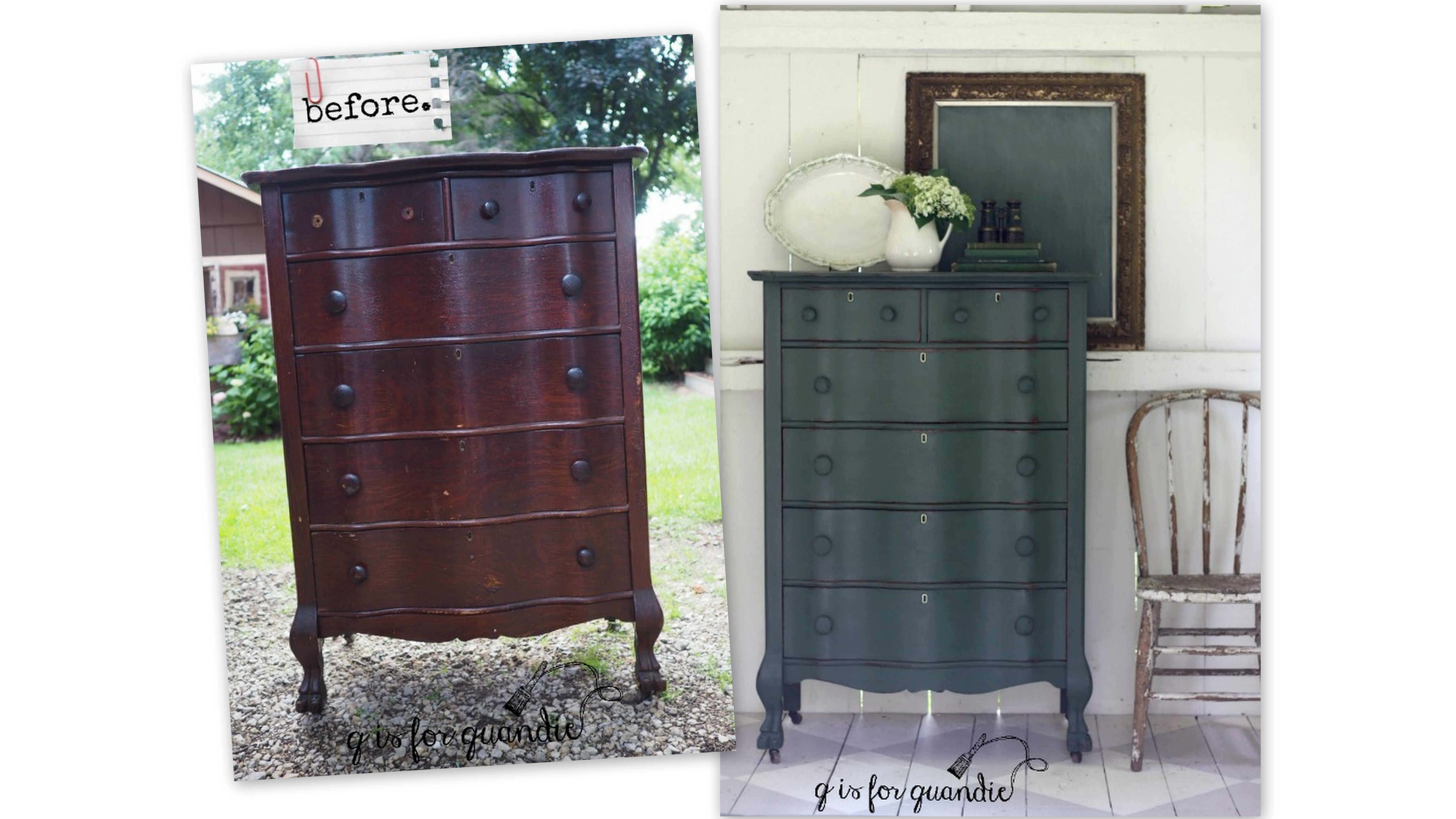
Mr. Q had recently brought home this tall serpentine dresser with lovely claw feet.  His step-dad’s ex-wife (is there a better title for that relationship?  step-ex maybe?), who is also a very supportive follower of my blog, snagged this for me from her neighbor who was having a garage sale (thanks again Sherry!)

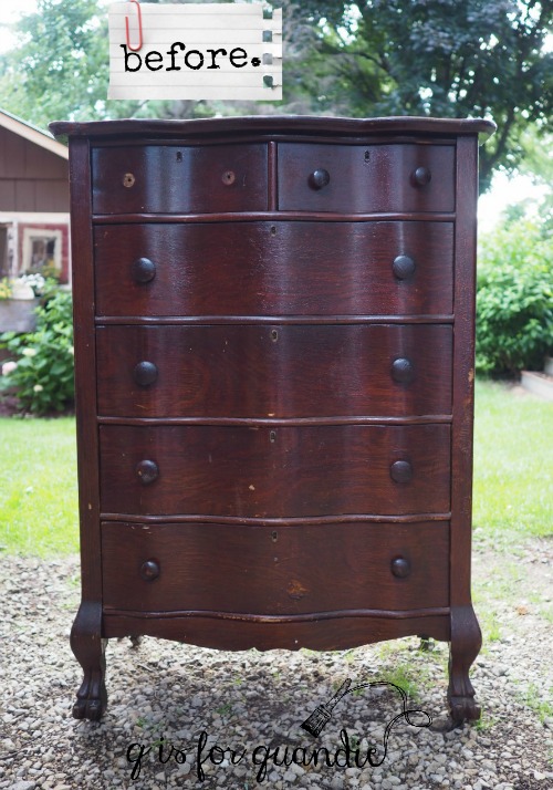
It needed a little work.  Ken replaced a drawer bottom that was damaged beyond repair and I dealt with some veneer issues by patching with wood filler.

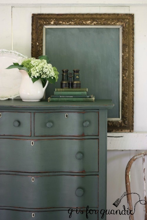
Next I pulled out my paints to see what my options were for green and I had quite a few.  I had some of Miss Mustard Seed’s Lucketts Green and Boxwood.  I also had several shades of green milk paint that Homestead House sent me, Upper Canada Green, Gatineau, Acadia Pear.  In the end I opted for Homestead House’s Bayberry.

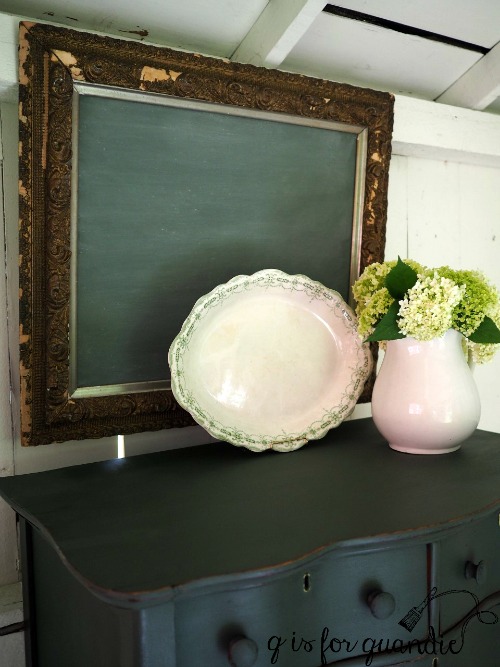
I found it a bit challenging to get a photo that shows the true shade of this green.  It’s a deep green that leans more towards the blue side rather than yellow, and with a grey undertone.  I added a topcoat of hemp oil, which deepened the color quite a bit.

While working with the Bayberry, I discovered it makes the perfect ‘chalkboard green’.  That’s it on the gold framed chalkboard, without hemp oil and after being ‘seasoned’ with chalk.  From now on rather than mixing MMS Boxwood and Artissimo to make green chalkboard paint, I’ll just use Bayberry straight up.

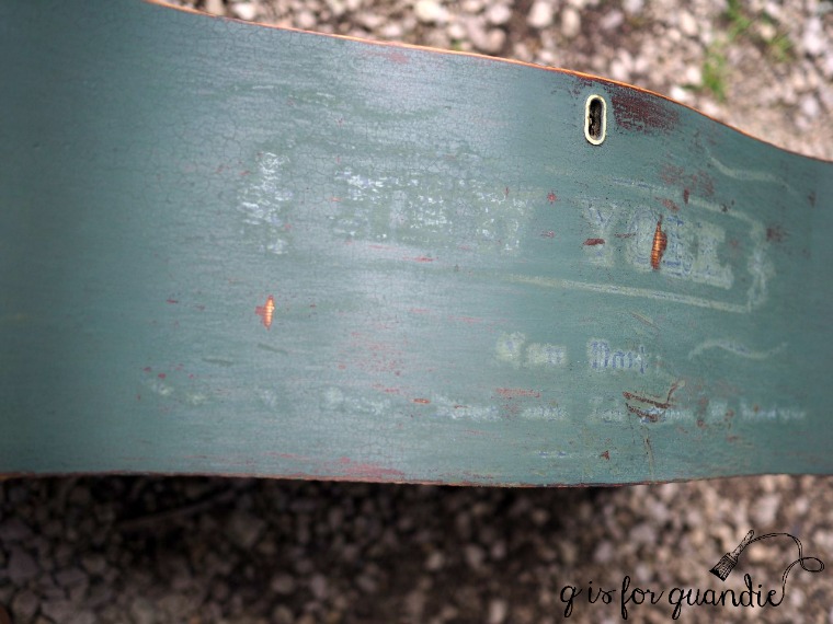
I also tried a little experiment on this dresser.  I added part of an Iron Orchids Design furniture transfer.  I wasn’t sure how well it would show up on a dark color like this, and I knew I was taking a chance that it wouldn’t work at all and I’d have more work to do to correct it.

And as it turns out, transfers and dark colors don’t mix.  I expected that the transfer wouldn’t be as obvious over a dark color, but I didn’t expect that that filmy sort of white halo would be so much more noticeable.

Speaking of which, after getting a question from Nancy recently about the ‘cloudy halo’ that you can see with the IOD transfers, I reached out to Sally at Iron Orchid Designs.  She told me they are working on improving their product to minimize that halo, but in the meantime the transfers are best suited for light colors.  In addition, she said that a little light distressing with a fine grit sandpaper can help blend it more on light colors as well.

OK, so next came the ‘fix’.  I was hoping I could use a sharp razor blade to remove the transfer without damaging the paint too much.

Nope.  That didn’t work.  That transfer was stuck good.  Really, that’s good news since it means the IOD transfers are pretty durable and won’t just easily peel off your surface.

On to Plan B (or would it be C at this point?)  I knew this was going to be dicey at best, but it was worth a shot.  I sanded down the two drawers with the transfers, sanding off the transfer as well as most of the hemp oil.  Then I wiped them down with TSP substitute to further reduce the oil.  I had a little bit of my mixed paint left, so I stirred it well and added a fresh coat to the two drawers.

I’ve had issues in the past with getting different shades of green doing this.  I posted about that here.  Over time as green milk paint sits it tends to change color slightly.

So, I do know better.  But I thought I might as well try it since I had the paint.  Worst case scenario I have to re-do ALL of the drawers.

Yep, worst case scenario.  It’s not a really glaring difference, but enough of a difference that it bugged me.

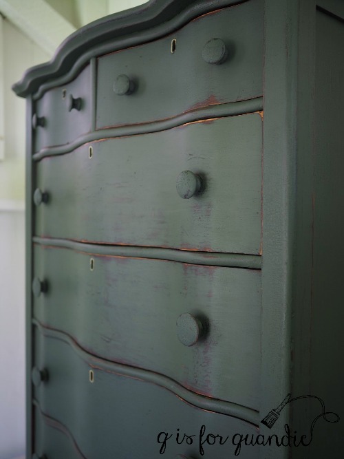
So, back to sanding and cleaning each drawer with TSP substitute, mixing up a fresh batch of Bayberry paint and repainting each drawer.  I didn’t have to do the body of the dresser, just the drawer fronts.

In the long run it would have been smarter to try this experiment with Fusion acrylic paint or chalk paint.  That way I could have gotten away with just repainting the two drawers.  Hindsight is always 20/20.  I hope that by sharing my failures in this way, you guys can learn from them and not make the same mistakes.

To recap.  New lesson learned:  don’t use IOD transfers on dark colors.  Old lesson reinforced:  paint your milk paint pieces all at once, you can’t go back later and just paint one or two drawers.  Got that?

I promised ‘dibs’ on this dresser to the original owner.  But if she doesn’t want it back, it will be for sale.  Be sure to check my ‘available for local sale’ tab for more details.


stavanger street art.

Although Mr. Q pretty much indulged me and was very patient about wandering around charming old wooden houses in Gamle Stavanger on our recent trip, he’d pretty much had enough of that after a couple of hours.  That was when we headed into the Tourist Information center that was located right next to our ship and found a postcard about the Stavanger Street Art walking tour.

Before I go any further, let me give you Wikipedia’s definition of street art:  Street art is visual art created in public locations, usually unsanctioned artwork executed outside of the context of traditional art venues. The term gained popularity during the graffiti art boom of the early 1980’s and continues to be applied to subsequent incarnations.

Stavanger hosts a street art festival every year hosted by Nuart and is one of the world’s leading destinations for street art.  I’ve always been a big fan of street art and I love the idea that Stavanger is embracing this art form.  I had done a little reading about the street art in Stavanger before our trip, so I was pretty excited to realize that not only was there was a tour, it was conveniently starting in just a little over an hour!

We purchased tickets for the tour right there at the tourist info center (it was about $36 for two) and then headed back to the ship for a quick lunch.  Then Mr. Q and I headed back to the TI to meet our tour guide.  We were starting to wonder if we were in the right place because there were only two other people waiting, but our guide showed up and we realized the four of us were it.  The other two people on the tour were a writer and a photographer from Portugal who were doing an article on the Stavanger street art scene for a magazine.  A little later we were joined by two more ‘tour guide trainees’ who were learning from our guide, Michael (in the green jacket).

 I think you can easily pick out the photographer from the magazine in that photo, right?  She had a very nice camera!

Michael was very energetic and led us quickly from spot to spot while educating us about particular street artists as well as the various techniques they use such as stenciling.

Yep, basically the same kind of stenciling I do on furniture … well, sort of.

An artist named Jaune from Brussels did a series of these “working class heroes” pieces, and I just loved the humor in them …

as well as his use of actual infrastructure like the metal ring above or the 4 pipes coming out of the wall below.

As a former sanitation worker himself, Jaune is symbolically freeing them from their work.  Amen to that Jaune!

I also thought these electrical boxes stenciled to look like buildings by the German artist Evol were pretty cool.

They were so realistic looking, and you know how I love anything miniature!

This next piece by Norwegian artist Martin Whatson was another of my favorites.

The black and white character is stenciled first, and then the colorful ‘tags’ are added after.  I love his use of vibrant colors to contrast with the black and white, don’t you?

Speaking of color, Bortusk Leer paints these brightly hued ‘happy monsters’.

Our guide explained that Bortusk’s goal is to cheer people up, as evidenced by his motto “Cheer up you bastards”.  Ha!

This next artist likes to incorporate surrounding foliage.  I don’t think I would have noticed this piece if our guide hadn’t pointed it out.

However, this next piece caught my eye from a block away.

I was surprised that our guide wasn’t leading us over to this one.  I could tell that there was something a little bit different about it, so I kind of veered off from the group to take a closer look.

The writer from Portugal followed me over and started to tell me that this piece was done by a Portuguese artist named Vhils.  He uses a ‘hammer drill’ to remove the outer layers of the wall revealing the brick behind.  According to his website, by “applying his original methods of creative destruction, Vhils digs into the surface layers of our material culture like a contemporary urban archaeologist, exposing what lies beyond the superficiality of things, restoring meaning and beauty to the discarded dimensions buried beneath.”  That’s a kinda fabulous concept, right?

Soon Mr. Q and the magazine photographer had left our guide and wandered over to look at this piece too.

Our guide finally realized he’d lost his group and came over to accuse us of ‘eating dessert first’.  As one of the most impressive street art pieces on the tour, he’d been saving this one for last.  Ooops!  I messed up his plan.  I could tell that the pair from the Portuguese magazine were happy to realize that our guide wasn’t totally dissing their favorite artist!

Once our guide had us back under his wing, we checked out a couple more pieces and our tour was brought to an end.  We had just enough time to make our way back to the ship and hop on board before sailing to our next port, Flåm.

Be sure to check back next Wednesday because Flåm was definitely one of the highlights of our trip!


just the right white.

There are so many shades of white out there!  And I’m sure you will all agree with me that sometimes choosing the right shade of white can be just as difficult as choosing a color!

Normally I lean towards the creamy whites; Miss Mustard Seed’s Linen, Fusion’s Limestone and Annie Sloan’s Old White.  These warmer shades of white tend to play well with others.  A piece painted in one of these colors can be brought into your room without everything else suddenly looking dingy.  My ‘Specimens Cupboard’ (below) is painted in MMS Linen as are most of the white pieces in my own home.

When I brought home this charming antique washstand last week, I initially thought maybe I should paint it black.

You see, it has these amazing original black knobs.

I don’t know exactly what it is that appeals to me about these knobs, but I just love them.

And had I painted the washstand black, the knobs would have just blended in and I wanted them to really pop.  I also rejected the idea of pairing a color with the black knobs.  So that left white.

  As for what type of white paint, with an old piece like this washstand I like to go with milk paint.  I feel like nothing emphasizes the vintage character of an old piece like a chippy milk paint finish.

Choosing which shade of white ended up being a bit more complicated.

I started with my current go-to warm white milk paint, Homestead House’s Limestone (which is very similar to MMS Linen).  After painting the first coat I realized that it felt just a bit too creamy for this piece, so I decided to switch it up and for the 2nd coat of paint I went with Miss Mustard Seed’s Farmhouse White.  Once that was dry, it was really just a bit too … well … white.  It felt a bit sterile on this piece.

So I decided to try Miss Mustard Seed’s Grain Sack for my 3rd coat of paint.  Grain Sack is a white with a definite grey undertone.  I’ve paired this color with black accents before and loved the results (here).

Sure enough, the 3rd time was the charm!  The Grain Sack is perfect on this piece.

Now you might be thinking to yourself, “what a bummer to waste all of that paint before landing on the right white.”  But actually, this piece would have required three coats of paint for good coverage anyway.  And since these were all shades of white, I was able to get away with just that one final coat of Grain Sack.

The chippy-ness gods were smiling on me with this piece.  I got just the right amount of chipping.  It looks authentic, but not overdone.  I’ll admit I didn’t use any special technique to get this result.  I did scuff sand this piece, followed by a good cleaning with TSP substitute and then I just started painting.

Once the paint was dry, I sanded lightly and then vacuumed away any chipping paint.  The last step was to add some Miss Mustard Seed furniture wax which brought out a little more of the grey and also added some ‘age’ back to the finish.

Oh, but wait, I almost forgot!  Before I waxed I added just the tiniest portion of an Iron Orchid Designs furniture transfer to the upper drawer.  ‘1871.’

It’s just a subtle little touch that adds a bit of whimsy.

I have to note here that sometimes the white that works perfectly on one piece doesn’t work at all on another.  I was perfectly happy with Farmhouse White on my belgian bench, and I loved Homestead House Limestone on the farm fresh chalkboard, I just didn’t love either of those colors on this piece.  I’ve also found Grain Sack to be too grey for some pieces, while it worked perfectly on this washstand.

 Sometimes you just have to experiment a little to find the white that is just right.

Andy by the way, sometimes you have to experiment to find the staging for your photos that is just right too.  I started out using some geraniums and other green accents …

but out of two dozen photos this was the only one that I liked.

Next I decided to play up the black knobs a little more by using black props.

But I found I was having a really hard time getting the correct color of the grainsack in my photos because there was so much white inside the photo cottage.

So once again I resorted to photographing the piece outside.

Maybe outside photos are just going to be my thing and I should stop trying to fight it.  What do you think?

Meanwhile this sweet little washstand is for sale.  If interested, be sure to check out my ‘available for local sale’ page for more details.