

I fully admit, I’m a sucker for attractive packaging. So the other day when I was at Home Depot waiting for some paint to be color matched (to touch up the Carriage House), I was browsing the spray paint aisle and came across this …
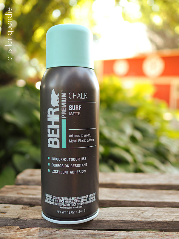
This is Behr spray chalk paint in a color called Surf. Isn’t that a nice looking can of spray paint? Somehow it’s much more appealing than your typical can of spray paint.
Am I right? Or is it just me?
And I didn’t even know that Behr was making a spray chalk paint, did you?
It was priced at $9.99, which is just a tad steep for a can of spray paint. But I went ahead and threw it in the cart to give it a try anyway.
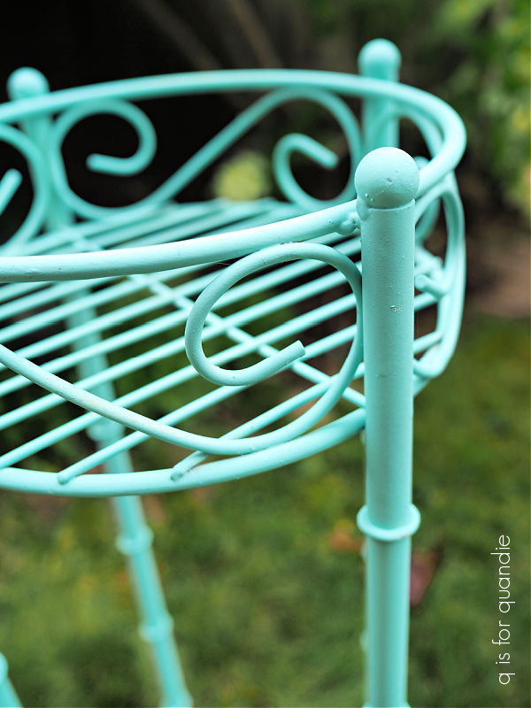
I pulled out this metal plant stand that I’d purchased at a garage sale earlier this summer to be my guinea pig.

After giving it a good cleaning with soapy water, I gave it a few quick coats of the spray paint.
One thing I noticed right off is that this spray paint does not dry nearly as quickly as traditional spray paint. Just something to keep in mind if you plan to try it.
But it went on beautifully, and it did have a nice matte finish similar to chalk paint.
I got some paint on my hand when I accidentally touched the plant stand before it was dry, and it was not as easy to wash off as chalk paint typically is.
I didn’t attempt to distress the plant stand, so I can’t speak to whether or not the spray chalk paint distresses as easily as other chalk style paints. I’ll have to experiment with that on another project.
I checked out the Behr website and found a blurb in the description of the product calling it a “simple two-step paint and wax process.” However, the instructions for use didn’t say anything about having to add a topcoat, wax or otherwise.
But I would guess that it needs a topcoat for durability based on them calling it a “two-step process”, and that you can use any topcoat that you would normally use with chalk paint.
However, I didn’t add a topcoat to mine because as it turns out, this color is a bit brighter than I thought it would be and truthfully it’s not really my vibe.

So in the end, I decided to go back to the drawing board.
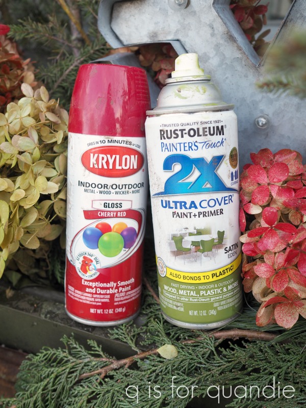
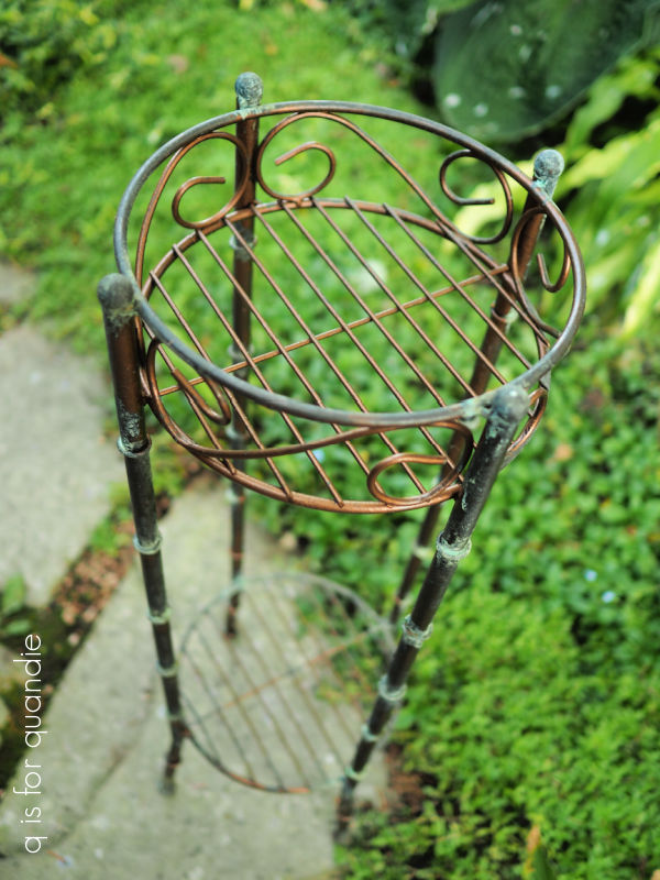
After first spraying over the Surf color with a matte black spray paint, I then brushed on the Dixie Belle Patina Paint in Bronze. While the paint was still wet, I sprayed it with the green activating spray (find a full tutorial on using the Patina Paint here).
Yep, that’s fits my aesthetic much more than the bright turquoise.
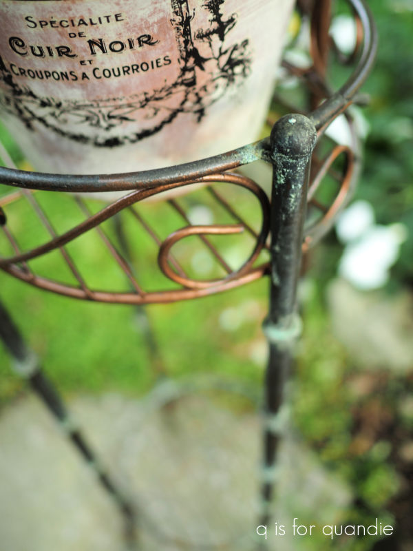
The green spray created a nice bit of verdigris.
After adding a small pot of ornamental kale, I put the plant stand in my recent sale.

It almost sold. And by that I mean that someone put it in the ‘holding area’, but then they changed their mind and didn’t buy it.
Oh well. Maybe next time.
Meanwhile, which version did you like better?
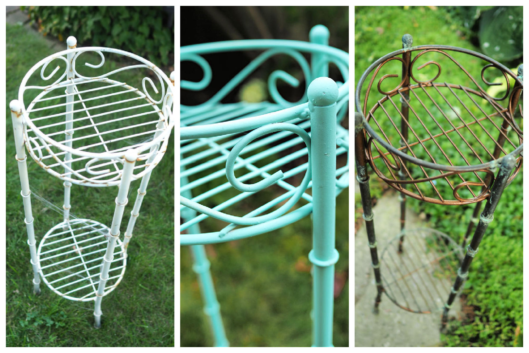
White, turquoise or bronze?
Leave a comment and let me know.

no doubt about it, the bronze is best. Thanks for the heads up on the new HD paint. I have a project I might try it on. But not in turquoise 🙂
LikeLike
Good call Jan! They do have some more neutral choices for sure!
LikeLike
I like the bronze ♡ Looks great ♡
LikeLike
Thanks Diane!
LikeLike
If I still lived in Washington state I would have chosen the bronze one, but now that I live in Florida I would choose the turquoise one😊
LikeLike
The turquoise definitely has that Florida vibe!
LikeLike
Definitely the bronze version!!!
LikeLike
Thanks Cyndi!
LikeLike
It’s the bronze for me. I am usually a sucker for anything turquoise, but I have to agree this spray paint is a bit too bright all on its own. The bronze is beautiful.
LikeLike
Yep, just a bit too bright.
LikeLike
Thanks for trying it out for all of us and giving your honest opinion…..you are gre
LikeLike
You’re welcome!
LikeLike
The bronze, definitely the bronze. Great information about the spray paint though.
LikeLike
Thanks Kathy!
LikeLike
Is the surfs up plant stand still available? I am interested. Thanks.
LikeLike
It is still available, but now I’m in Mexico! I’ll try to reach out when I get back.
LikeLike
Please do. I live nearby in Oakdale. Enjoy your time in Mexico.
LikeLike