
A while back I picked up another simple wooden tote at a garage sale.

I love that the end pieces are curved at the top rather than cut straight like so many of them.
I planned to just do my usual, add paint and maybe some transfers.
Like I did on this one …

And this one …

And this one …

And even this one …

Although technically that is an I.O.D. paint inlay, not a transfer.
So after cleaning and then painting it with some of Dixie Belle’s Drop Cloth, I went through my transfer stash to find just the right thing.
It wasn’t until I started holding bits of transfers up against the tote that I realized the sides were really rather short. In fact, too short for most of the florals that I had thought about using.
Then I saw my old re.design with prima Simplicity transfer, which is a black toile. I’m not even sure if you can get this one anymore. I know there are several other options for a toile transfer out there though, if you’re looking for one.
I had used Simplicity on the upper drawers of a dresser once.

I thought it was pretty, but ultimately it didn’t sell and I ended up sanding it off and re-doing the dresser.
Maybe that was a little bit of foreshadowing as to how this project was going to go.
Or maybe I am just doomed to keep repeating the same mistakes over and over.
Either way, I pulled out Simplicity and decided to try it on this tote.

It was a little tricky to get the transfer situated as one full piece, so I ended up cutting out separate elements of the toile design and adding them one by one.
It was working out fairly well, as I wrapped the toile all the way around.

But then I got to the last side, and decided that I really wanted to use the roosters …

Ummm … yeah … maybe not my finest moment. There is just too much white space all around them. And they are almost centered, which gives them too much importance in the overall design.
Honestly, I just didn’t like it. At all.
You know what they say, if at first you don’t succeed, try again. So I sanded it off and started over with a fresh coat of Drop Cloth!
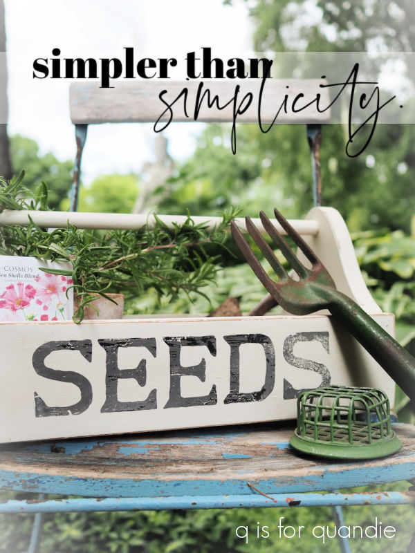
Then I decided to go much simpler than … well … Simplicity.
I just added the word ‘SEEDS’ from the I.O.D. Gregory’s Catalogue paint inlay.

It was the perfect fit.
Also, FYI, this is the 2nd use of this inlay. I used the full inlay once already on this piece …

So I was OK with just taking out that one word and using it on this tote. I can still use the rest of the inlay a 2nd time (and in fact, I do have plans for it).
I will note, as I have before, that I was unable to get the inlay off this tote in one piece, so that 2nd use will be it for this one.
After sealing the inlay with some clear matte spray sealer, I used Dixie Belle’s flat clear coat over the rest of the piece. Then, while I had it out, I also used it to apply some re.design with prima decoupage tissue to the bottom inside.

So, in the end, it’s a much simpler look.

And I really like it.
How about you?

I love both designs! But if forced to choose, the classic black and white toile and roosters would get my first pick. I think it lends itself to a wider variety of decor options. The white space around them doesn’t bother me at all. Everything you create is beautiful and inspiring and makes me want to paint every stick of furniture in my house🤣
LikeLike
Love it!!!! I have a small one, that needs attention…. Great reminder!!!
LikeLike
Have fun with your version Dawn!
LikeLike
Thanks so much Jan!
LikeLike
I LOVE it!! I have a huge vintage wooden toolbox that I just cleaned, sanded and added some stencils to it. I did paint just the inside bottom in white, for it was rough looking. I didn’t paint the toolbox, left it in his original brown wooden color. Looking at your little toolbox I may just paint it, as it has not sold.
LikeLike
I always find that, for the most part, these things sell better when painted. That may change one day, but for now painted items still do better for me.
LikeLike
Awwww. I liked the toile look, even the roosters, but then I like toile.
LikeLike
I like toile too, but there was something so jarring to my eye about that empty space around the roosters!
LikeLiked by 1 person
I like both versions. It always interesting to see how you make over items whether it is furniture or small things.
LikeLike
Thanks Cheryl 🙂
LikeLike
I agree with the simple approach. And the inside makes it perfect. Very versatile this way!
LikeLike
Thanks Sheri 🙂
LikeLike
I like both but I think I like the simpler one better.
LikeLike
I could be wrong, but I think the simpler one will sell better too.
LikeLike
Love the simple one!
LikeLike
Thanks Joyce!
LikeLike
I do love the simplicity of this one❤️
LikeLike
The flowers inside the 2nd one that “makes” it! The first one was great . . . . Until the roosters, lol! Love all your work!
LikeLike
Oh no! I was absolutely loving the transfer. Especially the birds. Fighting chickens? Not so much maybe lol But, I did love the simplicity. 😉
LikeLike