
Finally, I have a piece of furniture to share with you guys today!
I purchased this secretary desk/hutch last fall, as evidenced by the fall colors in the ‘before’ photo which I took right away when I brought it home …
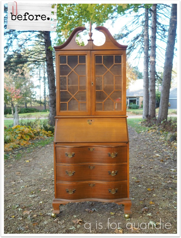
I partially chose this piece because the price was right, but I also thought it would be a fun challenge to totally change it up.
I’ve been storing this one in the carriage house all winter, so it feels good to have it out of there now. When I first started to work on it, I pulled out the little drawer inside the drop down desk section to find that the previous owners hadn’t emptied it out.
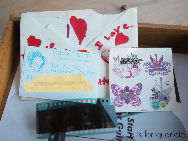
Once again, I was disappointed when I didn’t find a wad of cash or maybe a lost Van Gogh. Instead I was gifted with Hannah Montana tattoos and some questionable film negatives. But I did find it slightly magical that the owner of the handmade drivers license and I share the same birthday. It feels meant to be.
Step one with this piece was to remove that header on the top. I think this may end up being a controversial approach, but I feel like that colonial sort of look is pretty dated … and not in a good way. I also removed the fretwork in front of the glass, the faux key hole escutcheons and the drawer pulls (also decidedly colonial in style). Finally, I removed those very 80’s looking round ball wheels. I’ll admit, they worked really well … but they looked totally out of place on this piece.

I painted the interior of the piece in Dixie Belle’s Sea Glass, and the exterior in their Drop Cloth.
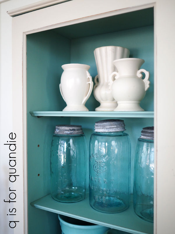
This is such a pretty combination.
It was seriously putzy to paint the interior of the drop down desk portion using a brush. But back when I started on this piece it was only in the 30’s outside, so I had to paint inside the house which meant I couldn’t spray it. If only I had known that it was going to warm up to the 70’s within a week or so. I may as well have waited just a bit longer to work on this one.

By the way, I’ve totally cheated on these photos by taking them before putting the glass back in those doors. I always get so much glare from glass doors. But I will be putting the glass back in before listing it for sale.
Once two coats of Sea Glass were dry, I added a small section from one of the newest re.design with prima transfers called Paris Valley to the little drawer.

The Paris Valley transfer is a collage style mix of various graphics …
![]()
Once again, this is one that you could use as is, but I’ll definitely be cutting it up to use various bits and pieces on lots of different projects. I circled the little bit that I used on that drawer above.
Then I coated it all with Dixie Belle’s flat clear coat. I chose to use the clear coat rather than my usual wax for more durability on both the writing surface of the drop down desk and the shelves.
Next I pulled out another of the new Spring 2020 re.design with prima transfers. This one is called Flower Collector, and I’m fairly sure it’s going to end up being one of my favorites.
![]()
It’s another gold transfer, and for this piece I chose to put it over the Drop Cloth for a more subtle look. These gold transfers also look amazing over dark colors (like this piece).

I’ll point out that I switched up the layout of this transfer, using the bottom section of it on the drop down desk and the rest on the drawers.
![]()
That was a much better fit for my piece. Always keep in mind that you don’t have to use a transfer ‘as is’ out of the package.
Once the transfer was applied, I added a coat of clear wax to the exterior (all of the Drop Cloth parts).
I was planning to put clear glass knobs on the drawers, but then I discovered these knobs in my stash. I had just the right amount, and they were the perfect color. I’m pretty sure I bought these at Hobby Lobby, but it was at least a year ago or more.

One last little detail to share, I did put the brass key hole escutcheon back on the upper door. But first I used Dixie Belle’s patina paint in Copper with their blue spray to give it a verdigris sort of finish which worked beautifully with the Sea Glass color.

It feels so good to have this piece finished at last!

I absolutely love how it turned out. I’m tempted to keep it for my front porch. If it doesn’t sell right away, I might just have to do that.
So, now I’m curious. How many of you wish I had left those original colonial elements in place? And how many of you prefer my slightly modernized version?

As always, thanks to Dixie Belle Paint Co for providing the paint and to re.design with prima for providing the transfers for this project.
If you’re looking for Dixie Belle products you can find them here.
If you’re looking for re.design with prima products you can find local retailers here, or online sources here.
And if you are local and in need of a flower collector’s secretary desk, check out my ‘available for local sale‘ page. Although our ‘Stay at Home’ order has now been extended another two weeks, I am willing to set up a physically distanced appointment if anyone local is interested in this or any other pieces I have for sale.

Loved the pared down version. Sometimes less is more ! Color combo is spot on and the transfers are icing on the cake. Won’t last long I’m betting. You have such a good eye for the combination of all these details!
LikeLiked by 1 person
Thanks Sheri!
LikeLike
I totally agree with removing the top detail. I like fretwork on doors so I would’ve kept that. Having said that, however, it came out gorgeous. Love the color combo.
LikeLike
I was torn about that fretwork too. Even as I was putting the glass back in I debated whether or not I should put the fretwork back in too. But, I let it go …
LikeLike
Love it. But I’m a fretwork lover too. But either way would work for me. Reallu hate the top piece, so glad it’s gone. Amazing what some paint, transfers and elbow grease can do for a tired piece of furniture.
LikeLiked by 1 person
I LOVE it!!! Wow what a difference.
LikeLike
Thanks V!
LikeLike
What a beautiful transformation! Much better with the de-colonialization. I love the Sea Glass color inside! My living room walls are a similar Sherwin-Williams color called Sea Salt. The secretary would look amazing by my front door but, alas, I live on the West Coast. I also want to say that I never feel “cheated” when you blog about something other than furniture. I LOVE furniture but often don’t know what to do with “little things.” So thank you for the well-rounded inspiration!
LikeLike
You’re welcome Connie!
LikeLike
It definitely looks better with the parts removed. Such a pretty piece. I love Sea Glass. Great job.
LikeLike
Sea Glass is one of my favorites too 🙂
LikeLike
You removed just the right elements – especially the ball wheels! That’s one of my favorite color combinations and I’m sure this won’t be on your porch long enough for you to get attached to it! Great work, as usual.
LikeLike
Those wheels were so ugly, but they must have been somewhat expensive originally because they rolled smooth as silk. Still, they had to go!
LikeLike
Yes!! Loose the colonial style elements! That’s what I do. This piece is beautiful and fits in many styles now.
LikeLike
Thanks Sharon!
LikeLike
Removing the period details has ensured that this piece will live on well into the future which is the goal, after all. All of your choices are spot-on!
LikeLike
Thanks Kim!
LikeLike
Love the revised version-much cleaner and less fussy. I love the finish on the escutcheon!
LikeLike
I love the patina paint from Dixie Belle, it’s so fun to create authentic aged metal!
LikeLike
I definitely like it better now. Good call pulling off the colonial stuff. Love the colors together too!
LikeLike
Thanks sis!
LikeLike
i love the new version. I especially disliked the old hardware and I am never sure what would look good in it’s place. Great choice. I wouldn’t change a thing!
LikeLike
I know, I really dislike that particular style of hardware as well. I rarely leave it on a piece.
LikeLike
Love the updated look and the colors and transfers you used. Doesn’t even look like the same piece!
LikeLike
Thanks Laura! That’s what I was going for, a whole new look 🙂
LikeLike
I’ve never liked that top piece on furniture so I’ve taken it off a couple times too. I like the fretwork but love the cleaner lines of the renewed desk. Great job. Thanks for sharing all the neat things you do. Love your blog.
LikeLike
Thanks so much for your continued support Jeannie!
LikeLike
I would have left the interesting fretwork, but other than that it’s beautiful.
LikeLike
I did like the geometric feel of the fretwork. Maybe next time 😉
LikeLike
Love the color combo ~ I like it better without the fretwork, but I’m torn on the header. Looks beautiful though!
LikeLike
Thanks Sue!
LikeLike
Miss Quandie this is a beautiful beautiful piece! I just love it! I think that if you’d left the top on it it would have been beautiful, too because, IMHO, the Drop Cloth would have un-dated it. But, we’ll never know hahahaha……. the blue/white combo is so pretty……..and the knobs you chose are perfect for it…….they are large and substantial without being distracting visually. Another winner for you Miss Quandie! ;-D
LikeLike
I think you’re probably right about that Connie, paint would have updated that header. But it was fun to see how it would look without it too 🙂
LikeLike
I love the new look! I would have never thought about all the changes you made, it showed me how to “think outside of the box.”
LikeLike
Awesome! Sometimes there are lots of ways to totally change up the look of a piece!
LikeLike
Absolutely lovely!!!
LikeLike
Thanks so much Michaela!
LikeLike
Love everything you did. I like fretwork but it shows off your collections so much better without it. Wonderful job!!
LikeLike
That was my thought as well, if you really want to see what’s inside it’s better without the fretwork 🙂
LikeLike
Linda, i love your new creation! The combination of white and blue is gorgeous, and that transfer was meant to be. Amazing piece!
LikeLike
Thanks so much Olga!
LikeLike
Quandie. It’s fabulous! I probably would have kept the fretwork. But it really turned out lovely.
LikeLike
Thanks Beth!
LikeLike
Lovely! The look you were going for would not have worked with the colonial items so it is smashing as it is!
LikeLike
Thanks Mary!
LikeLike
Genious the changes you made! That piece is right up my alley, looks amazing as always!
LikeLike
Thanks Melanie!
LikeLike
Wonderful transformation! Love!
LikeLike
Thanks Laura!
LikeLike
oh I’m drooling- love every inch of it! Wonderful job!
LikeLike