
Sometimes I take on a piece that I think is going to be a fairly simple makeover and it just ends up taking forever. Today’s piece is one of those.

First off, we drove to a galaxy far, far away (to the opposite side of the Twin Cities) to pick this one up. I’m really not sure what possessed me. Normally I won’t go that far for a piece of furniture. And it wasn’t particularly bargain priced either.
I guess something about it just spoke to me. I also thought it would be a quick paint job, but that ended up not being the case.
My initial plan was to strip and wax the top, but then I discovered that it’s full of really deep scratches. So deep they seem to go right through the veneer in some spots.

So that scraps that idea.
Next, one of the pulls was missing and one was broken. Sigh. You know what that means. All new hardware. Then as the icing on that cake, when I removed the rest of them I found that they had all left big gouged out rings around the holes. Those had to be filled before I could move on because the new knobs I selected wouldn’t cover up those rings entirely.

Next, as Mr. Q and I were moving this piece around to get that ‘before’ photo taken I realized that one of the back legs was a bit wonky. So I had to ask my handyman Ken to take a look at that and do some repair work. That required taking the back off the piece so that Ken could get to some nails that were holding the leg in place. He removed the nails, then the leg, and then added fresh glue and new screws to hold the leg in place. It’s much sturdier now.
Finally, my initial plan was to paint this piece either white or pale grey and then use a Prima Marketing transfer on the front. However, I quickly realized that the mahogany stain on this piece was going to be difficult to cover with a pale paint color.
So at that point I re-evaluated. It was time to consider using a dark color to save myself further headaches, and that meant no transfer.
Then I remembered a tutorial by Brandy from Brushed by Brandy I believe you have to join the How to Paint Like a Pro Facebook page to watch that video though, so if you aren’t already a member I encourage you to become one. Brandy used the new Prima Marketing re.design decor wax with a stencil. Eureka! If I hadn’t seen her video, I don’t think it would have ever occurred to me that I could stencil with these waxes.

And it just so happened that Prima Marketing had provided me with a bunch of their new waxes, as well as some of their amazing stencils. So I had all of the necessary ingredients to try this technique.
So I started with some test boards. These were just scrap chunks of unfinished board. I painted them with various Fusion paint colors and then stenciled them with the different wax colors.

From left to right the paint colors on the boards are Ash, Bedford and Midnight Blue. I tried several wax colors over each paint color. This was a great way to both practice stenciling with the wax, and also to see how I liked the various colors together.
I quickly realized that my two favorite combos were the Diamond Dust wax on the Bedford paint …

and the Galaxy wax on the Ash paint.

Obviously I’m a fan of the more subtle combinations, but there are many different looks that you can get using these waxes with a stencil.
Since I wanted to keep my paint color dark, I decided that the Ash would be my best bet, paired with the Galaxy wax (now are you getting my galaxy far, far away title?) Some black knobs with a matte finish that I found at Hobby Lobby would be the perfect finishing touch.

After my usual prep of light sanding followed by cleaning with a damp rag, I painted the buffet with two coats of the Ash.
Once that was dry, I used the Imperial Damask stencil and the Galaxy Decor Wax (both from the Prima Marketing re.design line) to add the most subtle textural-looking design onto just the door and drawer fronts.

Isn’t that a cool look? Although it looks fairly pronounced in that photo, it actually looks a little bit more subtle in real life. In a dimly lit room you can barely even see the damask pattern. And it also shows up better at certain angles more than others.

In case you are wondering, once it has dried/hardened the wax does not smear or rub off.
I couldn’t resist adding a gorgeous pop of color to the inside of the buffet with Dixie Belle’s Peony.
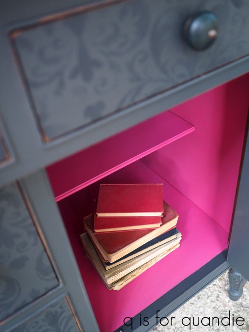
I just love this beautiful vibrant pink. Using this color on the outside might scare off some of my more conservative mid-western buyers, but having it on the inside is a whole different story. It’s just there to make you smile when you open those doors.

I debated adding some of the wax to the carved details on the buffet to highlight them, but in the end I just distressed them and left them alone.

This next photo gives you a better feel for how subtle the waxed stencil pattern is from straight on.

In the long run, I’m very happy with how this piece turned out!
If you’re wondering where to purchase the Prima Marketing re.design stencils or decor wax, check out their ‘where to buy’ page.
If you’re wondering where to buy the Fusion paint in Ash, check out their ‘where to buy‘ page.
If you’re wondering where to buy the Dixie Belle Peony paint that is inside the buffet, you can shop with them directly online or find a retailer near you.
The knobs came from my local Hobby Lobby but you can also find them online.
And finally, if you happen to be local (Twin Cities, MN) and in need of a gorgeous dresser, check out my ‘available for local sale’ page for more details on the buffet from a galaxy far, far away.


It turned out gorgeous!! Immediately felt like it would be an amazing bathroom vanity – with double sinks. Of course – probably too tall – lol especially for my 5’2″. Beautiful ‘SAVE’ as always. 💗
LikeLike
Thanks Carmelina! Yep, it’s a bit too tall for a bathroom vanity, and no real way to cut it down without losing those cute little legs.
LikeLike
This is beautiful! I love that the stencil is so subtle!
LikeLike
Thanks Pat. I love the subtlety of this look too!
LikeLiked by 1 person
Beautifully subtle.
LikeLike
Thanks Cyndi!
LikeLike
Just gorgeous! I love, love, love this look. Again, I wish I lived local to you!
LikeLike
Thanks Kim! Hopefully someone who does live near me feels the same 😉
LikeLike
Great job on this one, as always. Love that it kind of changes depending on where you stand to look at it. Beautiful…and the pink is so unexpected…it pops with color! Love it.
LikeLike
I love that pop of pink too, but I have to say … my handyman Ken is not a fan 😉
LikeLike
Amazing, what a great finish you put on this piece.
LikeLike
Thanks Skip! It’s almost as pretty as that lovely buffet I got from you 🙂
LikeLike
Oh My! this is a true beauty, you chose a wonderful way to re-love this piece
LikeLike
Thanks Laura! I think it turned out pretty good considering that I had an entirely different idea in mind when I purchased it. Just goes to show that sometimes you have to just let your plan evolve depending on the piece.
LikeLike
Yes! 🙂
LikeLiked by 1 person
Love it and thanks for inspiring with new ideas! If only you were closer…
LikeLike
You’re welcome. I was happy to discover this technique by watching Brandy’s video, so I’m glad I can then share it with even more people.
LikeLike
Wow!! Such a great makeover!
LikeLike
Thanks Valerie!
LikeLike
This dresser turned out beautiful! I love the color and the subtlety of the stencil. The style of the dresser is very pretty. When you used the wax with the stencil, did you dab or use a circular motion? Is it just like using paint? Did you have to offload the wax a little? Thanks for sharing. The dresser turned out beautiful.
LikeLike
I used the same technique I use when stenciling with paint. So that means I dipped my stencil brush in the wax, then offloaded any excess wax on a paper towel, then used a stippling (pouncing) motion to apply. I found this to be a bit easier and more forgiving than using paint. Probably mainly because it is a more subtle look so the mistakes just don’t show up as clearly.
LikeLike
Thanks Linda 😊
LikeLiked by 1 person
Beautiful work !!
LikeLike
Thanks Darlene!
LikeLike
I love it! I am looking around my tiny house trying to figure out which piece of furniture I could swap this out with without my hisband noticing. Sadly, there isn’t one. Sigh.
You are doing amazing things and I want them all!!!
LikeLike
LOL, yeah, it would be a little hard to just sneak this one in 😉
LikeLike
That is Gorgeous!!!!!!!!I love blue and you took the color up a notch.
LikeLike
I think my photos might make the color look a bit more blue than it really is. It’s really a fairly warm deep charcoal grey.
LikeLike
Miss Quandie! Once again, boom!
LikeLike
Thanks Connie!
LikeLike
Beautiful!!! I love what you did on this piece! You continue to amaze !
LikeLike
Aw shucks! Thanks Shelly 🙂
LikeLike
U ABSOLUTELY love the way this turned out. I am going to try this!!
LikeLike
Definitely give it a try. It’s a super simple technique!
LikeLike
Love this look, so classy yet fresh! Linda you are just amazing and love your titles! I have an old dresser from my grandfather that I think I would like to attempt this technique! Thanks for sharing!!
LikeLike
LOL, I’m so glad that someone appreciates my titles 😉
LikeLike
This piece of furniture is a one-of-a-kind. It’s a classic beauty and the stenciling adds a subtlety to it that makes it amazing. It reminds me of the classic beauty of Audrey Hepburn, Katherine Hepburn and Lauren Bacall. You see them and think immediately of that old style class and beauty – one that surpasses time and changes of style. This is definitely a forever piece. If it were mine, I’d sit around all day just gazing upon it! You always find a way to surprise and awe me! Using the wax instead of paint for the stencil gives the design an entirely different look and now I have new uses for my collection of Prima Marketing waxes!
LikeLike
Classic beauty! I love it! Keep in mind that this is the Decor Wax rather than the Metallique wax that I usually use on hardware. It is a little bit more sheer. That’s not to say that you couldn’t use the Metallique wax in the same way, but I haven’t actually tried that. I’d do a little experimenting on a board first to get an idea how it’s going to look before diving in to a full piece of furniture 🙂
LikeLike
I’d definitely practice 1st and to use the Metallique Waxes it would take a special piece.The Aged Bronze might look super cool with the right color but on something small – like maybe a vase.On a piece of furniture I’d want the subtle look you came up with. But, it would be hard to even come close to the perfection you achieved!
LikeLike
I absolutely love that color of the Bronze Age wax, that could look really amazing over the right paint color.
LikeLike
This really is in the top 3 of my favorite pieces ever done by anyone. I’m raving but it really is beautiful. I’ve made everyone in my family look at it. LOL!
LikeLike
Thank you so much Christie!
LikeLike
I can see why this caught your eye in the first place. Pretty piece love the knobs look like they were made for this. I also am quite smitten with the under stated look of the stenciled wax. Another winner.
LikeLike
It is a very pretty piece of furniture! Thanks Victoria!
LikeLike
I love this piece! If you ever decide to try this again on a smaller piece (say 38″ W x 35″H ?) I’m your girl! Barbara in St Paul
LikeLike
Good to know Barbara!
LikeLike
Oh my gosh! That is gorgeous! I never would have thought to use the stencil. I love how it’s subtle but it really adds so much to the piece!
LikeLike
I’m so glad I happened across that video by Brandy because otherwise I’m sure I never would have thought of this either!
LikeLike
Oh my but that pretty! I wouldn’t have bought it in its original form, but I would love to buy it as it has turned out. If only I were local.
LikeLike
If only 😉
LikeLike
Beautiful work!
LikeLike
Thanks Joyce!
LikeLike
Stunning!
LikeLike
Thanks Becky!
LikeLike
i fell in love with this so much, i just ordered the stencil on Etsy! Gorgeous work, thanks for the inspiration!! ❤
LikeLike
That’s one of my favorite stencils, I’ve used it on a few things. Have fun with it!
LikeLike