

I know that a few of you out there are fellow furniture painters. Some of you might just take your pieces to a shop to sell them, but I’m betting that many of you need to take good photos of your pieces to sell them online too. Possibly you share photos of your furniture on Facebook. Or maybe you’re a blogger, or thinking about starting a blog, in which case you really do need to have great photos.
I’m hoping that whether you take your photos with a smartphone, iPad, click and shoot or a more expensive DSLR, you’ll get some info out of this post that you can put to use. I’m planning to stick with tips that you can use without having to purchase software or buy new equipment of any kind.
Today’s post focuses (pardon the pun) on one of the most important pieces of the photography puzzle and that is composition. That are lots of things to consider when it comes to composition, so let’s just briefly touch on the ones that can be directly applied to furniture photos.
Rule of thirds.
Many of you probably already know about the rule of thirds because it’s one of the basic rules of good photography of any kind. Many cameras even have an option for including a grid in your view screen that will help you instantly see if you are following this rule. It might look like this …
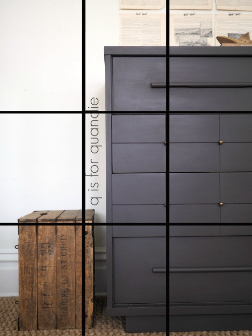
The basic idea is that you will create a more dynamic photo if rather than centering your subject, you place it on one of the lines of a grid separating your frame both vertically and horizontally into thirds.
You might be wondering how you can accomplish that with a close up furniture shot where the piece fills the frame. The trick is to pay attention to what the subject of your photo really is. For example, in this next shot the subject of my photo is the drawer pull itself, not the entire piece.

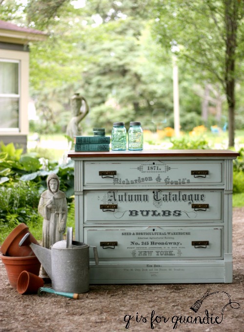
But even with photos from further out showing the entire piece of furniture you can use props on one side of the piece to balance a photo where your furniture isn’t centered in the frame.
Sometimes it still makes sense to center your piece in the frame though, if so then try to use some of these next tricks to improve your composition.
Symmetry.
As I was looking back through my blog posts for a good example of symmetry, I realized it’s something I rarely use. To achieve symmetry you want to center your subject and then have each side of the frame somewhat mirror each other, or at least be visually balanced. This symmetry in this next photo comes from the cabinets that are behind the piece and are equally balanced on each side.

Triangles and diagonal lines.
Making a visual triangle with your props is another great way to add dynamic tension to your photos.
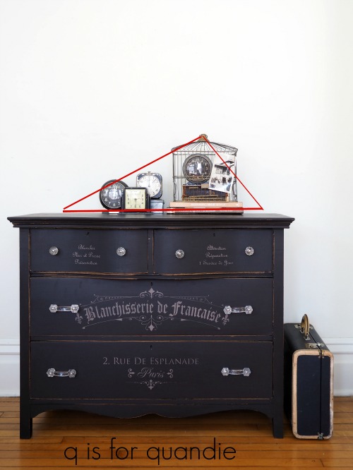
Diagonal lines work well for this also.

OK, technically that’s not a piece of furniture, but you get the idea.
Rule of odds.
This is a simple rule to follow when adding multiple props to your photos. For some reason odd numbers of items always look better than even numbers. For example, five paint brushes, three books, etc.

This works when styling shelves in your home as well, try grouping things in odd numbers.
Filling the frame.
This is the idea that you should fill your entire frame with the subject of your photo, even to the point where you can’t see the entire thing. Filling the frame adds instant impact to your photo.

There are three ways to accomplish this; 1) use a zoom lens to zoom in on your subject, 2) just get close with your camera or 3) crop your photo in post-production.
Foreground interest.
This is something that I wish I would remember to do more often. One of the furniture artists I admire most does this all the time and it looks amazing (Marthe Leone). Basically the idea is to have something in the foreground of your photos to help add some depth to your photo and make it look less two-dimensional.

This can be challenging if you don’t have a lot of space where you take your photos, but if you have the room give it a try!
Point of view.
Point of view refers to the position your camera is in when taking a photo and it’s an important thing to pay attention to. Are you looking up at your piece? Down at your piece? Are you taking the photo from an angle or from straight on?

I find that a lot of people tend to take furniture photos from a standing position, and thus are really shooting down on their subject. While shooting down can be flattering for people (because it makes things look smaller), and it can add some artistic flare to one or two photos in a blog post (like the one above), it tends to throw off the scale of the piece. Especially if you’re taking a photo for an ad.
Instead try taking your photos straight on at eye level with the piece. I use a little kid size chair to sit on when I’m taking the majority of my furniture photos (just because it’s easier than spending a lot of time on my knees). Always include at least one or two photos taken at eye level when posting an ad for selling your pieces.
As you’re taking the photo, pay attention to your lines. The horizontal and vertical lines of the piece of furniture should all be straight and even like in the photo above.
I hope some of my tips for composing photos specifically for furniture have been helpful. If you’re interested in seeing more posts with photography tips for furniture painters or if there is a particular subject you’d like me to address, be sure to let me know with a comment. If you guys are interested, I’ll definitely do some more photo finish Friday posts!

Photo Finish Friday! 👍🏻 Great tips,
they make such a huge difference! It’s just a great skill to have in general even just for personal purposes. As far as trying to sell things, I think photo quality can make or break a deal. Even in real estate listings. I can’t believe the difference. There’s a Q-tip! Baha! Before you book an agent, check their listings to see if they use these rules!
LikeLike
Oh no! I forgot to give you credit for helping me come up with the name! Thanks again for that Meggan 🙂 And great tip about real estate listings, so true.
LikeLike
Thanks– these tips were so helpful!
LikeLike
You’re welcome Lee!
LikeLike
Thanks for the tips – some there I hadn’t thought of before.
LikeLike
I’m glad you found them helpful!
LikeLike
This was great very informative. I try to take photos for my design work but my skills are lacking. I would enjoy more post on photography this one alone has points I’ve not considered. Thanks Linda.
LikeLike
You’re welcome Victoria! I’m glad that you can apply these tips to your design work photos too!
LikeLike
Great information! Staging and point of view are my strengths….I had heard of the Rule of Odds….all your words of wisdom will help me improve the other points….I love your photography on this blog….Thanks again!
LikeLike
Thanks Laura!
LikeLike
Definitely want more! Thank you for sharing all of wisdom & knowledge with us. I can’t wait to incorporate some of these techniques in my next photo shoot. Always learning! 🙂
LikeLike
I’ll try to keep them coming then Cheryl!
LikeLike
Great ideas…now I will be looking for these when browsing magazines too! Good info, as always.
LikeLike
Another great idea … scrutinize magazine photos that appeal to you based on these tips to get a feel for what works and what doesn’t.
LikeLike
Great info, thank you!
LikeLike
You’re welcome!
LikeLike
Yes that’s a great help! My husband is the photographer in our home but with my new blog I don’t want to rely on him all the time. I know good quality shots help. Any help/advice you can give us newbies is greatly appreciated!
LikeLike
Glad to hear it!
LikeLike
For some reason I had to log in to an old WordPress account to post a comment. My new blog site is sheila.marksawthis.com
LikeLike
I’m not sure why that would be. Those sort of techie things are always above my pay grade. You should be able to post a comment without a WordPress account, although I will have to approve you the first time you do that.
LikeLike
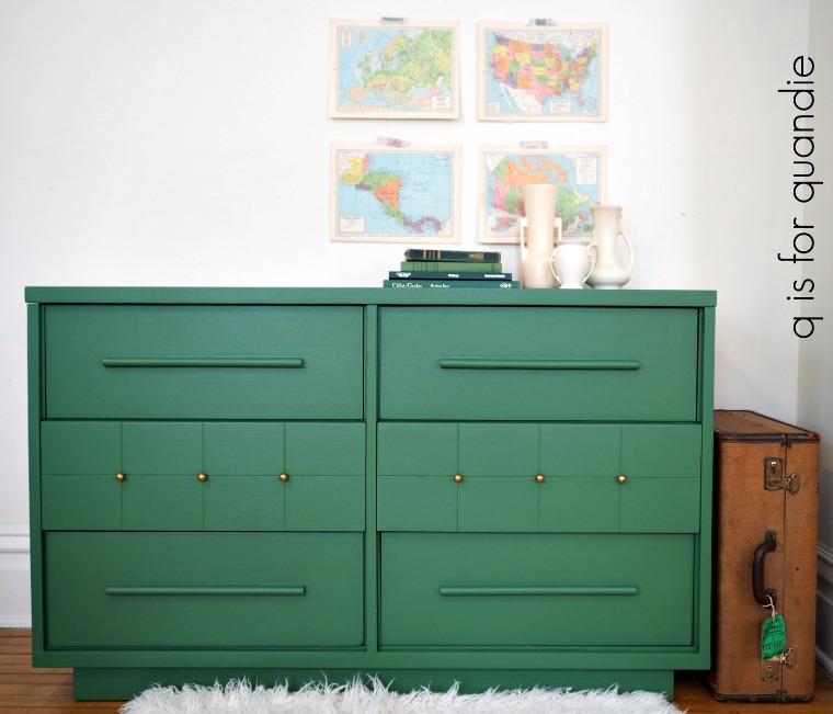
Outstanding photography atelier. Oh, also it is cool to see the green mid-century chest of drawers. Cheers!
LikeLike
That green mcm chest was so awesome I’m planning to do another similar piece this weekend!
LikeLiked by 1 person
Thanks for the wonderful tips Linda! Keep ’em coming!!
LikeLike
You’re welcome Sue! Thanks for the vote of confidence 🙂
LikeLike
Loved this post! I also sell furniture and I follow most of these but I love the Foreground tip. I’m definitely going to try that one. Thanks so much Linda!
LikeLike
Keep me posted on how it works out for you!
LikeLike
I’ve enjoyed all your photography posts from theonesabout your cameras to this. They are all so incredibly helpful. Some of this I knew from my photography classes and some are new to me (or I forgot the info-lol). Thank you for sharing all your knowledge. Your photos are always professional looking nad beautiful.
LikeLike
Thank you so much Christie!
LikeLike
Loved learning your tricks Quandie. I have heard about the grid and not putting the subject straight in the middle, but I always forget of course! I would appreciate any photo tips and posts you create, but if I can ask for something outside of photos I would like to ask if you can do a post focused on repairing edges of wood. Especially would like to learn about the brown mud by Dixie Belle (?) that’s used to repair wooden furniture. I’ve read briefly that it is a harder finish than putty and can be sanded. I want to use it on a part of our baseboard that is cracking slightly due to too-tight trim added by the tile man when he tiled the floor. Any discussion you can provide about those type products would be appreciated.
LikeLike
So far I have only used the Dixie Belle mud to fill holes if I’m changing out hardware. In fact, I’m going to be doing that today on a dresser with … let’s see … 15 holes! I will keep this product in mind for the next time I have to do some more extensive repairs and keep you posted though.
LikeLike
Thanks for the staging / photo tips! It’s much appreciated. Have you ever discussed exposure? That’s what I really struggle with. Spring is coming, and it will be a great time to get outside and practice taking some pretty photos. Have a lovely weekend!
LikeLike
I have not discussed exposure, and that’s something I tend to struggle with as well. I’ll put that subject on my list of possible candidates for a post!
LikeLike
Good info, and not just for staging or for decorating. You can apply these composition rules to the general observation of anything. So deliberate and thoughtful to ask yourself, “Why is it I like what I am looking at? You have such a way with words, simple explainations of complicated concepts. Great post!
LikeLike
Thanks Kathy!
LikeLike
Great tips!! You always take beautiful photos. Thanks for sharing!
LikeLike
Thank you so much Melanie!
LikeLike