

While I was inspired by all of the shades of blue I saw in Norway on our recent trip, in Scotland it was all about the greens (and maybe the sheep!)
So when I saw this pretty green transferware platter at the Barn Chic Vintage sale, I snatched it up and decided that I needed to paint something green.
![]()
Mr. Q had recently brought home this tall serpentine dresser with lovely claw feet. His step-dad’s ex-wife (is there a better title for that relationship? step-ex maybe?), who is also a very supportive follower of my blog, snagged this for me from her neighbor who was having a garage sale (thanks again Sherry!)

It needed a little work. Ken replaced a drawer bottom that was damaged beyond repair and I dealt with some veneer issues by patching with wood filler.
Next I pulled out my paints to see what my options were for green and I had quite a few. I had some of Miss Mustard Seed’s Lucketts Green and Boxwood. I also had several shades of green milk paint that Homestead House sent me, Upper Canada Green, Gatineau, Acadia Pear. In the end I opted for Homestead House’s Bayberry.
I found it a bit challenging to get a photo that shows the true shade of this green. It’s a deep green that leans more towards the blue side rather than yellow, and with a grey undertone. I added a topcoat of hemp oil, which deepened the color quite a bit.
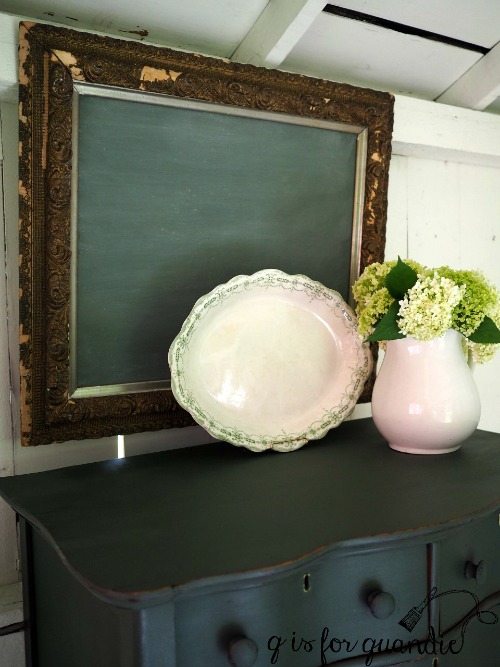
While working with the Bayberry, I discovered it makes the perfect ‘chalkboard green’. That’s it on the gold framed chalkboard, without hemp oil and after being ‘seasoned’ with chalk. From now on rather than mixing MMS Boxwood and Artissimo to make green chalkboard paint, I’ll just use Bayberry straight up.
I also tried a little experiment on this dresser. I added part of an Iron Orchids Design furniture transfer. I wasn’t sure how well it would show up on a dark color like this, and I knew I was taking a chance that it wouldn’t work at all and I’d have more work to do to correct it.
![]()
And as it turns out, transfers and dark colors don’t mix. I expected that the transfer wouldn’t be as obvious over a dark color, but I didn’t expect that that filmy sort of white halo would be so much more noticeable.
Speaking of which, after getting a question from Nancy recently about the ‘cloudy halo’ that you can see with the IOD transfers, I reached out to Sally at Iron Orchid Designs. She told me they are working on improving their product to minimize that halo, but in the meantime the transfers are best suited for light colors. In addition, she said that a little light distressing with a fine grit sandpaper can help blend it more on light colors as well.
OK, so next came the ‘fix’. I was hoping I could use a sharp razor blade to remove the transfer without damaging the paint too much.

Nope. That didn’t work. That transfer was stuck good. Really, that’s good news since it means the IOD transfers are pretty durable and won’t just easily peel off your surface.
On to Plan B (or would it be C at this point?) I knew this was going to be dicey at best, but it was worth a shot. I sanded down the two drawers with the transfers, sanding off the transfer as well as most of the hemp oil. Then I wiped them down with TSP substitute to further reduce the oil. I had a little bit of my mixed paint left, so I stirred it well and added a fresh coat to the two drawers.
I’ve had issues in the past with getting different shades of green doing this. I posted about that here. Over time as green milk paint sits it tends to change color slightly.
So, I do know better. But I thought I might as well try it since I had the paint. Worst case scenario I have to re-do ALL of the drawers.

Yep, worst case scenario. It’s not a really glaring difference, but enough of a difference that it bugged me.
So, back to sanding and cleaning each drawer with TSP substitute, mixing up a fresh batch of Bayberry paint and repainting each drawer. I didn’t have to do the body of the dresser, just the drawer fronts.

In the long run it would have been smarter to try this experiment with Fusion acrylic paint or chalk paint. That way I could have gotten away with just repainting the two drawers. Hindsight is always 20/20. I hope that by sharing my failures in this way, you guys can learn from them and not make the same mistakes.
To recap. New lesson learned: don’t use IOD transfers on dark colors. Old lesson reinforced: paint your milk paint pieces all at once, you can’t go back later and just paint one or two drawers. Got that?

I promised ‘dibs’ on this dresser to the original owner. But if she doesn’t want it back, it will be for sale. Be sure to check my ‘available for local sale’ tab for more details.

I love it!
LikeLike
Thanks BFF!
LikeLike
Yep. Got it! Thanks for saving the rest of us this frustration! The dresser turned out lovely.
LikeLike
Thanks Monica! And you’re welcome 😉 I’m happy when others can learn from my mistakes.
LikeLike
Beautiful lines on this piece, my favorite style of knobs, love it too!
LikeLike
I debated changing up the knobs, but they were all there and easy to paint so I went with them. I’m glad you like them Victoria!
LikeLike
The greens of Scotland really are special! Thanks for sharing your experience with transfers-benefiting from others helps us all. Love the deep smokey green-good choice.
LikeLike
That’s the perfect description of the color Laura, a deep smokey green. Love it!
LikeLike
I love it. One of the things I always say to my customers is “I make the mistakes so you don’t have to!” It’s wonderful that you shared this, because I might have tried an IOD transfer on a darker colour. So, thank you!
LikeLike
Of course I knew going in that the dark grey of the wording itself would be less noticeable on a dark color, but I totally underestimated how white that ‘halo’ would become. I’m glad I’ve saved you from trying it yourself Janet!
LikeLike
Thanks so much for sharing your experience! It helps so much to know these valuable tidbits. Will save all of us a lot of extra time!
LikeLike
You’re welcome Robin!
LikeLike
Hi Nancy here!
Thank you so very much for this detailed explanation and photos explaining how best to use the IOD transfer products. I was so excited when I first saw the IOD product, because I love love the french script on furniture. I kind of jumped the gun buying over $200 worth of IOD transfer & then using it over ASCP county grey. I tried using Graphic Fairy designs to transfer to furniture but a lot of work to do on a large piece so I thought these transfers were the perfect solution.
I watched the IOD video and many others that sell the product transfers and NO One touched on the fact that it isn’t great on colored furniture.
Now that I know I didn’t do something wrong, I will use all the other transfers I purchased on mixtures of white paint.
I hope your email reaches many painting enthusiasts out there and they won’t make the same mistake I did; purchasing the transfers to gor on furniture other than shades of white.
We are all so fortunate & I am so grateful for this post explaining the best way to use this great product.
Thank You! Thank you!
LikeLike
Nancy – I responded to the similar comment you left on the bedford linen press post, be sure to check it out. Obviously I had a similar experience to yours, not realizing that the transfers wouldn’t work well over darker colors. Luckily I only wasted a portion of a transfer testing it out. Hopefully my post will help save others from making the same mistake! And hopefully the gals at IOD will be able to come up with a furniture transfer that does work on dark colors!
LikeLike
Wow, this is really pretty and such a different color. Another great job. I think this would be a good color a guy could live with too.
LikeLike
I agree, this color is dark enough to have a more masculine feel. It adds a little manliness to what is otherwise a pretty curvy, more feminine piece. Keeping the original wood knobs rather than switching them out for something more sparkly like clear glass knobs adds to that as well.
LikeLike
I say your comment on the Bedford linen press after I figured out how to get back there. LOL
Thank you so much.
I read your story of how you came up with the name Quandie & had a very good laugh. Your friend is a hoot!
LikeLiked by 1 person
Hi there …just a note to say I absolutely love this piece and what a lot of work you have put into it. Now this is the second piece I have loved. Do you think .I could be converted LOL I loved every inch of Scotland too, a beautiful country. Love to your Mom.Betty from Wasaga Beach,Ontario, in our 150th year for Canada.
LikeLike
Well, I’m working on converting you slowly but surely Betty! And happy 150th to Canada!
LikeLike
Thanks for the chalkboard tip, Linda. Great idea using “Bayberry”. Love how the dresser turned out.
LikeLike
Thanks Mary! Yep, Bayberry is perfect for a chalkboard. I plan to ration the use of the rest of my bag of Bayberry strictly for chalkboards 😉
LikeLike
TSP?
LikeLike
TSP is trisodium phosphate, a common cleaning solution used before painting. It’s fairly bad for the environment, and for people too. You should wear gloves and eye protection, etc, etc. if you ever use TSP. I use TSP substitute which is less toxic. It cleans and degreases, which is what you want when prepping for paint. You can find this product at most home improvement stores. It’s usually in with other painting supplies.
LikeLike