
Bigger is better?
Before we get into today’s post, did you notice I made some tweaks to the blog? Wordpress announced a new and improved version of my blog ‘theme’ way back in January, but I never took the time to look at it until now. With this new theme, my page is wider, my photos can be larger, my fonts are larger … everything is just BIGGER! I think that’s a good thing, but what do you think? Feel free to leave a comment with your opinion.
I’m still exploring some other possibilities with this new theme, so don’t be surprised if you see a few more changes here over the coming weeks.
On with today’s post!
I’m a fan of color blocking, how about you?
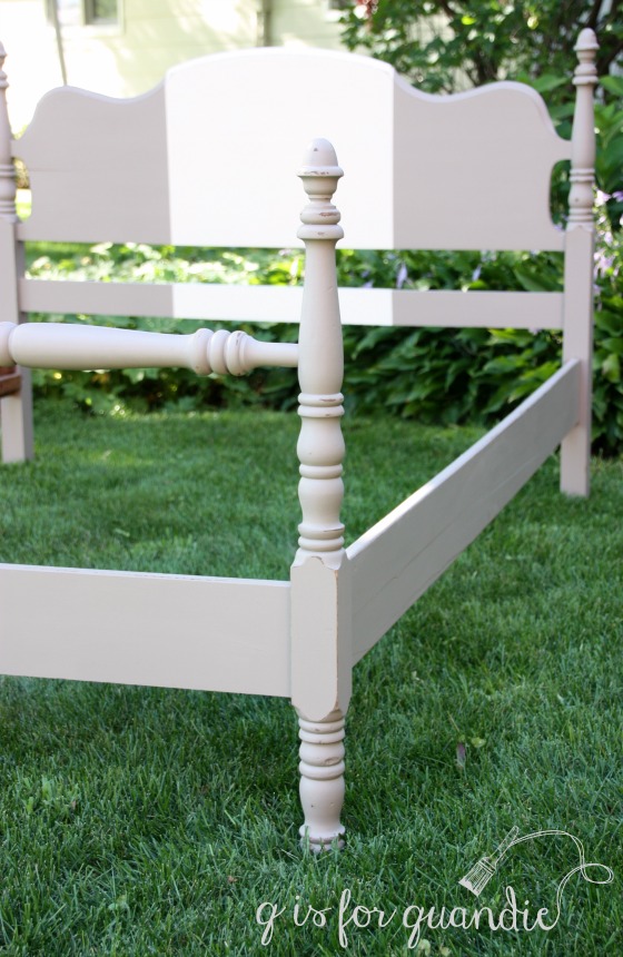
I like it in clothes, and I also like it in decor. In fashion, color blocking is described as pairing blocks of different colors together. It usually refers to pairing bright colors, so maybe I should call this ‘toned down color blocking’ because rather than using bright colors I used the muted tones of Fusion’s Algonquin and Limestone on this bed frame.

This bed came to me as part of a set. I split it up since I’m not much of a fan of ‘suites’ of furniture. The dresser and vanity have already been painted and all that was left was this bed. It was in great shape and has the side rails and the slats meant for holding the box spring and mattress, but it wasn’t particularly pretty or interesting. It was just rather dull.
So I decided to give it a slightly more modern vibe with some toned down color blocking.
First I painted the entire bed in Algonquin, which is a lovely sort of greige color. The I simply measured and taped off a wide stripe down the center of the headboard and foot board and painted that in the Limestone.

I distressed the edges a little with sandpaper.

Both my sister and my neighbor, nnK, asked me if I was going to put a stencil on the headboard, but I thought that would be too much. I like that this bed has a subtle sense of style. It could be dressed up or down with different bedding.
It is for sale. It is a full/double size bed, so a great candidate for a kids room or a guest room. Unfortunately vintage beds in anything larger than a full are pretty much unheard of since queen and king sized beds weren’t really around until the 50’s and 60’s.

By the way, have I mentioned that my Limelight hydrangea is absolutely GIGANTIC this year? Bigger may not be better in this case. I plan to prune it down a bit this winter to keep it in check!

I like this just as it is. I can also see it with a stencil, which in my mind, does not typically go with color blocking. Different genres maybe? The clocking blocking gave it a fresh face. Love your choice of paint colors.
I like the new the new look for the blog except and maybe it’s me and I am blind. But what happened to the comment
counter?
LikeLike
Oh! I didn’t even notice that what I liked to call the ‘comment balloon’ is no longer up next to the blog post title. Now you have to go to the bottom of the post to leave the first comment. But now that there are a couple of comments, you can see a comment count next to the title and click that to jump down to the bottom. The different ‘themes’ handle this stuff differently. I think we will all miss that comment balloon! There were a few other differences in this theme that I didn’t initially anticipate. At first I completely lost the ‘menu bar’ that you use to visit my different ‘pages’, but fortunately I figured out how to get that back.
LikeLike
So no more comment balloon got it. I think Ruth is righ furniture audio. I indulged myself this morning and read all the comments under the “About Me” heading. I saw the comment by Chantelle Deimling from Bungalow 47. Did that ever happen? I just don’t remember you using Junk Gypsy paint
although it seems like you did try some of Rachel Ashwell’s Chalk and Clay paint.
LikeLike
I did connect with Bungalow 47 and they sent me some Rachel Ashwell products to try. I posted a chair {here} and a dresser {here} both painted in Rachel Ashwell’s Shabby Chic paint. I would have loved to get some free samples of the Junk Gypsy paint as well, but no such luck. The Rachel colors are very pale and pretty (as you would expect from Rachel) while the Junk Gypsy colors are more saturated and vibrant. I did use a Junk Gypsy color called Granny’s Cornbread on some clay pots {here}. I had purchased a small sample jar at a local shop (which has now gone out of business).
LikeLike
Quite lovely but I do agree with your sister and neighbor – that headboard is begging for a stencil – lean in real close to it and you’ll hear it whispering to you. Must be the WordPress enhancements that made the gentle begging so audible to me. 😉
LikeLike
LOL, I didn’t realize that this theme upgrade included furniture audio 😉
LikeLike
Thanks Linda I revisited those posts and remember them now. Love that chair want that watering can and the yellow pots. I am a fool for linen presses. Gee that was fun – you really have painted a ton of stuff and with finesse I might add!
LikeLike
Thanks Victoria!
LikeLike
Like the choice of colors…but I’m one of those people who can’t seem to have a blank space anywhere…be it a scrapbook page or a wall. So I’m of course, thinking it’s saying (out loud) it needs some type of embellishment too. Just a matter of personal preference though. The right way is always the artists way…unless the artist is being commissioned for a certain piece, right? Lol. Still looks great!
LikeLike
LOL, yes you definitely are one of those who are opposed to blank spaces 😉
LikeLike
I would leave it plain, if it doesn’t sell because people keep wanting it to say something (Highly unlikely) you can always add something later. I think it would get too busy with color blocking AND a stencil.
LikeLike
People might suspect that your opinion is biased 😉 but I’m with you!
LikeLike
Beautiful, I love it. I have a question about distressing with Fusion paint. I think it is harder to distress, do you have a trick? Thanks!
LikeLike
I think both chalk paint and milk paint are incredibly easy to distress, and by comparison Fusion is a little harder to distress. It does not come off with a damp paper towel like some chalk paints will for instance. Of course, the qualities that make it harder to distress are the same qualities that make it fully washable without a top coat so it’s a trade off. The trick with Fusion is to distress shortly after painting, and by that I mean pretty much as soon as the paint is dry. That will be when it’s easiest to sand the edges and take some of the paint off. You can still distress it further down the road, but it will get progressively harder over time to remove the paint. I also tend to use a little coarser grit sandpaper to distress Fusion than I would use on milk or chalk paint. Try to avoid putting so much pressure on the sandpaper that it starts taking off the wood underneath though. I hope this info helps!
LikeLike
You have unerring taste with your rescue re-do pieces. The color block idea is stark at first look but becomes very agreeable after a moment, completely unadorned. I love few embellishments more than a neat stencil, but I think this can stand alone. With a simple quilt, the owner could use a pillow with pattern, like the one in the photo to provide some detail and activity to the otherwise somber color blocked palate. Or perhaps just a curly “No. 9” somewhere off-center and unobtrusive.
LikeLike
I’m with you Kim. I think the more subdued paint treatment leaves the door open for changing things up with some patterned bedding. Patterned bedding and a stencil/color blocked headboard would be overkill, right?
LikeLike
Yes, love the changes, everything looks closer!
LikeLike
Thanks for the comment Kathryn! I felt that way too, like everything looks closer and maybe even a bit clearer. Thanks for the feedback!
LikeLike
I think it’s beautiful as is. I like stencils but I think this time it’s pretty as is. You did a great job.
LikeLike
Thanks Becky! I love a good stencil too, but I was going for a more modern edge on this one. I am glad you like it!
LikeLike
HI LINDA,
LOVE THE NEW LOOK OF THE BLOG. YES, BIGGER IS BETTER…ESPECIALLY THE FONT SIZE. AND BY THE WAY, THANK YOU FOR KEEPING THE TRADITIONAL BLACK FONT.
THE BLACK AGAINST THE WHITE BACKGROUND IS SO MUCH EASIER TO READ.
SOME BLOGS LIGHT GRAY OR LIGHT BLUE LETTERING FOR DESIGN PURPOSES BUT IT IS IMPOSSIBLE TO READ.
GREAT POSTS!!!
BILLIE
LikeLike
Well Billie, I am 52 (egads!) years old and my eyesight has been going downhill since 40. So I personally like an ‘easy to read’ font myself. You can count on me to keep it that way 😉
LikeLike
Love the changes on the site! Easier to read. I think a stencil on the bed would be better. I just like your stenciled pieces really well! They are so awesome!
Blessings
LikeLike
Thanks for that input Shelly! Who knows, I may end up adding a stencil to this bed in the long run.
LikeLike