
This dresser came to me from my friend Cecelia.

When Mr. Q picked it up, the top was separated from the bottom. That was probably one of the easier fixes that Ken has had to deal with for me. One of these days I have to write a blog post about the cool little tool that he uses for reattaching tops like this. Next time he does that I’ll have to try and get some photos of the tool and the process.
The strange thing about this dresser is how discolored that middle drawer is, it really kind of jumps out at you. I really don’t know what would cause this phenomenon. If any of you have any ideas, I’m all ears. IMHO, this ‘flaw’ made it a good candidate for a paint job and I love using milk paint on these old pieces. The shop in Stillwater where I occasionally sell my pieces, Reclaiming Beautiful, just started carrying a line of milk paint from The Real Milk Paint Co.

I picked out Peacock based on the sample sticks they have in the shop. For me the hardest part of using a new brand of paint is getting to know the colors. You can look at photos of the colors online all day long, and somehow the color always looks different in person. The plus for me with Miss Mustard Seed milk paint is that I know exactly what all of her colors look like in real life.
But I also have to admit that I’m getting a little bored with the MMS colors. It’s time for a change.
So after stripping and waxing the top of this dresser (with Cece Caldwell’s Aging Cream), I mixed up some Peacock. It mixed up pretty much exactly like the MMS milk paint that I’m used to. The only slight difference I’ll note is that it foamed up a little more than I’m used to. The Real Milk Paint Co has a product called Anti-Foaming Agent that I’m going to try next time. But I didn’t run into any trouble with the foaminess, I just let the paint settle a bit before I started working with it.
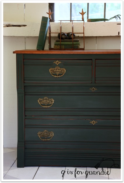
This color is deep, rich blue green that almost looks black in low light. It leans a little more towards green on my piece than on others I’ve seen it used on. I wonder if that is because there was a lot of red to the wood underneath. Milk paint can be a little more transparent than other paints, so the color you are painting over can make a difference.
I also used hemp oil as my topcoat and that really changed up the color. It brought out a lot more green, and darkened it up quite a bit as is typical of hemp oil. By the way, the Real Milk Paint Co has a hemp oil in their line, but I used MMS hemp oil because I already had it on hand.

The hardware on this dresser is just stunning, isn’t it?

You can also see the green of the color a little better in that last photo.
I was hoping for more chippiness, but it eluded me once again. Next time I’m going to try another product from this line called Chippy Paste. Have any of you heard or it, or used it? I’ll be sure to let you all know what I think of it when I try it.

I used an old copy of Moby Dick in staging this piece.

The colors on it worked perfectly with the Peacock.

Funny though, it wasn’t until I was editing the photos for this post that I noticed the sea horse motif on the cover. See it? Isn’t that cool?
Have any of you tried the Real Milk Paint Co milk paint? If so, let me know what you thought of it. I’ll be trying out a few more of their colors soon.
As usual, please check my ‘available for local sale’ page for more details if you’re interested in purchasing this dresser.

so beatuiful! Did you have multiple coats with this paint? thanks!
LikeLike
When I first started blogging I used to give a lot more details info about the actual painting process, but I’ve kind of fallen out of that habit. I think because I’m worried it will bore people. But I know for myself I like seeing that info in other blogger’s posts, especially if I am thinking about trying the same products they used. So, I need to get better about that again! Yes, I used 3 coats on this dresser. I found it a little difficult to cover that reddish toned wood. I probably could have gotten away with 2 coats, but 3 coats gave me a nice opaque finish.
LikeLike
Thanks for the information! You are never boring 🙂
LikeLike
You are too kind. I wonder if Mr Q would agree with you 😉
LikeLike
Without a doubt!
LikeLike
Boring? no, never boring!
LikeLike
This piece is very highbrow & regal looking. Which seems perfect with the hardware that reminds me of gold crowns. Chippyness would have made it too common.
At least that is how it strikes me. 👑
LikeLike
I like your way of thinking Diane! Regal. Perfect description 😉 Thanks!
LikeLike
I have to agree with Diane about the finish. This color is so rich the finish came out perfect. I like how it looks a bit worn. Beautiful hardware – is this an Eastlake piede?
I might add my second you are never boring!
LikeLike
Yep, I would consider this Eastlake. I didn’t mention it in the post, but it has pin and cove joints. {Here} is a good article about pin & cove joints, and it mentions they are often seen on Eastlake style pieces. It also mentions spoon carving, another thing that is often characteristic of Eastlake pieces.
LikeLike
I love that color! The dresser is so much better after your beautiful painting. I will definitely look for that brand of paint while I am out and about, too. And please, please do a post about Ken and his skills – I would love for my husband to have some input, he loves helping me ‘fix up’ my old stuff.
LikeLike
Next time I have Ken use that thingie (I don’t even remember what he called it) I’m definitely going to get some photos and post about it.
LikeLike
Nice to learn of a new paint line. The hardware on this dresser is very dominant and attractive, giving the dresser a grand appearance. Proud as a Peacock!
LikeLike
The hardware is pretty spectacular. I chose the darker color because I wanted to let the hardware be the focus. It is proud as a peacock!
LikeLike
The hardware IS gorgeous. Once again, another excellent job Q! xx
LikeLike
Thanks A.H., and thanks so much for leaving a comment! I really do appreciate every one.
LikeLiked by 1 person
Once again, you transformed to perfection! How could we be bored with your details — you are a wonderful writer (I’m sure Mr. Q would agree).
LikeLike
Thanks Joni! You’ve made my day!
LikeLike
I wish I wrote as well as q!
LikeLike
She has a gift that is for sure but I think you are being modest. I believe you have authored book?
LikeLike
He is being modest! He’s actually authored 3 books;-) and majored in English. Mr. Q is no slouch in the writing department.
LikeLike
The “chippy paste” sounds interesting. What company makes it? I love that deep shade of green. Looks very regal!
LikeLike
It’s made by the Real Milk Paint Co. I am intrigued myself and looking forward to trying it.
LikeLike
I love that color but I like the blue shade in the first photos rather than the greener look in the later photo. I also like the red showing on the edges.
LikeLike
I like the bluer looking color too, but I have to say that the later photo is more accurate to how the color looks in person. At least in a bright light.
LikeLike