
A little while ago I told you about the Fusion custom color contest. After some confusion about when the deadline was for submitting colors, I can confirm that it has definitely been extended to March 31, 2016 (instead of February 29). Which means I had some time to get my act together and submit a piece myself.
To participate in the contest, you have to create your own custom color by mixing together two or more existing Fusion colors. Then you have to name your color and paint something in it. Check out their Facebook page for more details.

When my sister was over for my hatbox party the other day, she played around with mixing some colors and she came up with a gorgeous dark teal blue by combining equal parts of Homestead Blue and Liberty Blue.

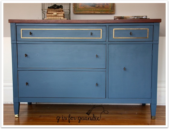
So I asked her if she wanted to team up with me to paint a piece to submit to the contest using her color and my painting skills. We even went halfsies on the paint. She had a jar of Liberty Blue and I had a jar of Homestead Blue. We mixed our two paints until we got a color that we thought was perfect. Our recipe ended up being 3 parts Liberty Blue to 2 parts Homestead Blue and it leans a little more towards blue than Debbie’s original half and half mix (although it certainly doesn’t look that way in the jar!)
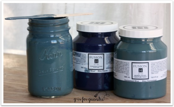
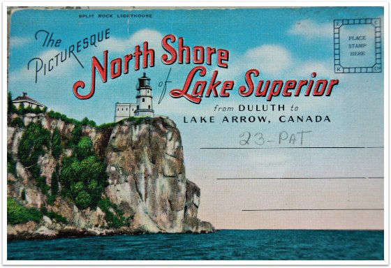
Debbie hadn’t come up with a name for her color though, so I gave it some thought. I wanted to name it something that reflected our partnership, but also described the color. I thought about our trip to Duluth last fall and came up with Lake Superior Blue.
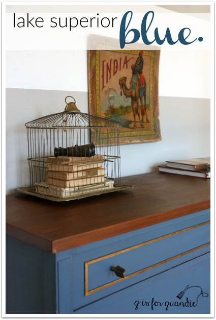
I knew this color would be the perfect choice for updating this piece …
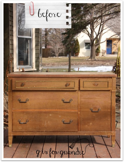
This was another freebie from my friend Terri’s Uncle Don. The finish was in terrible shape and the bottom drawer was completely stuck. Poor Mr. Q spent quite a long time getting that thing out.
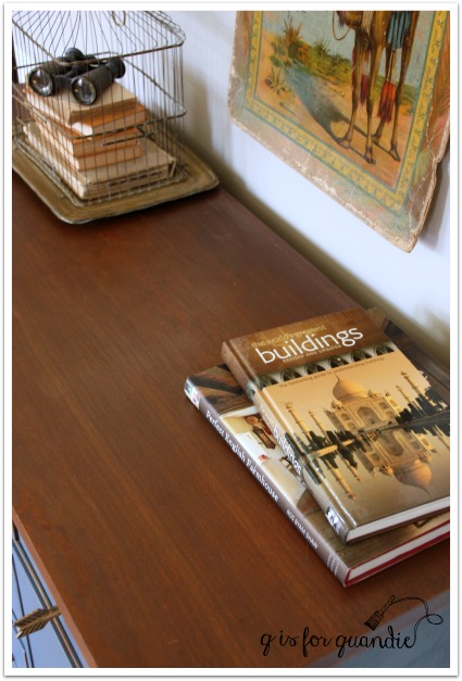
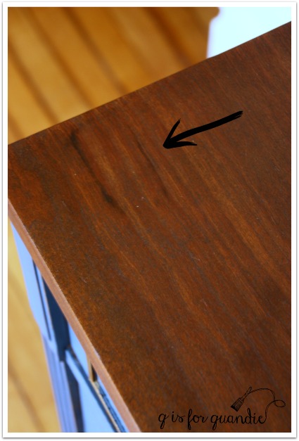
Although the top of the credenza had numerous stains (I think someone probably kept house plants on it at one time), I decided to attempt to stain it rather than paint it. I wanted the warmth of some wood to pair with the cool Lake Superior Blue. The existing finish on this one was so dried out that I was able to easily sand it off with just a couple of passes with the palm sander. Also, it was so nice out last weekend that I was able to work on it right there outside on the deck so creating a bunch of dust wasn’t an issue. I sanded it down first, then I decided to try bleaching some of the heavier stains. I used a q-tip to apply bleach just to the dark stains, then left the piece out in the sun for an hour or two. Then I sanded some more. I wasn’t able to eliminate all of the stains entirely, so I stained the top with in a dark walnut to camouflage them a bit more. I then added a wipe on poly in a satin finish.
This was the darkest stain and although I didn’t remove it entirely, in the scheme of things it blends in fairly well.
Here are the knobs that I ended up with on this piece. It took me a while to land on this choice. I’ll be posting more detail about this choice on Wednesday, so be sure to check back!

That brings me to the trim detail on the two upper drawers.
That’s metal. I debated removing it and filling the groove with wood putty, but I think it would have been difficult to disguise it completely. I also considered just painting over it. The Fusion would have stuck to it, and that would have been a very reasonable choice. But ultimately I decided to work with it. It was a brassy gold to begin with, but I added some gold rub ‘n buff to give it a more of a gold leaf look.
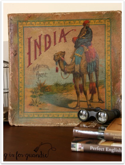
I purchased this India board game box on eBay many years ago. The colors worked beautifully with the credenza, but I had a lot of trouble with glare on it in my photos. I originally tried hanging it on the wall, but for some of the shots I had to angle it in strange ways in order to not just get a shiny blank in the photos. So for some final shots, I just took it down from the wall.
And voila! Here is the Lake Superior Blue credenza!

What do you think of our Lake Superior Blue?
Voting for the contest begins in April so I may have to call on you guys to go and vote for us!
Sharing at Friday’s Furniture Fix!

LOVE it! Beautiful blue you got there… And those knobs are to die for!
LikeLike
Thanks so much!
LikeLike
It’s a beautiful color. For those of you who have never seen the color of the Great Lakes you are missing out. Absolutely a gorgeous blue hue.
LikeLike
For sure! Lake Superior is a sight to behold.
LikeLike
Such a perfect name for your color…Lake Superior Blue conjurs up so many images in the mind of anyone who loves spending time along the lake. After spending the weekend visiting several occasional sales with a daughter who was “just looking” at furniture, I really appreciate how much personality you infuse in even the simplest piece. The wood top, metal details on the drawers (which nicely highlight the metal feet), and the unexpected drawer pulls are all pleasing details for the eye to discover and savor over and over. Great teamwork!
LikeLike
Thanks so much for that lovely compliment Kim!
LikeLike
Brilliant compostion! Brilliant color, brilliant name, brilliant knobs, brilliant execution
Love the metal bits which are enhanced by the knobs. And that box is lovely. Perfect for adding to the photo shoot. .
LikeLike
Thanks Victoria! I thought the box added a little bit of a mysterious air to the photos 😉
LikeLike
I NEED those knobs! Can’t wait until Wednesday. Love this whole piece!
LikeLike
Here’s a hint … I got them at Hobby Lobby, but I doctored them up a bit.
LikeLike
I really love how the finished dresser looks. I think we did good on the color. Too bad I don’t have room for it. Hope lots of other people like it and we win!
LikeLike
Me too sis!
LikeLike
Love the moody blue and the great name and how fun to do it with your sister!
LikeLike
It is a moody blue, that would have been a fun name too! Thanks Darrielle!
LikeLike
Another fun day for you and your sister! Beautiful color and it sure worked well on the dresser. I’m sure you have a winner there! And how fun to create your own color! Let us all know when voting is open!
LikeLike
I will definitely keep you posted on that!
LikeLike
Well the name is excellent of course!
LikeLike
For sure 😉
LikeLike
Beautiful, just beautiful, Ladies! Love the name & color…gets my vote, for sure!
LikeLike
Thanks Patty!
LikeLike
HI Linda,
Absolutely LOVE your work – you have a huge fan over here in England 🙂
May I ask if and how you take your own photos and if you use any editing?
LikeLike
Thank you so much! I love having fans in foreign countries, somehow it always seems just a little extra special 😉 I do take all of my own photos. I use a Canon EOS Rebel digital camera that I’ve had for ages. I do a bit of editing, but only on a very amateur level, mostly using PicMonkey (occasionally I use Picasa or Windows Live Photo Gallery too). Once upon a time I used Photoshop, but I never mastered Photoshop and eventually I just gave it up. Here is a post I wrote about using PicMonkey to add titles to photos, check it out!
LikeLike
Thank you so much for your reply! I’m working on a similar item and am trying to figure out how to deal with the gold trim details on all of the drawers. May I ask if you painted around them, or painted over it and sanded off the paint? Hope I’m not sounding too silly lol! I’m new to this and can’t get my head around it hehe. Sherry
LikeLike
The trim in this dresser was metal, which was a bit odd. In my case, I talked my sister into taping off the trim for me before I painted. Painting over it, and then sanding off the paint would have really scratched up the metal. I might have been able to successfully paint around it, but to get a nice close edge, it was easier just to tape it off before painting (OK, maybe it was easier because I had my sister to do it!) Is your trim metal or wood? If wood, I think I’d be tempted to paint over it with your overall color, then go back and highlight the trim using gold rub ‘n buff, or the gold leaf Goat Stick … or some other metallic wax product.
LikeLike
Nice sisterly teamwork! It’s a gorgeous blue and the name fits perfectly. And those knobs…my fave. Will be voting for you!
LikeLike
I was actually thinking that those knobs would be right up your alley Meggan!
LikeLike
Beautiful!! Love the color and he final work
LikeLike
Thank you Nilda!
LikeLike
Oh I love this!! Gorgeous colour, well done you two! xxSada
LikeLike
Thank you Sada!
LikeLike
A perfect name for this color and way to give your sister her credit for the inspiration. Just send a shout out when it is time to vote.
LikeLike
I definitely will, thanks Diane!
LikeLike
HI – I think it is an absolutely beautiful blue colour and the name suits it perfecty (I am sure y our Mom will love it too as there are no vintage scratchy nicks on it) Betty from Ontario, Canada.
LikeLike
Well, it’s only fitting that you should like my Lake Superior Blue Betty from Ontario 😉
LikeLike
What a fantastic dresser! The color is wonderful — my favorite shade of blue. I so wish that I had room in my house for this dresser!!!
Good luck in the contest — definitely let us know if you need votes!
LikeLike
Thanks so much Michelle!
LikeLike
have you used actual wood bleach to remove stains? I found it to work well on nail stains in old oak chairs. Beautiful work on this and your site, as usual!
LikeLike
I did not know there even was such a thing! Thanks for that info Mary.
LikeLike
LOVE IT!! And the India book is incredible also. Great job Linda, as always. And I forgot to email you back and let you know that I already had Jennylyn ship one of the decorative tiles to me . . . Thank to you we are re-stenciling our backsplash 🙂
LikeLike
Oh my gosh, I’m so excited that you’re going to do that! I can’t wait to see how it turns out!
LikeLike
Oh I wish I had seen this sooner. I just finished a piece with Fusion paint and was wanting to mix my own color but couldn’t find the containers! lol Your color is just gorgeous and the name has me pinning to go back to Canada and see one of the great lakes! Thanks so much for linking up to Friday’s Furniture Fix! ;o)
LikeLike
Thank you for having me Lucy!
LikeLike