
Who remembers way back in January 2014 when my blog was still fairly new, and I posted about the trend towards gold? I mentioned how I couldn’t imagine ever being drawn to using gold again, having lived through it once in the 80’s. However, I also knew myself well enough to say “never say never.” Let’s face it, tastes change … or shall I just admit that I am fickle?

Now here it is almost two years later and I’ve got a stash of gorgeous metallic paint from Fusion’s new Matthew Mead Studio Metallics line. What is a girl to do?
Find a chair to paint, that’s what!
So I found this chair on craigslist and sent Mr. Q off to pick it up.

I would have preferred a chair that wasn’t already painted, but I really liked the details on this one and the price was right. Plus sometimes I’m just not patient enough to wait for the exactly perfect piece to come along.
I removed the seat and sanded the life out of this chair with my palm sander. I knew that when I distressed it later I wasn’t going to want to just see that white under it, so I tried to get most of the edges back down to the wood. Then I started painting. It took three coats with the Pale Gold Fusion paint to get that white covered up. I might have gotten by with two coats if I was painting over a darker wood. By the way, the first coat really looked like crap. So if you are going to do some experimenting with this paint, don’t panic if it doesn’t seem to cover at first.
After three coats, here is how the chair looked.


Not really a look that works for me. A little too bright and too clean. I like things that have a bit more age to them. So I sanded the edges and then added some of Miss Mustard Seed’s dark wax.
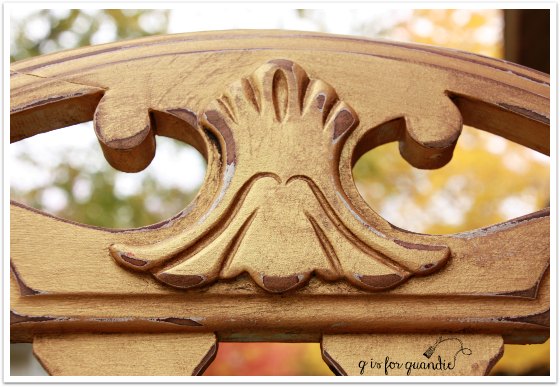
Ahhhh, so much better. The wax highlights the texture a bit more giving the gold more depth.
Now remember, this is Fusion paint, so you don’t have to wax it if you don’t want to. But in this case I was waxing to get a certain look, not to protect the finish. If you are wondering if the wax goes on the same, I would say that the Fusion paint is less ‘absorbent’ than milk paint or chalk paint so the wax goes on a little more smoothly, if that makes any sense. It doesn’t soak in as much. Clear wax also doesn’t alter the color as much with Fusion as it does with the other paints. It’s also easier to work with the dark wax because you can buff it back out more easily if you over-apply.
With the painting done, I moved on to the chair seat. I tried a number of different fabrics that I pretty much hated with the gold. I finally decided to go with a faux grain sack look. I used some drop cloth material and painted on some grain sack stripes and then added a stencil.
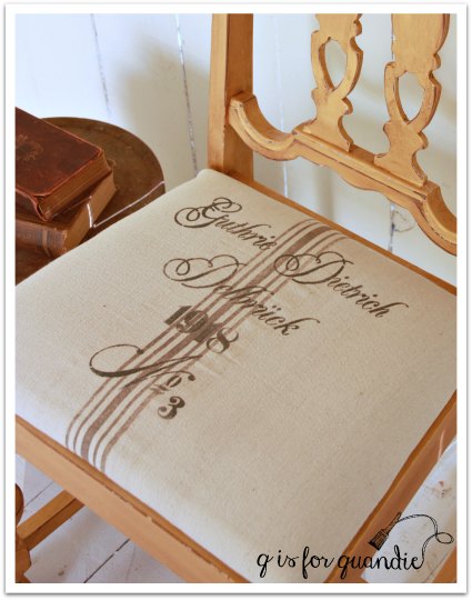
I think that the more rustic look of the faux grain sack provides a nice balance for the gold paint.
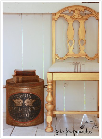
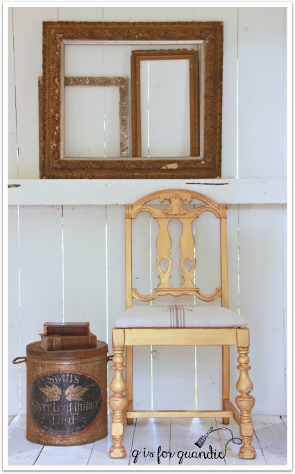
I’ve staged it with an old Swift’s Silver Leaf Brand bucket that I bought at a garage sale a few weeks ago.
And some old gold frames …

So, what do you think? Do you need a touch of gold in your life?
This chair is available if you are local. Leave me a comment if you are interested in getting the details.
Sharing at: French Country Cottage and The Curator’s Collection

Love it! The dark wax was exactly what was needed to give it the aged character.
But the seat omg goodness go smacked! You’ve got a great eye combining those two looks would have never ever have occurred to me. Truly makes it for me.
LikeLike
P.S. Love the accessories too. I would take one of those frames to put a mirror in if you were closer.😞
LikeLike
Thanks Victoria! I really started out going in a different direction with the seat, but it all looked so formal with the gold. I wanted something a little less ‘traditional’ and the faux grain sack seems to work.
LikeLike
Beautiful! I never liked gold, never owned anything gold except from my wedding band, but I’ve been getting a lot of orders from clients who want their furniture gold or with golden details and I have to admit, it is growing on me. Great job as always!
LikeLike
For some reason I had to dig your comment out of my spam filter! How odd. But I’m glad I found you in there 😉 I’m with you exactly, it’s growing on me too. I really loved the result I got on this chair, and it was fairly easy to do. Paint, sand, wax. Bam!
LikeLiked by 1 person
I am not a gold fan either but this looks good! I might have to try this color!
LikeLike
The copper is also really pretty, and copper seems to be making a comeback as well!
LikeLike
I love the gold. Definitely not something I would seek out but I love new looks and you made this look raucous!!
LikeLike
Thanks LaLa! Have you ever seen the French County Cottage blog? She does lots of gold, and she does it really well!
LikeLike
I’ve been on the search for the perfect fabric to finish up a set of Mid Century chairs, and I think I just found my inspiration. Thank you! I won’t go grain sack, but I will definitely be painting up some drop cloth. You’re the best!
LikeLike
It is definitely the budget friendly route to take for fabric. Keep me posted about how they turn out!
LikeLiked by 1 person
Beautiful! I love the aged look, the straight gold was a little too glaring, but the antique wax gave it a fabulous patina. Perfectly paired with the faux grainsack, too!
LikeLike
I agree totally Anya, that straight gold was a little too glaring … especially for a piece of furniture. On something smaller it might work well, but the wax brought it down a notch which was just what it needed! Thanks for your comment!
LikeLike
I love it! Totally agree that the distressing and dark wax adds the perfect depth. I definitely want to try this!
LikeLike
Give it a try Melanie! I’ll watch your blog to see what you do with it 😉
LikeLike
gorgeous
LikeLike
Thanks Bianca!
LikeLike