
You all were very kind in leaving positive comments about my first Nieman Marcus knock off nightstand. Thank you for those!
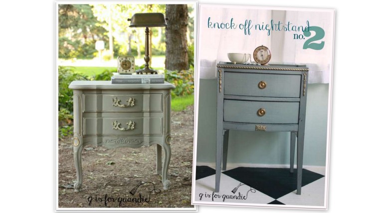
But I knew I could do better! So last weekend while garage saling in Lake of the Isles, I picked up another candidate for the Nieman Marcus look!
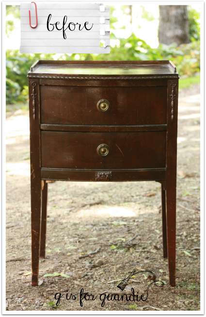
This one has more delicate features and it has some great details that I knew would be lovely highlighted in gold. Someone had done a rather awful ‘make-over’ on it in the past. It had a coat of drippy, shiny, poorly applied poly on it. In fact, it looked as though they hadn’t even bothered to remove the drawer pulls, but just poly’ed right over them!
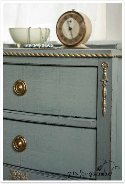
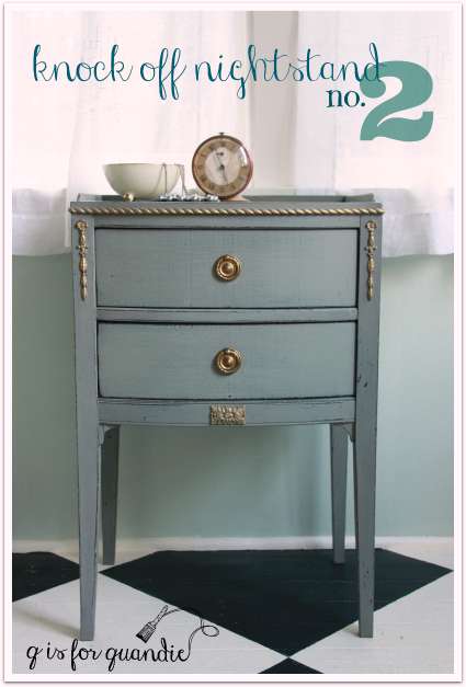
This time I did use MMS milk paint in Trophy!

And this time I added gold to all of the details, the braided trim around the top edge, the carved bits on the sides and bottom of the front and even the drawer pulls.
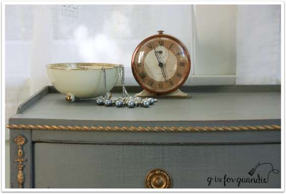
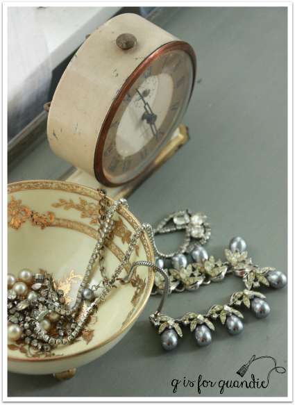
I staged it simply with an alarm clock and some lovely vintage jewelry in a gold rimmed bowl.
I am much happier with this version of my Neiman Marcus knock off nightstand!
Which is your favorite?
Linking up with the Making Broken Beautiful party at The Curator’s Collection.

Knock-off #2 takes the Trophy! Love the light, minimalist, delicate lines, and Trophy is my favorite MMS paint color. I can’t quite tell, but when you re-do an awful previous make-over, do you try to sand down the drips or just make them part of the new finish? Your staging always lends a nice personality dimension to the featured piece.
LikeLike
Good one Kim! As for the drips, I do try to sand them down a little to make them less noticeable. I’m not always patient enough to do a good job of it though.
LikeLike
Number 2 is beautiful! Are you selling it or keeping it for yourself?
LikeLike
I am selling it! Do you need a Nieman Marcus knock off?
LikeLike
They are both special in their own way, but the extra gold takes it up a notch!
LikeLike
I’m with you on that! I am learning not to be skimpy with the gold 😉
LikeLike
Said Loius XVI!
LikeLike
Love, love, love this one!
LikeLike
Thanks Kristin!
LikeLike
Love, LOVE the second one!!!! You do just a great job…they are both wonderful!
LikeLike
Thanks Patty! Hope the chairs are working out for you!
LikeLike
Wunderful, wunderful, wunderful ladies and gentleman! Lawrence and I concur
it’s time to crank up the bubble machine. Oops fell in a time warp. Love the lines of this piece there is something about this era and color is perfect!
LikeLike
What does it say about me that I knew right away that you were doing Lawrence Welk?
LikeLike
It says you might have been lucky enough to polka with your daddy like I did?
Seriously Linda this is a beautiful piece very classic.
LikeLike
As usual your painting skills are extraordinary! I love #2 the best because of the simpler lines and the applied wood carvings and more gold is always better! It makes all the details shine. I love that the paint is gray with the blue undertones. Think I’ll pick that color me ownself. Great job.
LikeLike
Thanks Laura! I am a fan of the simpler lines too.
LikeLike
Well I thought the first one looked fabulous but then I saw No. 2 and that one is stunning. You have talent and vision. Love it!
LikeLike
Aw shucks! Thanks Donna!
LikeLike
Oh, my! Might just be my favorite piece that you’ve done. That Trophy is such a beautiful color. Exquisite use of the gilding wax.
LikeLike
Thanks so much Teri! I am getting the hang of the gold wax.
LikeLike
L O V E – nuff said!
LikeLike
Wait, is this one you weren’t sure of? Phht! I have a table about that size and I think this (meaning you again) will be my inspiration:)
LikeLike
Nope, I was sure of this one. It was the first one that I thought I should have used more gold on. I’m glad I inspired you! Let me know how your table turns out!
LikeLiked by 1 person
I love them both but the second one is my favorite.
LikeLike
The 2nd one seems to be getting the most votes!
LikeLike
In all fairness, you did a nice job on both. They just have very different lines. Although some miraculous things can be done with a neglected/abused piece, it does help if it has good bones and classic lines to pull off “the look.” I do love the color on the second one. In the photos it looks like there is a subtle variation between gray/blue and gray/green going on. It gives the finish almost a linen look. Love it!
LikeLike
Milk paint can have a little variation in the color, and I think that is part of its charm. It does give a more textured sort of look to the finish I think.
LikeLike
Yea I noticed that linen look as well pretty cool.
LikeLike
The second piece has more character.
LikeLike
I would have to agree with you on that Joyce!
LikeLike
Love both your creations but No. 2 has stolen my heart. As always your work is beautiful.
LikeLike
Thanks so much Jacqueline!
LikeLike
They’re both beautiful, but number two would get my vote!!
LikeLike
The second one seems to be the clear favorite! Thanks Cynthia!
LikeLike
I definitely like #2 better, but #1 does have the legs!
LikeLike
Those curvy legs with the little turned up feet on the first one are fab!
LikeLike
YOU ARE KILLING ME! I love #2!! I liked #1 , but #2 is WOW!!! Girl, you are awesome with the paint!
Blessings
LikeLike
You are too kind! Thanks Shelly!
LikeLike
Number 2is outstanding. 1 was nice but nothing unusual compared to 2. Very nicely done and I love the color.
LikeLike
Thanks Jill! I feel the same way!
LikeLike
My choice is for No.2. I prefer the unfussyness (is that a word) of the style.
Very high end looking.
LikeLike
Good word! I like it.
LikeLike
This is really quite superb! She was a beautiful piece to begin with, but the paint job you did really set her apart. Gorgeous!
LikeLike
Thanks so much Cheryl!
LikeLike