
One drizzly evening last week Mr. Q and I picked up a lovely bedroom set. This is one of my craigslist secret tips. I hesitate to even share it here, because the competition for craigslist pieces has gotten seriously fierce in my neck of the woods. Maybe I should start keeping my secrets tips to myself! But no, here it is. I often search for bedroom sets instead of individual pieces. They might seem expensive at first glance, but if you break down the cost per piece they can sometimes be a great deal. Plus there is the added bonus of getting multiple pieces in one trip. Time and gas saving!
This set included a full sized bed,

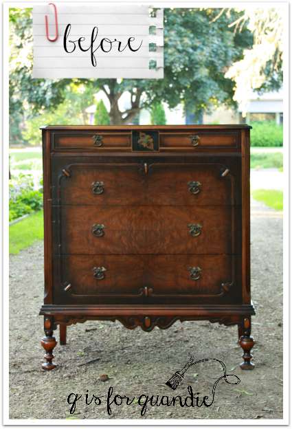
a tall gentlemen’s dresser,
and a lady’s dresser with mirror.

Personally, I think the coloration on these pieces is quite hideous. OK, maybe hideous is a strong word … but … well, yep, hideous. The dark shadowing around the edges is a total turn off for me. And then there is this odd looking flower detail.

You can’t see it as well on the dressers, but they both have it too. Gack! The green center just boggles the mind. Isn’t it kind of creepy?
But I had a sneaking suspicion that these pieces could be quite beautiful with a paint job. The prettier details that were barely noticeable before really pop now.
See?

The difference is night and day, don’t you think?
I chiseled the weird flower from that raised circle on the foot board and replaced it with a 1902 stencil.

But first I had to use some Tough Coat Sealer just on this raised circle because the black kept bleeding through my paint.
Speaking of paint, this is a custom mixed Annie Sloan chalk paint color. I used about 1/3 Louis Blue, 1/3 Pure White and 1/3 Old White. Then I topped it off with a smidge of French Linen (grey) to tone town the ‘sweetness’ of the Louis Blue.
While we are on the subject of tweaking colors, let’s talk about white balance and how it messed up the color in my photos of this bed. Do you use the white balance setting on your camera? I know that the professionals calibrate their white balance for the exact conditions of their photo shoot. I’ve done that with my camera, but I seldom get it right that way. I’m a total amateur! However, I do frequently change between the ‘canned’ white balance settings on my camera; sunny, shady, cloudy, tungsten light, and fluorescent light instead of using the ‘auto’ white balance setting. Sometimes you have to play around with them to get the right setting for your conditions. I find that in many cases I need the “sunny” setting even when I’m in the shade. The two photos above were taken using the sunny setting, and as you can see, they were taken in the shade (but with a sunny background behind the subject). The color in them is fairly accurate to the piece itself, except I think the color is a bit lighter in person. A pale blue with not a lot of green in it.
Then just to experiment, I decided to switch my white balance to the “shade” setting. And this is what I got.

A pretty picture, but not an accurate representation of the color. This looks a lot like Duck Egg blue, which the bed definitely is not. Sometimes you can fix this using a photo editing software, but I was unable to get the true blue of this bed using Picmonkey, Picasa or Windows Live Photo Gallery. I kept getting a lot of extra pink thrown in.

I’m not an expert on white balance, but I have been working on getting it right in my photos since that translates to showing more accurate pictures of colors on my blog. I feel like it’s important since a lot of you (like me) will see a color you like on a piece of furniture, and then be so disappointed when the color looks entirely different in person. I still don’t get it right all the time, as was the case with these bed photos, but I try!
Did you know that even a lot of camera phones have a white balance setting? Mine does. It doesn’t have as many as my Canon Rebel camera but it has cloudy, daylight, fluorescent and incandescent. So, if you aren’t already working with your white balance settings, give it a try.
And if you want to see the real color on this bed, drop in at Reclaiming Beautiful in Stillwater where it is sporting one of my new tags!


Will be in the Afton,Stillwater,Hudson area Saturday. Will be watching for your items. Love everything you create.
LikeLike
Thanks Diane! Unfortunately, you may not find much of my stuff. I only have two pieces left at Reclaiming Beautiful at the moment, the bed from this post and the primitive cupboard. I don’t have anything at Eye Candy yet, that will be next Sunday (Aug 2). However, both shops have lots of other amazing stuff. I hope you bring home some great finds!
LikeLike
Ok there may be two posts from me I had not finished the first when I left your site and came back now the original one has disappeared. Unusual finish in the before
shots for sure much prefer the afters. These pieces have good lines. I am glad you brought up the white balance setting on the iPhone. I never knew that was there. I just have not taken the time to get to know the camera on my phone. I must remember this when I go looking for paint in the future. I was all about MMS Tricycle until I saw it in person much bluer than it photographed and came across online. Thus I went with Fusion which as you well know has a lot of sheen. Not glossy but not as aged looking to me. Tuesday I went to check out MMS Boxwood for a client’s piece and to my “surprise” the samples at the shop were again bluer than the pieces I have seen online came across. I was looking for more yellow in the paint. I do understand customizing the paint by adding different ones together is possible. Just a new way of looking at paint for me. I really need to go back and read your post again now that I am dabbling in the painting pool. I am sure you have talked about my “new” experiences.
So glad to hear things are moving quickly in the shop. Not at all surprised though.
Love your stuf.
LikeLike
I think a lot of people aren’t aware of the white balance settings! Check them out. As for the Fusion, I agree, it has some sheen. Not a lot, but definitely more than we might be used to with milk paint and chalk paint. As for the Boxwood, that is a tricky one. If you add the bonding agent, it becomes much more yellow. The choice of top coat can really change the color too. And the mixing while painting (as some pigments settle more than others) can really change the color too. To see this in action, revisit this post.
LikeLike
See I totally forgotten about that piece. And boy did that scare me off green for someone else until I have more experience. Great save though! That post has pretty much pushed me toward doing her stuff off black not gray but not a strong black. NO SHEEN!
We are painting the SW Blonde walls a warm white to go with the carpet. I will pump up the green with accessories. She is planning on selling in two to three years so I am trying to keep the fixed finishes neutral and pop color that way.
Enjoy the weekend!
LikeLike
You might be happy with the Annie Sloan Graphite. Check it out on pinterest.
LikeLike
What a great CL score! I love how chunky and substantial the legs are! The bed is lovely, and I can’t wait to see what you do with the dressers. Thanks also for sharing your tips!
LikeLike
You’re welcome Cynthia! Thanks for your comment!
LikeLike
Great pieces!
LikeLike
Thanks Joyce. I just finished the matching mirrored dresser, so stay tuned, it will be posted on Friday!
LikeLike