
I mentioned that the only thing I purchased while garage saling in Vegas was a little oil painting. It had to be small to fit into my suitcase. Here it is.
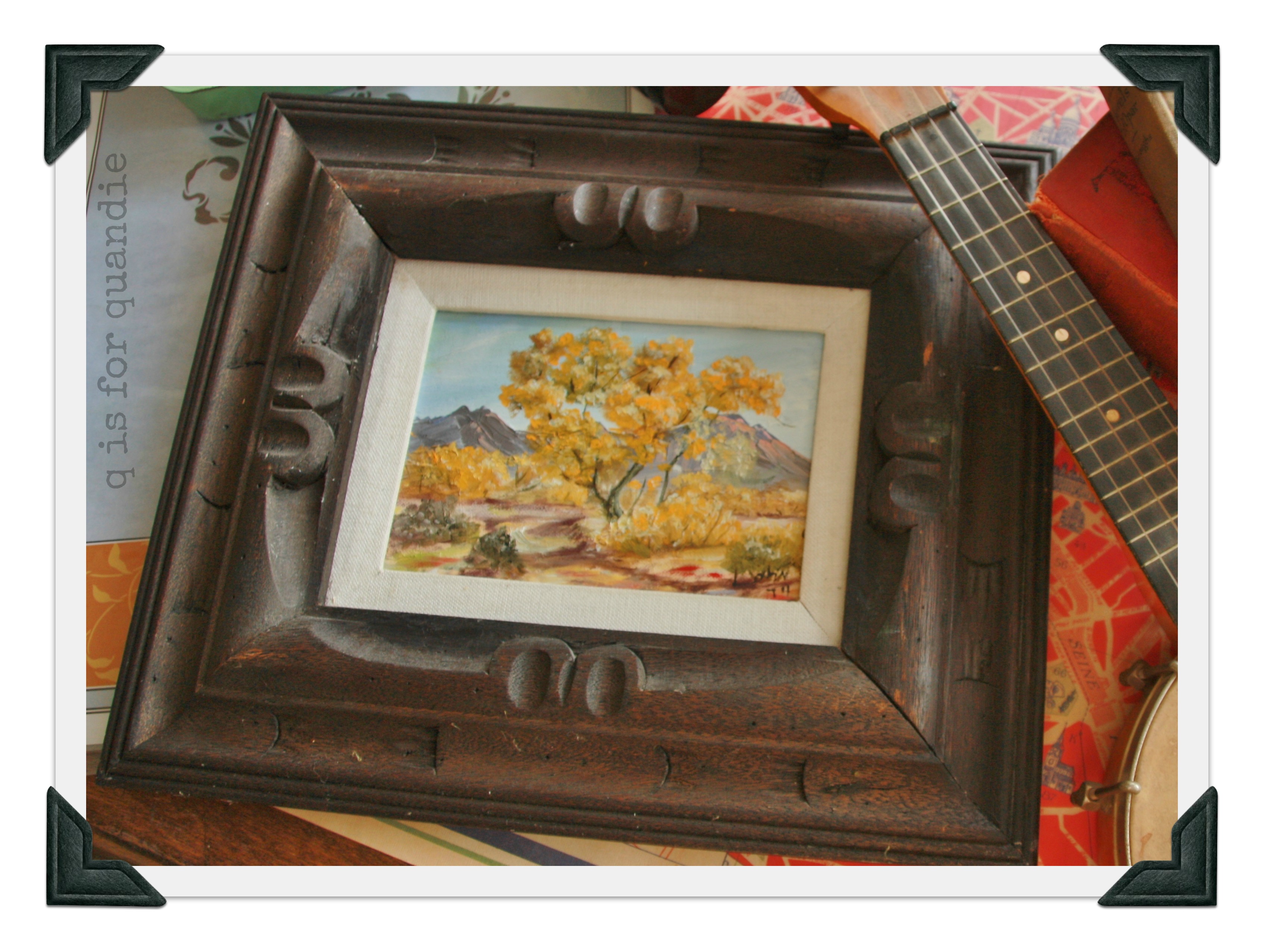 Before you recoil in horror, let me explain. There were a couple of things that drew me to this painting. First was the frame. Ugly as is, but I thought it would be a fun one to paint. Second, the painting itself, which I thought was rather sweet. Finally, the size, a mere 4.5″ by 6.5″. I like either things that are smaller than usual, or things that a bigger than usual. Why is that?
Anyway, I knew I could change up the look of this little painting by … well … painting it.
I also thought this would be a good way to try out the Annie Sloan chalk paint that I picked up at Bloom. I took everything apart, and painted a coat of Provence on both the mat and the frame. I have to say, the Annie Sloan paint went on smoothly. It didn’t dry as fast as the milk paint does though. Really, in the end, the main thing that I like about it is the color, and I can reproduce that in a much cheaper homemade version of chalk paint (latex paint mixed with plaster of paris). So, will I go out of my way to find more Annie Sloan paint? I doubt it. Will I pick it up once in a while for a special project? More testing required to answer that one.
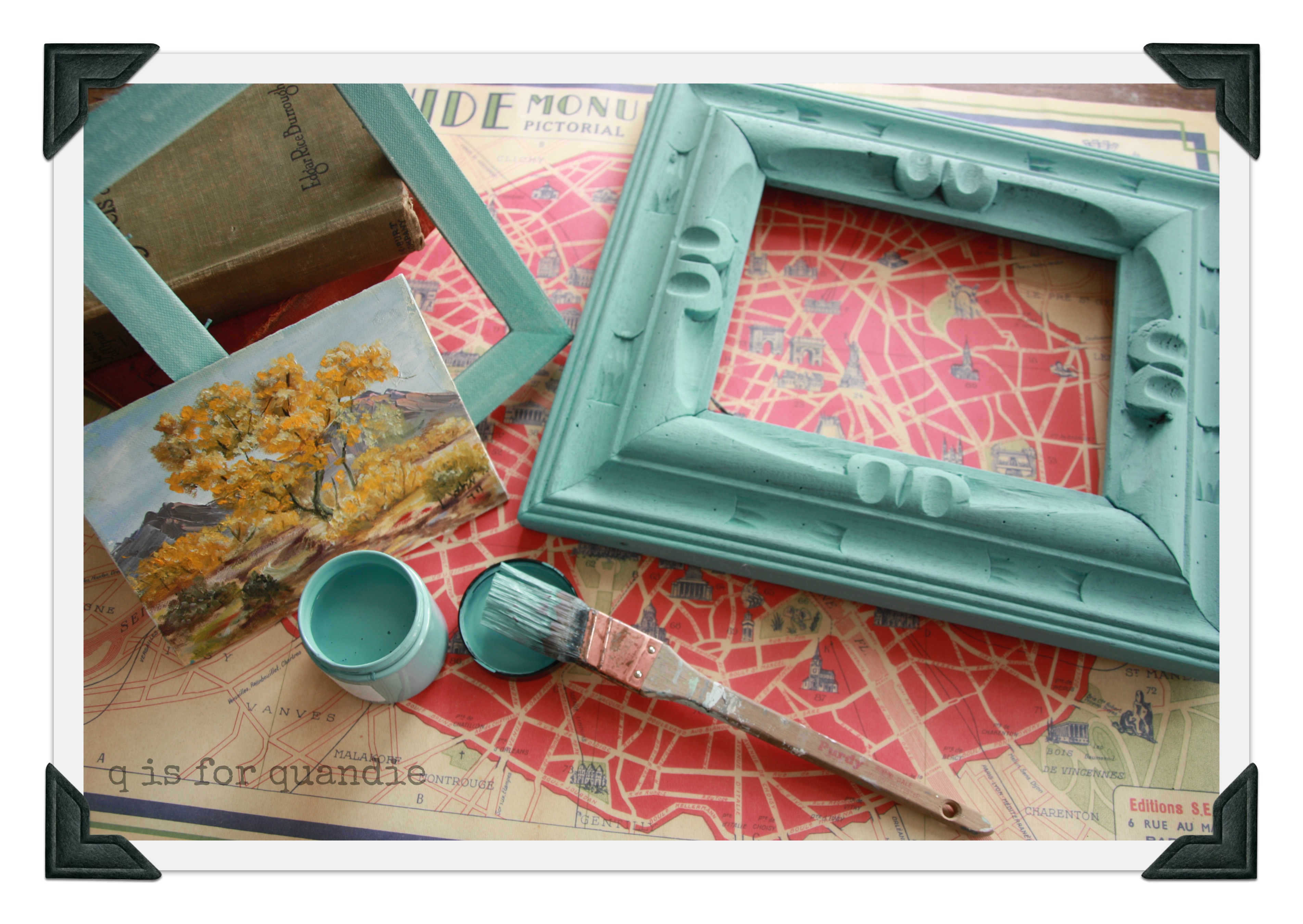
Anyway, I knew that my final coat of paint on the frame would be Miss Mustard Seed’s Linen, so I decided to leave the mat in Provence. I originally planned to just use the MMS white wax over the Provence, and that is where I started, but I didn’t love it. I added some clear wax to tone it down, but still didn’t love it. So, I broke out the MMS antique wax and that did the trick. I think having all 3 waxes gives the mat an aged appearance that works for me.
As for the frame, I added two coats of MMS milk paint in Linen. I was hoping for a lot of chipping, but got very little. I added more distressing by sanding it lightly, and then finished with a combination of clear and antique wax.
Here is a close up of the end result.

I like how the aqua of the Provence shows through the Linen.

In the end, I can’t decide about this guy. Is he kind of fabulous? Or just kind of not fabulous.
So, you tell me. What do you think? Go ahead, be honest. I really want to know. Love it? Hate it? Indifferent?

I love the frame, it it turned out beautifully! You have a talent for seeing the potential in blah things! The painting is nice, but I don’t think it works with the frame. Maybe something more muted in color or neutral, like a black & white (I’m partial to b&w photos), in the frame to really put the focus on the beautiful paint finish and wood details.
LikeLike
Thanks for your comments Kristy! I agree with you. It probably would have been wiser to use a color on the frame and mat that worked better with the painting … maybe a green. But I was so anxious to try out the Annie Sloan paint that I ignored those thoughts and just painted the aqua. But, I also think the painting has such a southwest feel to it, maybe it just isn’t going to appeal to some no matter what (probably including me). I think a seascape of some kind, or maybe something more floral with pinks and white, would be pretty in this frame too.
LikeLike
Oooh..you’re right, a beachy seascape would be pretty. I just bought some AS chalk paint & haven’t tried it yet, I too think it’s spendy, but wanted to see what all the hype was about. I caught onto MMS blog & paint a little while ago which is how I came across yours, seeing the 1890 Artissimo chest on there. I truly look forward to your new posts!
LikeLike
Thanks Kristy! I have to say, I love the MMS paint. It took a little getting used to, but now that I have the hang of it I use it on almost everything.
LikeLike
Wonderful transformation!
LikeLike
Thanks Victoria! I hope spring has arrived in your part of the U.S. I bet you have daffodils already and everything. I type this as I sit here looking out at crusty, dirty snowbanks and the forecast calls for a low of 4 tonight. Seriously! 4. In March. Ridiculous, even for Minnesota.
LikeLike
Fabulous!
LikeLike
Thanks Annie!
LikeLike
I love it, it really speaks to me in a way I can’t quite explain, just so pretty.
LikeLike
Thanks Barb. I think that is how I felt about it too, not quite sure why, but I was just drawn to it.
LikeLike
I really like that you tell us the exact procedure for how to accomplish the technique. That is really helpful especially how the different waxes add to the final outcome. I think that frame is really nice, and I have to admit, it is one I would have passed over without seeing passed the color of the wood. But, the design is really marvelous, isn’t it, the way the circular design draws the eye to the painting? The color of the sky is the one that argues with the Provence, the other colors are great with it. A good experiment and the piece was a worthwhile purchase. The frame is now marvelous and the little painting can be used without a frame someplace that will appreciate the wonderful yellows hues.
LikeLike
I think the distressing of the frame really brought out that circular detail in a nice way. It was hardly noticeable before. Yep, you are right, it’s the blue of the sky that is fighting with the frame.
LikeLike
I like the mat and the painting itself but not so sure about the frame. Too light for me I think.
LikeLike
I like it just as is. You certainly breathed new life into that dark frame 🙂 I like the painting as well and if you separate it from the mat and frame I would hang onto it for use somewhere else.
LikeLike
I love it! The painting pops now, whereas you didn’t even see the painting before because of the frame. And I love how you painted the matting. Very nice.
LikeLike
love how it turned out!!!
LikeLike
Thanks Natalie!
LikeLike
It’s PERFECT! Carry on.
LikeLike
Thanks!
LikeLike